The 'Why' Behind the 'What': Unpacking Visual Design's True Impact
Golden Hook & Introduction
SECTION
Nova: We often think good design stands out, right? That it's bold, eye-catching, maybe even a little avant-garde. But what if I told you the design is actually invisible?
Atlas: Invisible? Hold on, Nova, that sounds almost… counterintuitive. Isn't the whole point of visual design to be seen, to grab attention? My inner aesthetic seeker is a little confused right now.
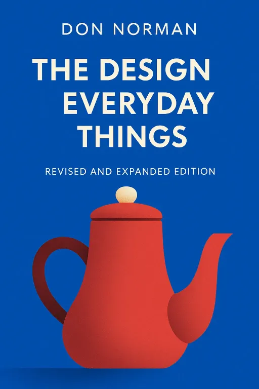
Nova: Exactly! That’s the beautiful paradox we’re diving into today. We’re exploring a profound shift in thinking about visual design, moving beyond just the surface, the 'what,' to the deeper 'why.' And our guides on this journey are two incredible minds: Don Norman, with his seminal work "The Design of Everyday Things," and Daniel Kahneman, the psychologist who won a Nobel Prize in Economics for "Thinking, Fast and Slow."
Atlas: Wow, a cognitive scientist dabbling in design and a psychologist winning in economics. That’s already speaking to my holistic creator side, bridging disciplines. What did they bring to the table that was so revolutionary?
Nova: Well, Norman, originally a cognitive scientist, essentially stumbled into the design world. He brought this completely fresh, human-centered perspective that revolutionized the field. He asked, "Why do people struggle with this door?" not "Is this door pretty?" And Kahneman, as a psychologist, peeled back the layers of how our minds actually make decisions, which has profound implications for how we design for human interaction. They're telling us that true design mastery comes from understanding human cognition and behavior, not just artistic principles.
Atlas: So, we’re talking about designing for the human brain, not just the human eye. That's a huge pivot.
Nova: Absolutely. Today, we'll dive deep into this from two perspectives. First, we'll explore the common 'blind spot' in design that keeps us on the surface. Then, we'll discuss the crucial 'shift' required to build design from the ground up, using human cognition as our ultimate blueprint.
The Blind Spot: When Design Screams for Attention
SECTION
Nova: So, let's start with this "blind spot." It’s a pervasive issue where we, as designers or even just consumers, focus so much on the aesthetics – the colors, the fonts, the layout – that we completely miss the underlying human interaction. We're looking at the 'what' and ignoring the 'why.' Don Norman famously says that good design is often invisible; it just works. Bad design, however, screams for attention through frustration and confusion.
Atlas: Bad design screaming? Can you give me an example that really makes me feel that frustration? Because I imagine many creators and users out there have experienced this, even if they haven't articulated it.
Nova: Oh, I know that feeling! Imagine a simple door. You walk up to it, you see a handle, so you grab it and pull. But it doesn't open. You try again, maybe harder. Still nothing. Then you notice a tiny, almost invisible sign that says "PUSH." You feel a flush of embarrassment, a surge of annoyance. The design of that door, with its misleading handle, screamed its badness through your confusion and wasted effort. It violated a fundamental principle of intuitive design. The handle pulling, but the door pushing. That mismatch creates friction, and friction is the sound of bad design screaming.
Atlas: Oh man, the universal door problem! I’ve been there so many times, feeling like an idiot, when it was the door's fault all along. But what if an artist their work to be challenging, to make you think, to even feel a little frustrated? Isn't there a place for that kind of 'artistic' design, especially for those of us who appreciate depth beyond mere functionality?
Nova: That’s a brilliant distinction, Atlas. When we talk about functional visual design – whether it's a website, an app, or a physical product – the primary goal is communication and ease of use. If a door is designed to a door, its job is to facilitate entry and exit as effortlessly as possible. If it makes you pause, think, or get frustrated, it has failed its fundamental purpose. Artistic expression, on the other hand, can intentionally subvert expectations to provoke thought or emotion. But even then, the most impactful art often understands human perception deeply. The problem arises when designers confuse artistic expression with functional design, prioritizing novelty or pure aesthetics over clarity and usability. It's about understanding the behind the design. If the intention is clear communication and seamless interaction, then ambiguity and frustration are failures, not features. Ignoring the 'why' means your beautiful creation might be beautiful, but it's also a pain to use.
The Shift: Designing for the Human Brain
SECTION
Nova: That brings us perfectly to the "shift"—how understanding human cognition transforms this. This is where Daniel Kahneman’s work in "Thinking, Fast and Slow" becomes incredibly powerful for visual designers. He introduces us to two systems of thinking: System 1 and System 2.
Atlas: Okay, so what do you mean by System 1 and System 2? For someone who enjoys synthesizing complex ideas, I need to know how these systems actually work in our brains.
Nova: Absolutely. Think of System 1 as your fast, intuitive, emotional brain. It’s what makes you instantly understand a facial expression, react to a sudden noise, or recognize a word. It operates automatically and quickly, with little or no effort and no sense of voluntary control. Visual design heavily appeals to System 1 with things like color psychology, immediate visual hierarchy, and compelling imagery. It’s about that instant gut reaction.
Atlas: So, are we saying design should only appeal to System 1? Make everything mindless, so we don't have to think? That sounds a bit out there for someone who seeks meaning and depth.
Nova: Not at all! And this is the crucial nuance. While visual design leverages System 1 for that immediate impact, understanding System 2 is vital for creating truly functional and profound experiences. System 2 is your slow, logical, deliberate brain. It’s what you use for complex calculations, comparing two products, or consciously focusing on a difficult task. It requires effort and attention. The genius of good design is how it subtly guides System 2 without overwhelming it. It makes complex tasks feel simple precisely because it anticipates and supports the slower, more analytical thought process when it's needed.
Atlas: That’s a great way to put it. So, it's not about making things mindless, but making the of a task truly effortless, so we can put our mental energy into the. How does a 'Holistic Creator' practically apply this? What's one thing they could change in their next visual project to leverage System 1 System 2 more effectively?
Nova: That’s a fantastic question. One practical application is in creating clear visual hierarchies. For System 1, you want the most important information to instantly stand out – perhaps through size, contrast, or strategic placement. This allows the user's fast brain to quickly grasp the essence. But then, for System 2, you need to provide structure and clarity for deeper engagement. This means using ample white space to reduce cognitive load, logical grouping of related elements, and clear, concise language to support the user's deliberate processing. It’s about creating an intuitive path that feels effortless in the moment, but is actually a carefully constructed cognitive journey. You’re designing for recognition over recall, making decisions easy, and reducing friction at every step.
Atlas: So basically you’re saying you hook them with System 1, but you keep them with a thoughtful, well-structured path for System 2. It's incredible how much science goes into something we often dismiss as just 'pretty pictures.' It truly elevates design from an aesthetic pursuit to a deeply human-centered science.
Synthesis & Takeaways
SECTION
Nova: Exactly. We’ve journeyed from the 'blind spot' of focusing solely on the 'what' of design, to embracing the 'shift' towards understanding the profound 'why' behind human interaction. The core insight here is that true design mastery isn't just about artistic principles; it's about deeply understanding human cognition and behavior. It's about making the user's life easier, reducing their mental effort, and guiding them with an almost invisible hand.
Atlas: That takes us right back to that deep question: "How can your next visual project intentionally simplify a complex interaction, guiding the viewer with an almost invisible hand?" What's your final thought on that, Nova? How do we truly achieve that 'invisible hand' in our creations?
Nova: The invisible hand of design is achieved when your creation feels less like an object you interact with and more like a natural extension of your own thought process. It simplifies complexity so profoundly that the user isn't even aware of the design at all. They just. They understand. They connect. The most impactful designs aren't seen, they're felt—they simplify life, reduce friction, and enable profound experiences without drawing attention to themselves. So, I challenge our listeners to look for the invisible design in their own lives this week. Where does something just without you even thinking about it? That's where the true magic lies.
Atlas: That’s such a hopeful way to look at it. It transforms our understanding of design from something that demands attention to something that grants freedom.
Nova: Absolutely.
Atlas: This is Aibrary. Congratulations on your growth!