From Data to Decisions: Empowering Influence Through Visualization
Golden Hook & Introduction
SECTION
Nova: What if I told you that sometimes, the more data you show, the people understand?
Atlas: Whoa, hold on a second. That flies in the face of everything I've ever been taught. I mean, my instinct is always to provide the data points, all the context, so there's no ambiguity. But you're saying that could actually be detrimental?
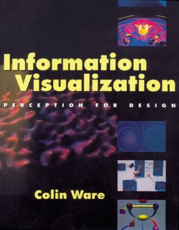
Nova: Absolutely. It's a common trap, isn't it? We think more information equals more clarity, but our brains often beg to differ. And that's exactly what we're dissecting today, drawing heavily from two foundational texts that bridge the gap between raw data and true comprehension. We're talking about "Information Visualization: Perception for Design" by Colin Ware, and "Visualize This" by Nathan Yau.
Atlas: Okay, so these aren't just design books, then.
Nova: Far from it. Especially Ware. He's a renowned perception scientist. He's not just telling you what looks good; he's literally studying how our brains process visual information, down to the neural level. That gives his insights a profound, scientific backing that few others can match. It's about understanding the biological wiring that makes some visuals instantly click, and others, well, just make your eyes glaze over.
Atlas: That's fascinating. So it's less about aesthetics and more about, what, cognitive ergonomics?
Nova: Exactly! It's about designing the human brain. And that leads us perfectly into our first deep dive: The Science of Sight.
The Science of Sight: How Perception Drives Impactful Visuals
SECTION
Nova: So, let's talk about why your exhaustive spreadsheet might be doing more harm than good. Our brains have these incredible shortcuts, right? Things like "pre-attentive processing." This means certain visual attributes – like color, size, orientation – can be detected by our brains almost instantaneously, without conscious effort. Ware explains that if you design your visuals to leverage these, you can highlight critical information in a blink.
Atlas: So you're saying our brains are actually wired to certain kinds of information if it's presented incorrectly? Like, we have a built-in filter that just tosses out the noise?
Nova: Precisely. Think about a crowded party. You can filter out all the chatter and focus on one conversation. Your brain is constantly doing that with visual information. If your data visualization doesn't guide that filtering process, your audience will just see a jumble. Imagine a sales team trying to figure out their quarterly performance. Their dashboard is a sea of numbers, tiny bar charts, and legends. They've got 20 different metrics, all in the same shade of blue. The critical insight – that one product line is plummeting – is buried.
Atlas: Oh man, I know that feeling. It's like trying to find a specific grain of sand on a beach. For someone who values precision, like a data analyst, it feels counterintuitive to information. How do we balance accuracy with simplicity? Isn't there a risk of oversimplifying and losing important detail?
Nova: That's a brilliant question, and it's where the science comes in. It's not about dumbing down the data; it's about optimizing its delivery for human cognition. Ware emphasizes that you can maintain precision while enhancing clarity. It's about what he calls "visual variables." If that plummeting product line in our sales dashboard was highlighted in a bold, contrasting red, or its bar was significantly taller, your brain would register that anomaly instantly, without having to consciously scan every single number. That's leveraging pre-attentive processing.
Atlas: Can you give an example of a visualization that brilliantly leverages that? Like, how does it to see one of those?
Nova: Think of a classic heat map. You're looking at a grid of numbers, but the background color changes from light to dark based on the value. You don't read every number; your eyes are immediately drawn to the hottest or coldest spots. It like the answer just jumps out at you. That's effective design rooted in how our eyes and brains are built to perceive differences. It guides your attention effortlessly.
Atlas: That makes sense. It's like the visual equivalent of a siren, telling you, "Look here, there's something important!" But it still feels like a tightrope walk. You want to be precise, but you also need to be understood.
Nova: Absolutely. It’s a delicate balance, but understanding the science behind we see helps you walk that rope with confidence. Once we know people perceive, the next step is we show them and we shape that into a compelling story.
From Raw Data to Resonant Stories: The Art of Practical Visualization
SECTION
Nova: So, moving from the science of perception to the art of practical application, Nathan Yau, in "Visualize This," really bridges that gap. He's all about how to take that raw, often intimidating data and craft it into something informative and engaging. It’s about choosing the right chart, adding the right annotations, and making sure your visual tells a coherent narrative.
Atlas: Okay, so it's not just about making pretty graphs; it's about making them. What's the most common mistake people make when trying to 'tell a story' with data? Because I've seen some pretty convoluted attempts.
Nova: The biggest mistake, and Yau points this out, is often choosing the wrong chart type for the message you want to convey. People default to a bar chart or a pie chart, even when a line graph or a scatter plot would be far more effective for their specific data. Or, they try to cram too much information into a single visual, creating what Edward Tufte famously called "chart junk."
Atlas: I've definitely seen a lot of 'chart junk' out there. Yau talks about bridging the gap – what’s one 'tiny step' our listeners can take today to make their charts more comprehensible, especially for someone who's used to drilling down into every detail?
Nova: Yau's work is full of these practical steps. One immediate action is simply to ask yourself: "What is the single most important message I want my audience to take away from this visual?" Then, ruthlessly strip away anything that doesn't support that message. It's about clarity of purpose. Imagine a company trying to show the impact of a new marketing campaign over time. Initially, they might show daily spend, daily impressions, daily clicks, daily conversions, all on separate charts. It's overwhelming. A better approach, one Yau would advocate, is to create a single, clear line graph showing conversions over time, with annotations at key points where campaign changes occurred. The cause-and-effect become immediately apparent. The story unfolds visually.
Atlas: That's a great way to think about it – focusing on the first. But given the immense power of visualization to influence, how do we ensure we're telling an story, not just a persuasive one? How do we avoid misleading with visuals, especially when we're trying to drive a specific decision?
Nova: That is such a critical point, and it speaks directly to the "ethical explorer" in all of us. The difference between persuasive and misleading is transparency and accuracy. A classic example of misleading is manipulating the y-axis on a bar chart to exaggerate differences. Or cherry-picking data points to support a narrative while omitting contradictory evidence. Ethical visualization means presenting the data truthfully, even if it doesn't perfectly align with your desired outcome. It means being honest about the limitations of your data and your visualization.
Atlas: So, it's not just about making the data look good, or even understandable, but about making sure it's and not deceptive. That's a huge responsibility on the part of the visualizer.
Nova: Exactly. It's about wielding that influence responsibly. You're not just presenting numbers; you're shaping perceptions, and ultimately, decisions.
Synthesis & Takeaways
SECTION
Nova: So, what we've really unpacked today is that effective data visualization isn't just a technical skill; it's a powerful blend of scientific understanding, as Colin Ware meticulously details, and thoughtful design principles, which Nathan Yau makes so accessible. It's how you move from merely presenting data to genuinely influencing decisions and empowering people.
Atlas: It sounds like mastering visualization isn't just about technical skill, but about becoming a more effective leader and communicator. It connects the precision of analysis with the bigger picture of human impact, which is something many analysts, including myself, are constantly striving for.
Nova: Right. It’s about ensuring your precision has a voice that resonates. And for our listeners today, we have a tiny step, a practical challenge: Choose a recent data set you've been working with. Now, sketch three different visual representations of that data. For each one, consider: what does this particular visual tell most clearly?
Atlas: That's a fantastic actionable step. It really forces you to think about the before the medium, and how different presentations can dramatically alter the perception. It's not just about seeing the numbers; it's about seeing the truth they reveal.
Nova: Ultimately, when you master visualization, you're not just showing numbers; you're revealing truth, fostering understanding, and empowering better human decisions. It's a profound act of communication.
Atlas: That gives me chills. That's such a hopeful way to look at it.
Nova: This is Aibrary. Congratulations on your growth!