Beyond the Beautiful Image: Crafting Meaningful Visual Systems
Golden Hook & Introduction
SECTION
Nova: Atlas, quick question for you: what's the very first thing that pops into your mind when I say the words 'good design'?
Atlas: Oh, well, definitely something beautiful, right? Elegant, visually striking, something that just good. That's the immediate instinct for me as a visual storyteller.
Nova: Interesting. What if I told you that beautiful visuals, all by themselves, are often not enough? In fact, sometimes the design is completely invisible.
Atlas: Invisible design? That’s genuinely counter-intuitive for someone who lives and breathes aesthetics. My brain is already trying to reconcile those two ideas. I'm intrigued.
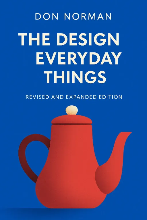
Nova: Exactly! Today, we're diving into an idea that fundamentally reshapes how we think about what makes a visual truly powerful. We're drawing insights from giants like Don Norman, author of 'The Design of Everyday Things,' and Rudolf Arnheim, who penned 'Visual Thinking.' Norman, for instance, had a fascinating career path spanning electrical engineering, psychology, and cognitive science, which gave him this incredibly unique lens to critique how everyday objects constantly fail us, often because they prioritize form over function.
Atlas: That makes sense. It's like, you can have the most beautiful coffee machine, but if you can't figure out how to make coffee with it, what's the point?
The Invisible Power of Functional Visual Systems
SECTION
Nova: Precisely! And that's where Norman's concept of 'invisible design' comes into play. Good design isn't about calling attention to itself; it anticipates user needs so perfectly that complex interactions feel natural, almost second nature. You don't about it, you just it.
Atlas: So it's not just about looking pretty, but about literally guiding someone's interaction without them even thinking about it? Like, for a visual storyteller, it's about making the message so clear, the viewer doesn't even notice the effort that went into the visual communication?
Nova: Exactly! Think about a classic example: a door. We’ve all encountered those frustrating doors, right? The ones with a bar that looks like you should push it, but it’s actually a pull. Or a handle that screams 'pull' but requires a push. The visual cues—the handle, the plate, the way it's hinged—they're supposed to tell you how to operate it. When they're ambiguous, you hesitate, you push when you should pull, you feel a moment of frustration. That's a design failure.
Atlas: Oh, I've been there! That little moment of public embarrassment as you wrestle with a door. It's so subtle, but it's a real friction point.
Nova: It is! Now, a well-designed door, on the other hand, might have a flat plate where you push, clearly indicating 'no pulling here,' or a clear handle where you pull. The visual —the way the object communicates its possible uses—is so clear that you don't even consciously process it. You just open the door. The design is invisible because it's perfectly functional. The cause of frustration is ambiguity, the process is fumbling, and the outcome of good design is seamless interaction.
Atlas: That's a great way to put it. It makes me wonder, how does this apply to something more complex than a door, like a website interface or an infographic? For someone crafting visual narratives, the 'door' is often the entry point to their story.
Nova: Great question! And this idea of guiding perception, of visuals doing more than just looking good, leads us beautifully to Rudolf Arnheim. While Norman focuses on the, Arnheim highlights how visual perception is a form of thinking. Effective visuals don't just decorate; they communicate meaning and aid understanding directly. They help us.
Atlas: So my aesthetic sense isn't just about making things beautiful, but about making them? Like using color or composition to literally for the viewer, to show them a pattern or an insight they might not otherwise grasp?
Nova: Precisely! Arnheim would argue that our visual system is inherently wired to seek out meaning, to make sense of the world. When you create a visual, you're not just presenting information; you're shaping how that information is processed and understood. Let's take a complex data visualization, for instance. Imagine trying to understand global climate patterns from a raw spreadsheet of numbers. It's overwhelming, it's abstract.
Atlas: Impossible! My eyes would glaze over immediately.
Nova: Exactly. But now imagine a beautifully designed interactive weather map, or a climate change infographic that uses color gradients, clear geographic overlays, and animated trends. The visual system in that map immediately conveys patterns, hot spots, and changes over time. The thoughtful arrangement of elements—the choice of colors, the scale, the legends—it's all designed to make that complex data intuitive. The cause is complex data, the process is thoughtful visual encoding, and the outcome is rapid comprehension and insight. It tells a story visually, without needing a thousand words.
Atlas: Wow, that’s actually really inspiring. So for a visual storyteller, who often focuses on emotion and narrative, this is about ensuring those visuals are also communicating meaning effectively, not just evoking feeling? It's about using that innate aesthetic sense for clarity, not just beauty.
Nova: Absolutely! Your innate aesthetic sense, as a harmonious cultivator, isn't just about making something pleasing to the eye. It's a powerful tool for clarity. It can make complex information intuitive and accessible, fostering that deeper connection you're always seeking. It’s about leveraging your natural observation skills to understand how people perceive, and then designing visuals that speak to that understanding.
Synthesis & Takeaways
SECTION
Nova: So, what we're really getting at is that true impact in visual systems comes from a synergy. It's when beauty and functionality dance together seamlessly, when your stunning visuals don't just catch the eye, but also effortlessly guide the mind. It’s about creating an experience where the viewer isn't just admiring, but actively understanding and engaging, almost without conscious effort.
Atlas: That makes me think about the 'tiny step' for our listeners, the visual storytellers out there. It's about looking at a recent visual project and asking: 'Is this beautiful effortless to understand?' It’s about being a harmonious cultivator of visuals – not just planting pretty flowers, but designing an entire ecosystem where every element serves a purpose, guiding the viewer seamlessly through your story.
Nova: Precisely! And that's a powerful vision because it means your unique perspective, your intuitive eye, isn't just a creative gift; it's a strategic asset for clarity and impact. It’s about defining your personal design philosophy, moving beyond surface aesthetics to truly connect.
Atlas: And that, Nova, is a profound insight. It makes me realize how much more impact our work can have when we integrate this approach, thinking about the user's psychology even in the most artistic creations.
Nova: Absolutely. This is Aibrary. Congratulations on your growth!