The Hidden Persuader: How Subtle Cues Shape User Decisions
11 minGolden Hook & Introduction: The Illusion of Rationality
SECTION
Nova: Atlas, quick game. In exactly five words, give me your review of "human rationality in decision-making." Go!
Atlas: Oh, I like that. Uh… "More gut feeling than spreadsheet."
Nova: Ha! "More gut feeling than spreadsheet." I love it. And that, my friend, perfectly encapsulates the hidden persuader we're dissecting today. We’re diving into a concept that completely upends how we think about choice, especially in the digital world.
Atlas: Okay, so we're talking about the subconscious forces at play, the things we don't even realize are influencing us?
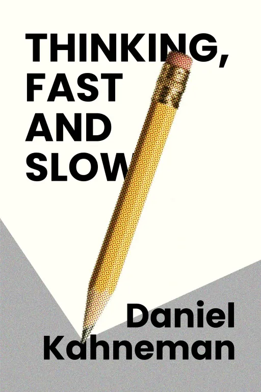
Nova: Exactly. We’re pulling back the curtain on "The Hidden Persuader: How Subtle Cues Shape User Decisions," a topic deeply inspired by the groundbreaking work of Daniel Kahneman, particularly from his seminal book,. Kahneman, a psychologist, actually won the Nobel Memorial Prize in Economic Sciences for his revolutionary insights into cognitive biases and prospect theory, basically showing that humans aren't the purely rational actors economists once assumed.
Atlas: Wow, that’s actually really inspiring. A Nobel Prize for saying people aren't always logical. But wait, how does this abstract psychology, this Nobel-winning theory about how our brains work, actually connect to the tangible, pixel-perfect world of UI design? Because I imagine a lot of our listeners, especially designers, are thinking, "My users are smart, they know what they want."
Nova: Ah, that’s the blind spot, Atlas, and it’s a big one. It's where the journey truly begins.
Deep Dive into Core Topic: Part 1 - The Subconscious Architect (System 1's Dominance)
SECTION
Nova: Many of us, especially as designers, craft beautiful, logical paths for users. We meticulously plan information architecture, flow diagrams, user journeys—all assuming that users will follow these rational breadcrumbs, making conscious, deliberate choices at each step. But the human mind, as Kahneman so brilliantly illustrated, is far more complex, and often, far less rational than we give it credit for.
Atlas: So you’re saying users aren't really when they're clicking around? That feels a bit counterintuitive to everything we’re taught about user-centered design.
Nova: Not that they thinking, but they're thinking is key. Kahneman introduces us to two primary cognitive systems: System 1 and System 2. Think of System 1 as your fast, intuitive, automatic, emotional brain. It's what lets you recognize a face, understand a simple sentence, or slam on the brakes without conscious effort. It operates effortlessly and constantly.
Atlas: Right, like when you’re driving and suddenly realize you’ve been on autopilot for the last five minutes. You were processing, but not thinking about every turn.
Nova: Exactly! Now, System 2 is your slow, logical, effortful, deliberate brain. It’s what you use for complex calculations, comparing two products with intricate features, or filling out a tax form. System 2 is the one that like "you"—the conscious, reasoning self. The crucial part? System 1 often makes decisions System 2 can even fully engage. It’s the gatekeeper, feeding impressions and intuitions to System 2, and often, System 2 just accepts them without much critical thought.
Atlas: Oh, I get it. So, a lot of our so-called "rational" decisions are actually just System 1 intuitions that System 2 rubber-stamped. That’s kind of alarming, actually. How does that play out in a common UI interaction, then? Can you give an example where System 1 is clearly taking the wheel?
Nova: Absolutely. Imagine you're on a website, trying to find a specific piece of information or complete a task. You land on a page, and it's cluttered. There are five different buttons, three pop-ups vying for attention, and text everywhere, all screaming for your focus. Your System 1, which prioritizes ease and speed, immediately registers this as "too much effort." It doesn't analyze each button; it just feels a wave of cognitive overload.
Atlas: That sounds rough. I totally know that feeling. My System 1 usually just screams "Nope!" and I bail.
Nova: Precisely. You might consciously tell yourself, "This site is confusing," but the to leave was likely made by System 1's instant assessment of high cognitive load. Or, consider a payment page. There's a big, green "Complete Purchase" button prominently displayed. Next to it, in smaller, grey text, is an option to "Review Order Details." A user, eager to finish, will instinctively gravitate to the big green button without a second thought. System 1 sees "big, green, action" and pushes for it, even if a careful System 2 check might have caught a wrong item in the cart.
Atlas: So, System 1 is basically our brain's path of least resistance, and it's constantly looking for shortcuts. I'm curious, how can we even begin to measure or predict something so non-rational? Because as designers, we're always looking for data, for logical reasons behind user behavior. This feels… amorphous.
Nova: That’s where the art and science meet. While you can't read minds, you can observe patterns. Eye-tracking studies, A/B testing variations in visual hierarchy, even simply watching users navigate a cluttered interface versus a clean one – these reveal System 1's preferences. It's about understanding universal cognitive biases, like anchoring, framing, or availability heuristic, and how they manifest in digital interactions. For instance, the mere placement of an item in a list can anchor a user's perception of value.
Atlas: That makes me wonder, if System 1 is so dominant, is there a risk of designers exploiting these intuitive biases, creating interfaces that gently nudge users toward outcomes that aren't necessarily in their best interest? Because that sounds like a bit of a tightrope walk.
Deep Dive into Core Topic: Part 2 - Designing for Intuition (Subtle Cues for Guided Outcomes)
SECTION
Nova: That's an excellent point, Atlas, and it highlights the ethical responsibility that comes with understanding these powerful psychological levers. But the goal here isn't manipulation; it’s about creating genuinely intuitive, frictionless experiences. This naturally leads us from System 1 to it. The shift is about moving from "users be rational" to "users intuitive, how do we design for that reality?"
Atlas: Okay, so if we can't force System 2 to always be on, how do we subtly guide System 1 effectively? What kind of "subtle cues" are we talking about here? Because as an INTP designer, I'm always looking for those elegant, almost invisible structural elements that create order.
Nova: Exactly! It’s about being an invisible architect for the mind. Subtle cues are design elements that speak directly to System 1's preferences for clarity, ease, and familiarity. Think about visual hierarchy: the size, color, and placement of elements. A primary call-to-action button that's bolder, larger, and in a contrasting color isn't just aesthetically pleasing; it's a powerful System 1 cue saying, "Start here! This is the most important next step."
Atlas: So it's not just about making something stand out, but making it stand out in a way that feels natural and inevitable for the user's subconscious. That’s a great way to put it. Can you give a specific, concrete example of a subtle cue that's easy to overlook but incredibly powerful in guiding System 1?
Nova: Definitely. Consider 'default options.' When you present a user with a choice, and one option is pre-selected, System 1 often accepts that default without much scrutiny. Think of a newsletter sign-up checkbox already checked, or a "recommended" pricing tier highlighted. System 1 sees the default as the path of least resistance, the "suggested" choice, and often, System 2 doesn't bother to override it unless there's a strong reason. This can be used to guide users to a better experience, like defaulting to 'private' settings for privacy-conscious users, or defaulting to a 'save' option rather than 'discard.'
Atlas: That makes sense, but how do we ensure we're intuition for good, not it? Because that line between helpful guidance and dark patterns can feel very thin.
Nova: That’s the ethical tightrope, and it comes down to intent and transparency. Good design for System 1 aims to reduce friction, confusion, and cognitive load, leading to a more satisfying and efficient user experience. It's about making the path the path, when that desired path genuinely benefits the user. Dark patterns, by contrast, exploit System 1's biases to trick users into doing things they wouldn't consciously choose, often through obfuscation or deceptive defaults. The distinction lies in whether you're enhancing user autonomy through clarity, or diminishing it through subtle coercion.
Atlas: Okay, so it’s about building trust with the subconscious, not undermining it. I’m curious, what about micro-interactions? Those tiny animations or visual feedbacks we often take for granted. Do they play a role in guiding System 1?
Nova: Absolutely! Micro-interactions are pure System 1 magic. When you click a button and it subtly changes color, or a form field instantly validates your input with a green checkmark, that's immediate, effortless feedback. System 1 loves that instant gratification and clarity. It confirms, "Yes, you did that right! Keep going!" Without it, System 1 gets anxious, thinking, "Did it work? What now?" leading to hesitation or abandonment. These small, sensory cues create a sense of responsiveness and control, building confidence without System 2 ever needing to logically process it. It's about making the interaction feel alive and reactive, almost like a conversation.
Atlas: That’s actually really inspiring. So, it's not just about the big architectural choices, but also the tiny, almost imperceptible details that cumulatively shape our intuitive experience. It’s like designing for the of rightness, not just the logical steps.
Synthesis & Takeaways
SECTION
Nova: Exactly. Ultimately, truly intuitive design transcends mere logical flow. It’s a profound understanding of how our brains actually work—the lightning-fast judgments of System 1, the deliberate processing of System 2, and the dance between them. It’s about respecting the human mind's natural processes, making technology feel like an extension of thought, not a barrier.
Atlas: And for designers, this means recognizing that the beauty of an interface isn't just in its aesthetics or its logical structure, but in how effortlessly it allows the user's intuition to navigate and achieve their goals. It's about creating order within the chaos of cognitive biases.
Nova: This is where allowing sensibility and rationality to intertwine becomes not just a personal philosophy, but a design superpower. It’s about leveraging that deep understanding—that curiosity about how humans connect with the world—to build experiences that feel innately right. It's the art of hidden persuasion for good.
Atlas: That gives me chills. Next time you interact with an app or a website, take a moment. Can you identify where your System 1 is taking the wheel, and how that interface might be subtly guiding you?
Nova: This is Aibrary. Congratulations on your growth!