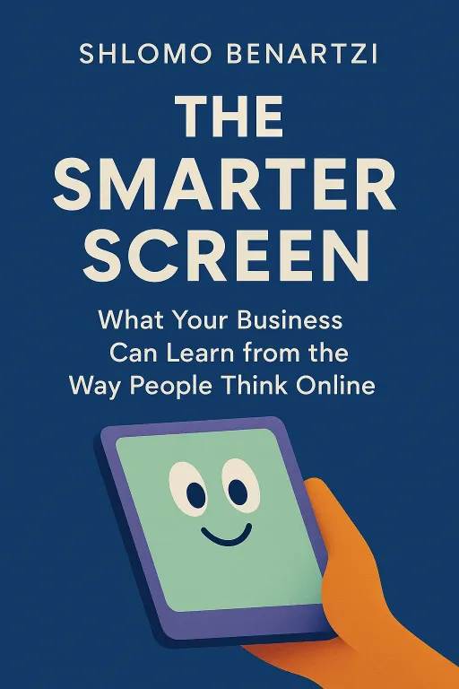
The Smarter Screen
What Your Business Can Learn from the Way People Think Online
Introduction
Narrator: Imagine it’s 2013, and you’re one of the millions of uninsured Americans logging onto the newly launched healthcare.gov. You’re looking for a good health insurance plan, something affordable that meets your family’s needs. But instead of clarity, you find chaos. You’re confronted with dozens, sometimes over a hundred, different plans, each with a dizzying array of deductibles, premiums, and co-pays. Overwhelmed, you make a quick choice, hoping for the best. What you don’t realize is that your decision, made in just a few minutes on a confusing screen, may have cost you dearly. Studies later revealed that the average user on a simulated version of the site chose a plan that was nearly $900 more expensive than it needed to be. The screen, meant to empower, had instead led to a costly mistake.
This failure of design is the central puzzle explored in Shlomo Benartzi’s book, The Smarter Screen. Benartzi argues that this isn't an isolated incident but a symptom of a larger problem: our digital world is often built without understanding how the human mind actually thinks online. The book reveals how the very architecture of our screens—from the layout and aesthetics to the number of choices presented—profoundly influences our decisions, for better or for worse.
The Attention Scarcity Crisis
Key Insight 1
Narrator: In our information-rich world, the most valuable and scarce resource is not data, but human attention. Benartzi introduces the concept of the "mental screen"—the tiny sliver of information our brain can actually process at any given moment—and contrasts it with the vast, overwhelming physical screens of our devices. This mismatch has created a new economy, one where businesses thrive by managing our attention.
Consider the modern process of booking a hotel. In the 1990s, a traveler might call a travel agent who, for a 10% commission, would find a suitable room. Today, a traveler is inundated with hundreds of options on Google. To make sense of it all, they turn to Online Travel Agents (OTAs) like Expedia or Booking.com. These platforms don't own hotels; they simply filter information. For this service of managing the user's limited attention, they charge hotels commissions of 20% to 30%, far more than the old travel agents. They profit directly from the scarcity of our attention. This cognitive overload isn't just expensive; it can be dangerous. When our mental screen is taxed, our decision-making suffers. In one famous study, participants asked to remember a seven-digit number were far more likely to choose a slice of chocolate cake over a healthy fruit salad compared to those asked to remember just two digits. The mental effort of memory left no room for willpower. In the digital age, we are all constantly trying to remember seven-digit numbers, making us vulnerable to poor, impulsive choices.
Function Follows Form: Why Beauty Builds Trust
Key Insight 2
Narrator: We like to believe our decisions are rational, based on a careful weighing of facts. Research shows, however, that our first impressions are formed in the blink of an eye, and they are overwhelmingly driven by aesthetics. Benartzi explains that we make judgments about a website's visual appeal in as little as 50 milliseconds—faster than our conscious mind can even process what it's seeing. More importantly, these snap judgments about beauty rarely change, even if we’re given more time to study the site.
This phenomenon has profound implications for how we behave online. A study by researchers Claudia Townsend and Suzanne Shu demonstrated this by giving students one of two corporate reports for a fictional company. The reports contained identical financial data, but one was beautifully designed with high-quality graphics, while the other was plain and unattractive. When asked to value the company’s stock, students who saw the beautiful report valued the shares at over $327, while those who saw the ugly report valued them at just $162. The aesthetic "halo effect" made them perceive the well-designed company as more competent and valuable. In the digital world, where trust is paramount, a clean, professional, and visually appealing design isn't a luxury; it's a fundamental signal of credibility and usability.
The Unseen Forces of Display: How Layout Shapes Choice
Key Insight 3
Narrator: Where information appears on a screen has a dramatic and often unconscious impact on what we notice and what we choose. Benartzi highlights a powerful "middle bias," a tendency for our eyes and our choices to gravitate toward the center of any display. This isn't just a digital quirk; it’s a fundamental aspect of human perception. In a study of supermarket shoppers, products placed on the two middle shelves were chosen 71% of the time. In public restrooms, the middle stalls are used 50% more often than the ones on the end.
This bias is amplified on screens. Eye-tracking studies of people choosing snacks from an on-screen menu revealed that their gaze almost always landed first on the options in the center. Consequently, they were 60% more likely to choose the food in the center, regardless of their stated preferences. The layout of information also dictates how we compare options. When the Dell website listed computer models in vertical columns, users naturally compared attributes horizontally, like scanning a row to compare the price of each model. This simple design choice guided their entire decision-making process. For designers, this means the placement of buttons, products, and information is not a trivial matter. The "hot spots" of a screen are valuable real estate that can be used to guide users toward better choices or, if ignored, can cause them to miss critical information.
The Double-Edged Sword of Digital Feedback
Key Insight 4
Narrator: The digital world has become a hall of mirrors, constantly reflecting our behavior back to us through fitness trackers, spending alerts, and social media likes. But Benartzi warns that feedback is only useful if it’s designed correctly. In fact, a meta-analysis of over 600 experiments found that in 38% of cases, feedback actually made performance worse.
One of the biggest dangers is "myopic loss aversion." When investors are given frequent updates on their portfolio, they are more likely to see short-term losses. Since humans feel the pain of a loss about twice as strongly as the pleasure of a gain, this constant negative feedback can cause them to panic and sell, even when their long-term strategy is sound. Conversely, well-designed feedback can be transformative. A study of the app Personal Capital, which aggregates all of a user's financial accounts into one dashboard, found that users who downloaded the mobile app checked their finances far more often. This real-time, easily accessible feedback led them to decrease their monthly spending by nearly 16%. The key is to provide feedback that is timely, personal, and, most importantly, tied to a clear action plan.
Desirable Difficulty: Making It Harder to Make It Better
Key Insight 5
Narrator: In the quest for seamless user experience, designers often assume that "easier is always better." Benartzi challenges this notion with the concept of "desirable difficulty." Sometimes, introducing a small amount of friction or cognitive disfluency can force us to slow down, engage our more deliberate thinking system, and make a smarter choice.
The most famous example of this is Uber's surge pricing. When demand for rides outstrips the supply of drivers, Uber’s algorithm raises the price. Initially, users would tap through the surge notification without fully processing it, leading to outrage when they received a massive bill. Uber’s solution was to introduce desirable difficulty. For high surge multiples, users are now forced to physically type the multiplier—for instance, "2.8"—into a confirmation box before they can order a car. This small act of friction ensures they cannot mindlessly agree. It forces a moment of conscious reflection, preventing future regret and anger. This principle shows that the best designs don't always make things effortless; sometimes, they strategically make things just hard enough to make us think.
Taming the Choice Overload
Key Insight 6
Narrator: The digital world promises infinite choice, but our brains are not equipped to handle it. As seen with the healthcare.gov fiasco, an overabundance of options often leads to decision paralysis or poor choices. The solution, Benartzi argues, lies in building a better "choice architecture" to help users navigate the maze.
The first step is effective categorization. In a study on coffee preferences, researchers found that when 50 coffee flavors were presented as one long list, customers were less satisfied with their choice. But when the same 50 flavors were sorted into simple categories like "spicy," "nutty," or "mild," satisfaction shot up. The categories helped people simplify the problem and feel more confident in their decision. The next step is to use a "choice tournament." Instead of showing a user 100 plans at once, a smarter system could first ask a few questions to narrow the field to 16 plans. Then, it could present them in a series of one-on-one matchups, like a tennis tournament, until only the best one or two options remain. This process of categorizing and competing reduces cognitive load and empowers users to make a truly informed decision, transforming choice overload into a choice opportunity.
Conclusion
Narrator: The single most important takeaway from The Smarter Screen is that the digital interfaces we interact with every day are not neutral windows onto information. They are powerful environments that actively shape our thoughts, biases, and decisions. Every design choice—from a button's color to the number of items in a menu—is a nudge that can either lead us toward smarter outcomes or exploit our cognitive weaknesses.
Benartzi’s work is a call to action for anyone who builds, designs, or simply lives in the digital world. The challenge is to move beyond a culture that is merely "chasing clicks" and instead start designing for clearer thinking. As we spend more of our lives mediated by screens, we face a critical choice: we can either drift into a future of distraction and poor decisions, or we can consciously build a digital world that respects the limits of our attention and, in doing so, helps us all to think better and choose wiser.
