How Screens Trick Your Brain
15 minGolden Hook & Introduction
SECTION
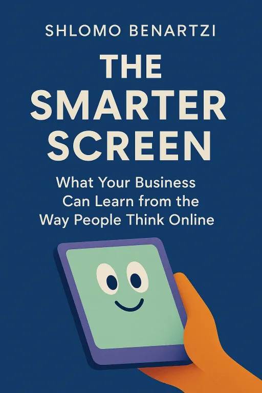
Mark: I recently learned that the average person spends less than fifteen seconds on a web article. Fifteen seconds! And honestly, Michelle, I think that's being generous for me. My attention span has been nuked. Michelle: You're not alone, Mark. And that's exactly the problem our book today tackles head-on. We're diving into The Smarter Screen by Shlomo Benartzi. Mark: Benartzi... isn't he the guy who worked with a Nobel Prize winner on that program to get people to save more for retirement? Michelle: The very same! He co-developed the 'Save More Tomorrow' program, a landmark in behavioral finance. So he's a master at using behavioral science to solve huge, real-world problems. And in this book, he turns his attention to what might be the biggest problem of our age: our relationship with our screens. Mark: Which, based on my fifteen-second limit, is a pretty broken relationship. Michelle: Exactly. Benartzi argues that we're not just distracted; the digital world is fundamentally changing how we think. And his big, optimistic idea is that we can design it to make us smarter, not just more scatterbrained. He starts by identifying the core of the problem, which he calls the 'mental screen.'
The Attention Crisis: Our Overloaded 'Mental Screen'
SECTION
Mark: The mental screen. Okay, that sounds like a term I should know. What is it? Michelle: It’s the perfect metaphor for our cognitive limits. Think about the screen you're looking at right now—your phone or computer. It's a physical screen, and it can display a virtually infinite amount of information. But our 'mental screen'—our working memory, our attention—is incredibly limited. It’s like we can only hold a few thoughts in our head at once. Benartzi says the fundamental challenge of the digital age is the massive, and growing, mismatch between our physical screens and our mental one. Mark: Huh. So my mental screen is like my brain has maybe eight tabs open, max, but the internet is trying to force-feed it a thousand? Michelle: That’s a great way to put it. And the consequences of that mismatch aren't just about feeling stressed or forgetting what you walked into a room for. Benartzi opens with some truly chilling examples. He tells the story of a drone strike in Afghanistan in 2010. Mark: Oh wow, okay. Michelle: The American drone operators were watching a live video feed from thousands of miles away in Nevada. They were trying to track a convoy they believed was carrying insurgents. But they weren't just watching the video. They were also monitoring radio chatter, getting instant messages from analysts, and toggling between different data streams. They were completely inundated with information. Mark: The firehose you mentioned. Michelle: Exactly. And in that flood of data, they missed the most important detail. The vehicles weren't filled with fighters. They were filled with civilians, including women and children. The operators gave the order to fire, and twenty-three innocent people were killed. An internal investigation later concluded that the analysts simply couldn't handle all the available information. They had all the data, but their mental screens were overloaded. Mark: Wow. That's... that's horrifying. To think that 'information overload' isn't just a buzzword for office workers, it can have these devastating, real-world consequences. Michelle: It puts it in a stark new light, doesn't it? And it happens in more common scenarios, too, just with financial consequences instead of fatal ones. He points to the launch of the US government's healthcare.gov website. It was meant to be this great tool for empowerment, giving people tons of choices for health insurance. Mark: I remember that launch. It was a bit of a mess, technically. Michelle: It was. But Benartzi looks past the technical glitches to the design flaw. In some counties, a single person would be presented with over 150 different health insurance plans. Each with its own premium, deductible, co-pay, and network. It was an impossible amount of information to process. Mark: My mental screen would just blue-screen. I'd probably just close the laptop and pretend I never saw it. Michelle: A lot of people did. But for those who pushed through, the results were disastrous. One study he cites found that the typical user chose a plan that was almost $900 more expensive per year than the optimal one for their needs. They were drowning in choices, so they just grabbed the first life raft they saw, which was often the wrong one. Mark: So we're not just bad at multitasking, we're actively making terrible financial decisions because of it. It’s like our brain's processing power is so consumed by just trying to remember the options that we don't have any left for actually judging the options. Michelle: You've just perfectly described a classic psychological experiment Benartzi mentions. Researchers asked people to remember a number. One group got a simple two-digit number. The other group got a complex seven-digit number. Then, as they walked down the hall to report the number, they were offered a snack: a healthy fruit salad or a rich slice of chocolate cake. Mark: Let me guess. The seven-digit group went for the cake. Michelle: Overwhelmingly. Their cognitive resources were so tied up holding that complex number in their mental screen that they didn't have the willpower left to make the healthy, long-term choice. They defaulted to the easy, impulsive one. That's what happens to us online every single day. We're all constantly trying to remember seven-digit numbers. Mark: Okay, so our brains are overwhelmed. That much is clear. But it feels like some websites and apps are designed to make it even worse. They're almost... too slick, too fast. It feels like they're designed to make us choose cake. Michelle: That is not an accident. And that brings us to the second, and maybe more unsettling, part of the book: the hidden persuaders built right into the design of our screens. It's not just about the amount of information, but the form it takes.
The Hidden Persuaders in Screen Design
SECTION
Mark: The form? You mean like the colors and fonts? Michelle: Exactly. Colors, fonts, layout, complexity. Benartzi has this great phrase: "function follows form." We usually think it's the other way around, that the look of something is just decoration. But online, the look and feel can fundamentally change how we perceive its function, its trustworthiness, and its value. Mark: I’m not sure I follow. How can a font make something more trustworthy? Michelle: It’s all about the speed of our judgment. He describes an experiment where people are shown a website for just 50 milliseconds. That's a twentieth of a second. It's so fast you can't consciously register what you saw. Mark: Right, it's just a flash. Michelle: Just a flash. And yet, when asked to rate the website's visual appeal, their rating at 50 milliseconds is almost identical to their rating when they're given five full seconds to study it. Our brains make an instantaneous, unconscious judgment about beauty. And that first impression is incredibly sticky. Mark: So we decide if we like something before we even know what it is. That explains a lot about modern dating apps. Michelle: He brings up Tinder as the perfect example! The entire platform is built on that 50-millisecond judgment. It's a firehose of faces, and you're making these rapid, visceral, aesthetic-based decisions. Swipe left, swipe right. You're not conducting a deep analysis of their bio; you're reacting to a picture. The screen's design encourages that fast, instinctive thinking. Mark: Okay, but isn't that just superficial? Judging a book, or a potential life partner, by its cover? Michelle: It feels that way, but the effect goes much deeper than just aesthetics. That snap judgment about beauty becomes a proxy for other qualities, like usability and trustworthiness. This is where it gets kind of scary. He cites a study by two researchers, Claudia Townsend and Suzanne Shu, that is just mind-blowing. Mark: Lay it on me. Michelle: They gave business students an annual corporate report to evaluate. Half the students got a report that was beautifully designed—great layout, nice fonts, clean graphics. The other half got the exact same factual information, the same numbers, but in a report that was ugly and poorly formatted. Then they asked the students to estimate what the company's stock was worth. Mark: Oh no. Don't tell me the pretty report made the company seem more valuable. Michelle: Not just more valuable. Doubly valuable. The students who got the ugly report valued the shares at about $162. The students who read the beautiful report valued the same company's shares at $327. Mark: Come on! That's insane. It's the same company! Michelle: It's the same data! But the beautiful design created a 'halo effect.' It made the content feel more credible, more professional, and more valuable. The form completely changed the perception of the function. We see a slick, beautiful website for a financial product, and our brain's shortcut is, "This looks professional, so it must be trustworthy." We're not even aware it's happening. Mark: Whoa. So beauty isn't just decoration, it's a powerful signal for trust and value. That's... kind of a terrifying thought when you consider how much of our lives, from banking to news, happens on screens. Michelle: It is. And it's not just beauty. It's layout, too. Benartzi talks about the "middle bias." Our eyes are naturally drawn to the center of a screen. It's a visual hotspot. He uses the game Battleship as an example. The most common guesses are always in the center of the grid, never the edges. Smart players hide their ships on the edges. Mark: That's so true! I always pick the middle toilet stall! Why do we do that? Michelle: It's just a cognitive shortcut! And retailers know this. An eye-tracking study on people choosing snacks showed that their eyes almost always fixate on the center of the screen first. And whichever snack was placed in the center was 60% more likely to be chosen, regardless of what it was or what the person's stated preference was. Mark: So they could put a broccoli floret in the middle of a screen of candy bars and I might actually choose the broccoli? Michelle: You just might! The screen location itself becomes a powerful, invisible nudge. And this is where Benartzi, the optimist, comes back in. He sees all these biases and shortcuts not just as ways we can be manipulated, but as levers we can pull to design a better digital world.
Building Smarter Screens
SECTION
Michelle: It is scary. But Benartzi is an optimist. He believes we can flip this and use design to make us smarter. And sometimes, the solution is surprisingly counter-intuitive. He introduces this wonderful concept called "desirable difficulty." Mark: Desirable difficulty? That sounds like an oxymoron. You're telling me that making a website harder to use is a good thing? That sounds like a recipe for losing all your customers. Michelle: In most cases, you'd be right. We want things to be easy. But Benartzi argues that in certain high-stakes situations, a little bit of friction, a little bit of difficulty, can be incredibly beneficial because it forces us to switch off autopilot and actually think. Mark: Okay, I'm skeptical. Give me an example. Michelle: The best one is the story of Uber's surge pricing. You remember the early days, right? A snowstorm would hit, you'd open the app, and suddenly a ride that was normally $20 was $150. People were furious. Mark: I remember the social media meltdowns. The #neveragain hashtags. Michelle: Exactly. Uber's problem was that people weren't consciously processing the surge warning. At first, they just had a little notification. People ignored it. Then they added a screen where you had to tap a button that said "I Agree to the Higher Fare." People just tapped it without thinking, like they were closing a pop-up ad. They were still getting hit with these massive, surprising bills and feeling cheated. Mark: Because their brain was on autopilot, just trying to get the car as fast as possible. Michelle: Precisely. So Uber introduced a dose of desirable difficulty. When the surge multiplier got really high, say over 2x, you couldn't just tap "I agree." The app forced you to physically type the multiplier into a box. So if the surge was 4.5 times the normal rate, you had to type "4.5" to confirm you understood. Mark: Wait, they deliberately made it harder to order a car? That sounds like terrible business! Michelle: It sounds crazy, right? But it worked. It wasn't about stopping people from getting a ride. It was about forcing a moment of cognitive reflection. The act of typing "4.5" broke the autopilot. It made the abstract concept of "surge pricing" concrete and forced the user to consciously consent to the high price. It built more long-term trust than a surprise $400 bill ever could. That's desirable difficulty in action. Mark: Huh. So a little bit of friction can be a good thing. It's like a digital speed bump for our brain. Michelle: That's the perfect analogy. And he has other tools, too. To fight choice overload, like with the healthcare website, he proposes using "choice tournaments." Instead of showing you 150 plans at once, the site would first ask you a few questions to categorize you—say, as a "Low Medical Use" person. That might eliminate 100 plans right away. Mark: Okay, that's a good start. Down to 50. Still too many. Michelle: Then, it would present the remaining options to you in rounds, like a tennis tournament. Here are eight plans. Pick your top four. Now, from those four, here are the detailed trade-offs. Pick your top two. Finally, here's the final match-up. By breaking the decision down, it makes it manageable and helps you find the actual best option, not just the first one that looks okay. Mark: It’s a Wimbledon for your health insurance. I like that. It's about designing a process, not just dumping a list. Michelle: Exactly. It's about building a "thinking architecture." And that's the big, hopeful takeaway of the book.
Synthesis & Takeaways
SECTION
Mark: So this whole time, we've been obsessed with making screens faster, slicker, and easier. The 'three-click rule' and all that. But Benartzi's saying the real goal should be to make them smarter—to build a 'thinking architecture' that works with our brain's limitations, not against them. Michelle: That's the core of it. He's not anti-technology. He's not saying we should go back to paper. He's saying we're at this incredible moment where we can merge psychology and technology to design digital environments that magnify our strengths and help us cope with our weaknesses. We can use these tools to make more prudent, more thoughtful choices. Mark: It's a powerful idea. It shifts the responsibility. It's not just on me, the user, to have more self-control. It's also on the designers to build more responsible, more humane digital spaces. Michelle: Exactly. And for all of us, the first step is just awareness. The next time a website feels overwhelmingly complex, or on the flip side, seductively simple and fast, just pause and ask yourself: what is this design making me think? Or maybe more importantly, what is it stopping me from thinking? Mark: That's a great question. And it's one we can all start asking immediately. We'd love to hear your own stories of being tricked or helped by screen design. Find us on our socials and share your experience. What's the best or worst piece of digital design you've encountered lately? Michelle: I can't wait to read those. It’s a conversation we all need to be having. Mark: Absolutely. This has been fascinating, Michelle. Michelle: This is Aibrary, signing off.
