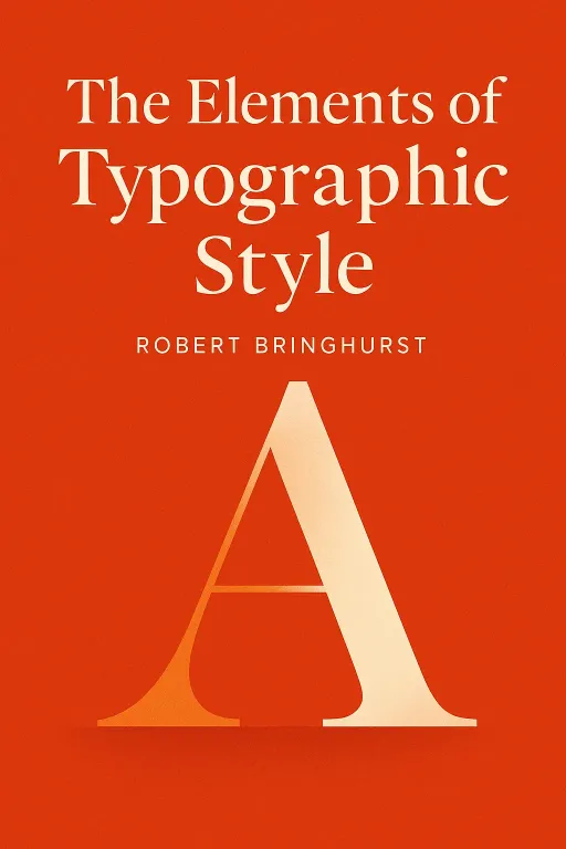
The Elements of Typographic Style
Introduction
Narrator: In 1770, a bill was introduced in the English Parliament with a peculiar aim. It sought to punish "women of whatever age, rank, profession, or degree" who used "scents, paints, cosmetic washes, artificial teeth, false hair, Spanish wool, iron stays, hoops, [or] high heeled shoes" to seduce any of His Majesty's subjects into marriage. Such a union, obtained through artificial means, was to be declared null and void, the woman treated as a witch. The law viewed these enhancements not as adornments, but as acts of deception, a way to impose upon and betray the unsuspecting.
This historical curiosity about authenticity versus artifice serves as a surprising but fitting entry point into the world of typography. For what is typography if not the clothing of our words? Does it exist to decorate, to disguise, or to reveal? In his seminal work, The Elements of Typographic Style, Robert Bringhurst argues for the latter. He posits that good typography, far from being the "cosmetic wash" or "iron stays" applied to empty prose, is an act of profound respect. It is a discipline dedicated not to deception, but to honoring and clarifying the content it serves, making the written word clearer, more resonant, and more durable.
Typography Exists to Honor Content
Key Insight 1
Narrator: The foundational principle of Bringhurst's philosophy is that typography must serve the text. Its primary role is to clarify, honor, and share the meaning of the words. While it must first attract the reader's attention, it should then gracefully cede that attention to the content itself. Bringhurst describes this ideal state as a "statuesque transparency," where the form is beautiful and well-constructed but does not distract from the message it carries.
This is a direct rebuke to the idea of typography as mere decoration. Bringhurst draws a sharp parallel to the 1770 English bill against cosmetic deception. Just as the bill condemned women for using artifice to trick men into marriage, Bringhurst condemns the typographer who applies "scents, paints and iron stays to empty prose." The goal is not to mask a text's flaws with flashy fonts but to give well-chosen words the well-chosen letters they deserve. This requires affection, intelligence, and skill. Typography is an act of interpretation, much like a musician performing a score. It can be done with insight, revealing the text's inner logic, or with obtuseness, obscuring its meaning. The first and most crucial step in this process is simple but often overlooked: read the text before designing it.
The Page is a Weaver's Loom of Rhythm and Proportion
Key Insight 2
Narrator: A well-set page of text has a texture, an evenness of "color" that is pleasing to the eye and easy to read. This visual rhythm is not accidental; it is woven from the horizontal and vertical movements of type. The horizontal rhythm is controlled by the measure, or line length, and the spacing between letters and words. Bringhurst suggests an ideal line length of 45 to 75 characters for a single column, as this allows the eye to travel comfortably from the end of one line to the beginning of the next.
When justifying text—making both the left and right margins align—typographers often face a dilemma. To achieve the straight edge, they must stretch or squeeze the spaces between words, which can create distracting "rivers" of white space or an uneven texture. Bringhurst tells the story of the "presumptuous typewriter," an early machine that tried to justify text but did so poorly. The result was often ugly and hard to read. In such cases, he argues, a ragged right margin is far preferable, as it allows for consistent and natural word spacing. This principle is underscored by Frederic Goudy's famous quip, "A man who would letterspace lower case would steal sheep," a stern warning against disrupting the natural fit of letters for stylistic whims.
Harmony and Counterpoint are Achieved Through Deliberate Choice
Key Insight 3
Narrator: Creating a harmonious page is an exercise in restraint. Bringhurst advises, "Don't compose without a scale," comparing the selection of type sizes to a musical scale. Using a limited, related set of sizes creates a more coherent and pleasing whole. This principle extends to every element on the page, including numerals.
A fascinating historical story illustrates this point: the development of titling figures. For centuries, text figures (also called old-style figures) with varying heights and ascenders and descenders were the norm, as they blended seamlessly with lowercase letters. However, in the 18th century, as commerce grew, shopkeepers desired numerals that stood out. The British punchcutter Richard Austin designed a set of uniform-height lining figures in 1788. These were later stretched to full capital height and became the standard for business and advertising. Bringhurst argues for using the right tool for the job: text figures for running text, and titling figures only when setting with full capitals. This deliberate choice, like choosing the right type size or understanding the difference between a true italic and a simple sloped roman, is a mark of a thoughtful typographer.
The Architecture of the Page Guides the Reader's Journey
Key Insight 4
Narrator: The page is not a neutral container; it is a designed space with its own architecture. The title page is the reader's first encounter with this space, and Bringhurst insists that "poise is more important than size." Poise, he explains, is made of white space. A few well-placed lines can have more dignity and impact than a title shouting in enormous type.
A classic example of this principle comes from designer Bradbury Thompson. For one magazine spread, he set the title, "BOOM," in gigantic letters that filled both pages. It seemed to be the very definition of overwhelming. Yet, he placed the article's text in a narrow column nestled inside the stem of the giant "B." As Bringhurst describes it, "The title has swallowed the text—yet the text has been reborn, alive and talkative, like Jonah from the whale." This illustrates that prominence is not about sheer size but about intelligent integration. Every structural element—from headings and subheads to footnotes and tables—must be considered part of this architecture, guiding the reader's eye and revealing the logical structure of the text.
Choosing Type is an Act of Historical and Cultural Interpretation
Key Insight 5
Narrator: A typeface is not a neutral vessel. Every font carries historical echoes and cultural associations. Choosing a typeface, therefore, is not a simple matter of taste but a critical act of interpretation. Bringhurst cautions against anachronisms, like setting a text from the 18th century in a font designed in the 20th century, unless there is a compelling reason. A typeface that truly suits a historical text often has its own clear historical content.
To illustrate what not to do, he tells the hypothetical story of a designer finding a typeface called "Bicycle" to use for a book on bicycle racing. This font has spokes in the letter 'O' and handlebars for the 'T.' While thematically cute, it's a gimmick that burdens the text with masquerade and hinders long-distance reading. The goal is to choose a face whose character is in harmony with the text, not one that literally illustrates it. This requires knowledge of typographic history, from the Renaissance forms of Garamond to the Baroque letters of Caslon, and an understanding that every alphabet is a reflection of a culture.
The Page Itself is a Proportionate and Living Space
Key Insight 6
Narrator: The shape of the page and the text block upon it are not arbitrary. For centuries, typographers and artists have relied on organic and mathematical proportions to create harmony. Bringhurst explores how these principles, from musical intervals to geometric ratios, form the "thoroughbass of the book." The most famous of these is the golden section, φ (phi), a ratio of approximately 1:1.618.
This ratio is famously derived from the Fibonacci sequence, which originated from a 13th-century thought experiment about breeding rabbits. The sequence—0, 1, 1, 2, 3, 5, 8, 13...—appears throughout the natural world, in the spirals of sunflowers and the shells of snails. In typography, it provides a powerful tool for creating harmonious proportions. For example, Penguin Classics paperbacks have long been manufactured to a size of 111 x 180 mm, a near-perfect embodiment of the golden section. This ratio can be used to determine not only the page size but also the relationship between margins, the size of the text block, and even the scale of type sizes used for headings and text.
The Digital Age Demands Both Technical Mastery and Respect for Tradition
Key Insight 7
Narrator: While the principles of typography are timeless, the tools are constantly changing. The digital revolution has brought immense power to typographers, but also new challenges. Bringhurst emphasizes that "the skill of practitioners matters more than the tools," but poor tools can constrain that skill. The development of Unicode, for instance, expanded the character set from a few hundred to over 100,000, finally allowing for the peaceful coexistence of the world's writing systems on a single page.
However, digital fonts are not perfect. Bringhurst notes that many digital revivals of classic faces contain flaws—poorly drawn symbols, incorrect spacing, or flawed kerning tables. He tells of discovering a recurring error in many of Monotype's digital fonts where an excessive space was added after the letter 'f' when it was followed by a word space. This requires the typographer to "groom the font"—to edit and refine it, correcting errors and tuning it like a piano. This act of grooming connects the modern typographer directly to the craft's long tradition, maintaining the system by embracing the future while staying in touch with the past.
Conclusion
Narrator: The single most important takeaway from The Elements of Typographic Style is that typography is a practice of intellectual and aesthetic empathy. It is not about applying rules or decorating a page, but about interpreting a text and creating a form that honors its content and serves its reader. Bringhurst elevates typography from a technical trade to a humanistic art, one that requires historical knowledge, meticulous attention to detail, and a profound respect for language.
The book's ultimate challenge is to change how we see the written world. After reading it, it becomes impossible to view a page of text as a simple object. Instead, you begin to see it as a performance. You start to ask not just what is being said, but how it is being said. Is the voice clear or muddled? Is the rhythm graceful or clumsy? Is the form honoring the words, or is it merely a set of "iron stays" holding up empty prose? Bringhurst gives us the language and the vision to not only ask these questions but to understand the answers.
