Designing to Disappear
12 minGolden Hook & Introduction
SECTION
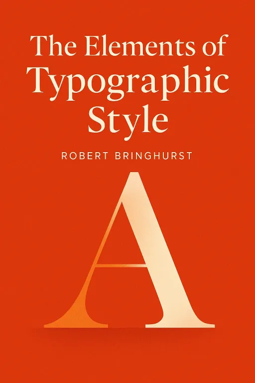
Rachel: The most beautiful font you've ever read was probably invisible. The most elegant page layout? You likely don't remember it. Today, we’re exploring an art form where the ultimate goal is to disappear, and why that makes it more powerful, not less. Justine: That is such a wild thought. Because everything in our world is designed to be noticed, to be loud, to grab you. The idea of an art form that succeeds by becoming invisible feels completely backwards. Rachel: It’s a total paradox. And it’s the central philosophy of a book that is basically the bible for designers, The Elements of Typographic Style by Robert Bringhurst. It's a book that has been massively influential since it first came out in the early 90s, right when digital design was exploding. Justine: And it's wild that the author, Bringhurst, isn't just a designer—he's a renowned poet and cultural historian. It explains why the book reads less like a technical manual and more like a philosophical text. It’s got this weight to it. Rachel: Exactly. He treats letters with the same reverence a poet treats words. And his first, most fundamental principle is this idea he calls 'statuesque transparency'. Justine: 'Statuesque transparency.' Okay, that sounds both beautiful and completely impenetrable. What on earth does it mean?
Typography as Statuesque Transparency: The Soul of the Craft
SECTION
Rachel: It means that good typography should be like a perfectly clean, crystal goblet holding a fine wine. Its job is to reveal the wine, to present it beautifully, but not to call attention to itself. The goblet is there to honor the wine. In the same way, Bringhurst says, "Typography exists to honor content." Justine: I like that analogy. So the typography is the goblet, the text is the wine. You want to taste the wine, not the glass. Rachel: Precisely. It should attract your eye for a moment, just long enough for you to think, "this looks inviting," and then it should completely vanish, letting you fall into the words. It achieves a kind of invisibility. Justine: But how does that square with the world we live in? I mean, think about the internet. It's all about clickbait headlines in giant, screaming fonts. Pop-up ads. Flashing buttons. Isn't all design today about being as loud and distracting as possible? Rachel: Bringhurst has a fantastic historical story for that. He talks about a bill proposed in the English Parliament in 1770. This bill was aimed at women who used, and I'm quoting, "scents, paints, cosmetic washes, artificial teeth, false hair, iron stays, hoops, and high heeled shoes" to "seduce and betray into matrimony" the King's subjects. Justine: Whoa. So, makeup and corsets were basically a form of witchcraft? That's amazing. Rachel: It was seen as a form of deception! And Bringhurst uses this as a perfect metaphor for bad typography. He says a typographer should not apply "scents, paints and iron stays to empty prose." The goal isn't to trick the reader or dress up bad content. The goal is honesty. The typography should reveal the true character of the text, not disguise it. Justine: Okay, but that's a lovely, romantic idea. In 2024, isn't all design, especially on the web, about screaming for attention? Is Bringhurst's philosophy even relevant, or is it just a beautiful, outdated ideal? I know some critics have called his ideas a bit medievalist, a little too focused on the perfect, hand-crafted book page. Rachel: I think that's a fair challenge. But I believe he’d argue we're confusing two different goals. The screaming headline and the flashing button are designed for a single action: the click. They are about immediate, fleeting attention. Bringhurst's philosophy is about sustained attention. It's about creating an experience so seamless and comfortable that someone will stay and read for ten minutes, or an hour. Justine: Ah, so it's the difference between a one-night stand and a long-term relationship with the text. Rachel: That's a perfect way to put it! The clickbait gets the initial interaction, but the 'statuesque transparency' is what builds trust and allows for deep engagement. It’s what makes you forget you're reading on a screen or a page and just lets you get lost in the story. It’s a quiet power, but it’s the one that lasts. Justine: Okay, I can see the 'why.' I'm sold on the philosophy. But how do you actually do that? It still feels so abstract. How do you physically arrange letters on a page to make them 'transparent'?
The Silent Music of the Page: Rhythm, Proportion, and White Space
SECTION
Rachel: This is where the poet in Bringhurst really comes out. He describes it as creating a kind of silent music on the page. He says, "Typography is to literature as musical performance is to composition: an essential act of interpretation." The typographer isn't just a technician; they're a performer. Justine: A performer? What are their instruments? Rachel: There are many, but let's focus on two of the most important ones: horizontal motion and vertical motion. Think of it like the melody and the rhythm of a song. Justine: Okay, horizontal and vertical motion. Break that down for me. Rachel: Horizontal motion is about how your eye travels across a line of text. The main tool here is the 'measure,' which is just a fancy word for the length of the line. Bringhurst points out that for comfortable reading in a single column, the ideal line length is about 66 characters. Justine: That specific? Why 66? Rachel: If a line is too short, your eye is constantly jumping back and forth, which is jerky and tiring. It breaks the flow. But if a line is too long, your eye gets lost on the return journey. You finish one line and then struggle to find the beginning of the next one. 66 characters is the sweet spot where the eye can travel smoothly and find its way back easily. It creates a comfortable, flowing rhythm. Justine: That makes so much sense. I've definitely abandoned articles online because the text was in one giant, wide block that felt impossible to read. I just didn't have the language for why. So that's horizontal music. What about vertical? Rachel: Vertical motion is controlled by 'leading'—the amount of space between the lines of text. It's the page's breathing room. If the lines are too close together, the text feels dense and suffocating. It's claustrophobic. If they're too far apart, the lines seem to float away from each other, and the connection between them is lost. The paragraph loses its cohesion. Justine: It's about finding that perfect balance so the whole block of text feels like a single, unified texture. Rachel: Exactly. And this is where we get to one of the most common typographic arguments in history: the space after a sentence. Bringhurst tells this great little story about how the habit of putting two spaces after a period is a leftover from the age of the typewriter. Justine: Oh my god, I still have fights about the two-spaces-after-a-period rule! My parents swear by it. Rachel: Well, typewriters have what's called 'monospaced' fonts, meaning every character, whether it's a tiny 'i' or a wide 'm', takes up the same amount of horizontal space. To create a clear visual break for a new sentence, typists were taught to hit the spacebar twice. But in professional typesetting, where letters have proportional spacing, that extra space is not only unnecessary, it's disruptive. It creates what typographers call "rivers" of white space that flow down the page and break up that even, beautiful texture we were talking about. Justine: Wow. So it's not just a "rule." It's a conscious decision about the 'color' and 'texture' of the page. You're right, that makes it feel less like a grammar-school argument and more like an artistic choice. It's about maintaining the music. Rachel: It is! Every tiny detail, from the line length to the space after a period, is a note in the composition. And that artistry goes even deeper. It's not just about the spacing around the letters; it's about the very soul of the letters themselves. Bringhurst argues that every font has a voice, a personality, a cultural DNA.
Letters as Living History: The Cultural DNA of a Font
SECTION
Justine: A cultural DNA? That sounds fascinating. You mean like some fonts feel 'serious' and others feel 'playful'? Rachel: It's much deeper than that. He argues that choosing a typeface isn't a neutral act. It's not like picking a color. It's like casting an actor for a historical film. Each font carries the history of its creation within its very strokes. Justine: Okay, you have to give me an example. How can a letter 'A' have a history? Rachel: Let's talk about numbers. Today, most of the numbers we see are what are called 'lining figures.' They're all the same height, and they sit squarely on the baseline, like capital letters. Think of the numbers on a credit card or a digital clock. 1, 2, 3, 4, 5. Justine: Right. Standard numbers. Rachel: But for centuries, the numbers used in running text were 'text figures,' or 'old-style figures.' These numbers have ascenders and descenders, just like lowercase letters. The '3' and '4' dip below the line, the '6' and '8' rise above. They are designed to blend in harmoniously with the rhythm of lowercase text. Justine: I think I've seen those in fancy books! They look more elegant, almost calligraphic. Rachel: They are! And they were the standard for hundreds of years. So what happened? The Industrial Revolution and the rise of modern commerce. Shopkeepers and advertisers in the 19th century didn't want elegant, quiet numbers that blended in. They wanted big, loud, uniform numbers for their price lists and ledgers. They wanted numbers that stood up and shouted. So, lining figures became the norm. Justine: Hold on. So you're saying that the very shape of the number '3' on a spreadsheet can tell a story about the rise of capitalism? Rachel: That's exactly what Bringhurst is saying! The choice between text figures and lining figures is a choice between two different historical voices. One is the quiet, scholarly voice of the Renaissance book. The other is the loud, assertive voice of the modern marketplace. Neither is 'wrong,' but they are not interchangeable. They carry their history with them. Justine: That is completely insane. It makes you look at every street sign, every menu, every price tag completely differently. What other secret histories are hiding in plain sight? Rachel: Oh, they're everywhere! The ampersand (&) is a beautiful one. It's actually a ligature, a combination of the letters 'e' and 't', from the Latin word et, meaning 'and'. You can still see the E and the T fused together in many versions of it. Or the fact that italic wasn't originally invented for emphasis. It was created in 16th-century Venice as a separate, condensed script to save space and money on paper when printing pocket-sized editions of the classics. Justine: It was a business decision! Not a stylistic one. That's incredible. These are not just shapes; they're artifacts. They're fossils of history embedded in our everyday lives.
Synthesis & Takeaways
SECTION
Rachel: Exactly. And that's the ultimate takeaway from Bringhurst. He teaches you to see the world of text not as a flat, utilitarian surface, but as a rich, three-dimensional landscape teeming with history, music, and meaning. Justine: So, it's not just about making things pretty. It's a philosophy of service to the reader, a craft of creating silent music, and an act of cultural awareness. It transforms something we see every day from a utility into an art form. Rachel: It really does. He writes that the goal is to "induce a state of energetic repose, which is the ideal condition for reading." It’s about creating a space of such profound harmony and respect for the text that the reader can simply enter and be at peace. Justine: A state of energetic repose. I love that. It’s what we all crave when we sit down with a good book. Rachel: And it leaves us with a powerful question. In a world that's constantly shouting, what is the value of a quiet, well-crafted voice? Bringhurst's answer is that it's the only voice that truly endures. Justine: It makes you want to go out and just look at things differently. We'd love to hear from our listeners—what's a piece of typography, good or bad, that you've noticed recently? A beautiful menu, a terrible website? Share it with us on our socials. We want to see the world through your newly opened typographic eyes. Rachel: This is Aibrary, signing off.
