Stop Designing in a Vacuum: The Guide to Customer-Centric Innovation
Golden Hook & Introduction
SECTION
Nova: Here's a quick challenge for everyone listening: picture the last time you utterly failed at using a simple everyday object. Maybe it was a confusing door, a tricky coffee machine, or a remote control with too many buttons. Got it? Now, what if I told you that wasn't your fault at all?
Atlas: Oh, I love this. I know that feeling of battling a door that's clearly marked "push" but demands a pull. It's like the object itself is gaslighting you!
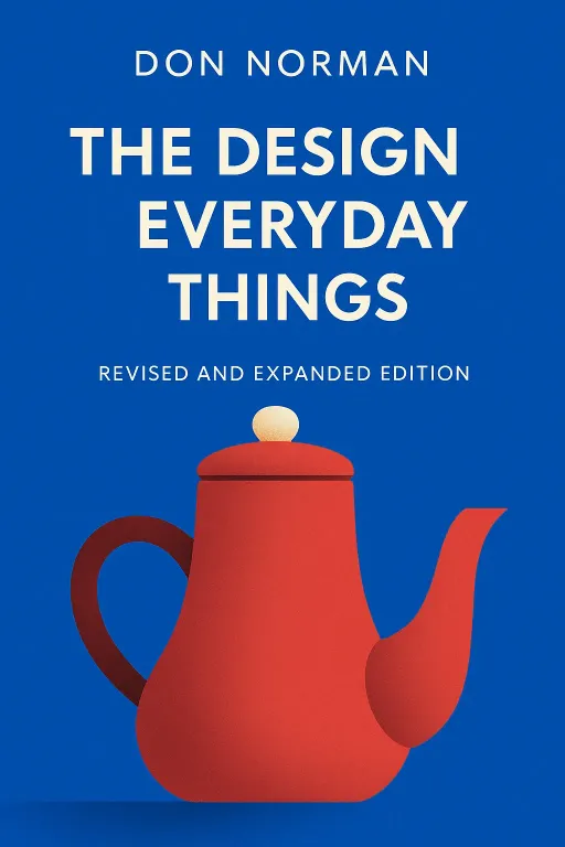
Nova: Exactly! And that frustration, that moment of feeling a bit foolish, is precisely what we're tackling today. We're diving into the world of customer-centric innovation, specifically through the lens of two foundational texts: "The Design of Everyday Things" by Don Norman and "Don't Make Me Think, Revisited" by Steve Krug.
Atlas: Ah, Don Norman. The man who made us all question every single door handle. He’s often credited with coining the term 'user experience' itself, even though his background was in cognitive science. It's fascinating how a cognitive psychologist became such a design guru.
Nova: Absolutely. Norman's work, especially "The Design of Everyday Things," is iconic. It's been widely acclaimed as a cornerstone text for anyone interested in product design, and its principles are still taught in design schools globally. It's one of those books that changes how you see the world, revealing the invisible hand of good and bad design everywhere.
Atlas: I can see how that would be. And Krug's book, "Don't Make Me Think," is the web design bible for many. It's praised for its no-nonsense, practical advice, and it's been a bestseller for years because it just... makes sense. It's almost a companion piece to Norman, but specifically for the digital realm.
Nova: They are the perfect pairing because they fundamentally solve the problem of user friction. They provide principles for creating intuitive, user-friendly designs that drive engagement and satisfaction. And for our listeners, especially those strategic designers and builders, understanding these principles isn't just about aesthetics; it's about impact, growth, and retention.
The Intuitive Design Imperative: Affordances, Signifiers, and User Friction
SECTION
Nova: So, let's kick things off with Don Norman and his concept of 'affordances.' It's one of those terms that sounds academic but is incredibly powerful. An affordance is essentially a property of an object that suggests how it can be used. Think of a door with a flat plate instead of a handle. It affords pushing.
Atlas: Okay, so you’re saying the object itself communicates its function, almost without words? Like a button affords pressing, or a knob affords turning?
Nova: Precisely! Good design makes these affordances obvious. The object tells you what to do. But Norman goes a step further with 'signifiers.' Signifiers are any mark or sound that communicates the affordance. So, the flat plate on the door is the affordance, but the small 'PUSH' label or an arrow is the signifier, clarifying the intended action.
Atlas: Oh, I see. So the flat plate pushing, but the word 'PUSH' it. Without that signifier, I might still try to pull, or even kick it if I'm having a bad day.
Nova: Exactly! And this is where user friction creeps in. When there's a mismatch between the affordance and the signifier, or when either is unclear, that's when we get confused, frustrated, and ultimately, we stop using the product. Norman argues that good design makes experiences error-tolerant and delightful, reducing that frustration. It's about designing products that feel natural, almost like an extension of our own bodies.
Atlas: That’s a great way to put it. I’m curious, can you give an example of a product that perfectly nails this, where the affordances and signifiers just sing together?
Nova: Absolutely. Think about a well-designed water faucet with two distinct handles, one red for hot, one blue for cold. The handles afford turning, and their color signifies their function. It’s so intuitive you don't even think about it. Now, contrast that with a single-lever faucet that you have to push, pull, twist, and pray to get the right temperature and flow. That’s a design failure because the affordances and signifiers are ambiguous, leading to user frustration. The goal is to make the user feel smart, not dumb.
Atlas: That makes sense. I imagine a lot of our listeners who are building digital products would relate this to a button that looks clickable but isn't, or a menu item that's labeled cryptically. It's that moment where you pause and think, "What am I supposed to do here?"
Nova: And that pause, that moment of cognitive friction, is a killer for user retention. Norman's insights teach us that design isn't just about aesthetics; it's about psychology. It's about understanding how the human mind perceives and interacts with the world, and then crafting experiences that naturally align with those perceptions. It's almost like the product is having a silent conversation with the user, guiding them seamlessly.
Atlas: So, it's about anticipating the user's mental model, right? How they expect things to work based on their past experiences, and then designing to meet or even subtly guide that expectation.
Nova: Precisely. And for anyone leading a team or building a product, this means moving beyond just making things look good. It means deeply understanding the user's journey, observing their behaviors, and designing not just for functionality, but for instinct. It’s about creating an experience that feels so right, so natural, that the user doesn’t even realize they’re interacting with a meticulously crafted system. They just it.
Simplicity as the Ultimate Sophistication: Minimizing Cognitive Load for Maximum Impact
SECTION
Nova: And that naturally leads us to the second key idea we need to talk about, which often acts as a counterpoint to what we just discussed, but truly complements it: Steve Krug's "Don't Make Me Think." While Norman gives us the foundational language of intuitive design, Krug gives us the urgent, practical mandate for the digital age.
Atlas: Okay, so if Norman is about the 'how' of intuitive interaction, Krug is about the 'why' of simplifying it, especially online?
Nova: Exactly. Krug's central tenet is radical simplicity in web and app design. He famously says that users don't read manuals; they scan and muddle through. The less thinking required, the more likely they are to stay and convert. He simplifies the entire user experience philosophy into one clear, actionable principle: "Don't make me think."
Atlas: That's a powerful and direct message. It’s almost a challenge to every designer out there to strip away every ounce of unnecessary cognitive load. But isn't there a risk that by simplifying too much, you might lose some functionality or depth?
Nova: That's the tension, and it's where the art comes in. Krug isn't advocating for dumbing down; he's advocating for clarity. He argues that every time a user has to pause, even for a moment, to figure out how something works, you're losing them. They don't want to solve puzzles; they want to accomplish tasks. For our strategic builders, this directly impacts conversion rates, user retention, and ultimately, product growth.
Atlas: So basically you’re saying, if a user lands on a page or opens an app and has to ask themselves "Where do I click?" or "What does this button do?", that's a failure of design according to Krug.
Nova: Absolutely. Think about an e-commerce checkout process. If there are too many fields, confusing labels, or unclear next steps, users abandon their carts. Krug would say, simplify the form, use clear labels, and make the 'Buy Now' button impossible to miss. It's about reducing friction points to zero.
Atlas: That makes me wonder, how does this apply to something like a complex enterprise software, where the functionality inherently deep? You can't just remove everything, right?
Nova: That’s a brilliant question, and it’s where Krug’s insights really shine. It's not about removing functionality, but about making complex functionality. It means designing clear navigation, using familiar conventions, and providing just enough information at each step so the user can 'muddle through' without needing a tutorial. It’s about progressive disclosure – showing users only what they need, when they need it.
Atlas: Like when you sign up for a new service, they don't hit you with all the advanced settings at once. They just get you to the core value, and then gradually introduce more features.
Nova: Exactly. That's Krug in action. Another key insight from Krug is the idea of 'satisficing' – users don't optimize, they satisfice. They don't look for the absolute best solution; they look for the first reasonable solution. So, if your design makes the first reasonable solution immediately obvious, you've won.
Atlas: That’s a really counterintuitive idea for a lot of designers who might be tempted to showcase every single feature. It’s saying, don't try to impress them with complexity; impress them with ease.
Nova: And that ease translates directly into impact. For anyone aiming to grow their product and connect with their audience, this means ruthless editing of your user flows, constant testing with real users, and an unwavering commitment to clarity over cleverness. It's about designing for how people behave, not how you wish they would.
Synthesis & Takeaways
SECTION
Nova: So, bringing Norman and Krug together, we see a powerful synergy. Norman gives us the fundamental grammar of intuitive design with affordances and signifiers, teaching us how objects communicate. Krug then gives us the imperative to make that communication as effortless as possible, especially in the fast-paced digital world.
Atlas: It’s like Norman teaches us how to speak the language of design, and Krug teaches us how to speak it without mumbling or using overly complicated sentences. The core message is that design isn't just about making things look good; it's about making them intuitively and effortlessly for the human mind.
Nova: Precisely. And the cold, hard fact is, even the most brilliant graphic design can fall short if it doesn't align with how real users think and behave. To achieve true product growth and user retention, your designs must instinctively serve the user's needs, often before they even realize those needs themselves. These two thinkers provide the playbook for that.
Atlas: That’s actually really inspiring. It frames design not as some esoteric art form, but as a strategic superpower for anyone wanting to build something impactful. It’s about empathy, really.
Nova: It absolutely is. And a tiny step our listeners can take right now, inspired by Krug, is to conduct a 5-second test on their current product's onboarding flow with a new user. Does it immediately communicate its purpose without explanation? If not, you have your starting point for improvement.
Atlas: That's such a practical, actionable insight. It’s a direct application of not making users think, and it can reveal so much. It's about building for the long term, connecting with your audience on a deeper level by respecting their cognitive energy.
Nova: It truly is. The power of customer-centric innovation lies in this deep understanding, ensuring that every design choice, every interaction, reduces friction and enhances satisfaction. It’s about building a bridge, not a barrier.
Atlas: Well said, Nova. This has been a masterclass in why good design is often invisible, and why that invisibility is its greatest strength.
Nova: This is Aibrary. Congratulations on your growth!