

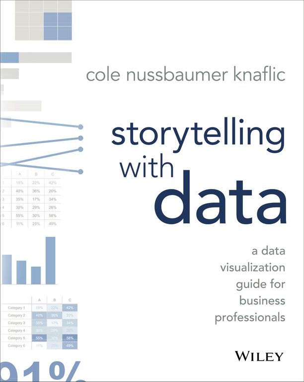
Storytelling with Data
A Data Visualization Guide for Business Professionals
Introduction: Escaping the Data Dump
Introduction: Escaping the Data Dump
Nova: Welcome back to The Insight Engine, the show where we turn complex information into clear, actionable knowledge. Today, we are diving deep into a book that has fundamentally changed how millions of professionals look at spreadsheets and slides: Cole Nussbaumer Knaflic’s "Storytelling with Data."
Nova: : That title alone is a promise, isn't it, Nova? Because let's be honest, most of us have sat through presentations that felt less like a story and more like being trapped in a spreadsheet that suddenly gained the ability to speak.
Nova: Exactly! Knaflic calls it "Death by PowerPoint," but it's really "Death by Data Dump." The core premise is that we are drowning in data, but starving for insight. We show the data, but we forget the narrative. Knaflic argues that if your audience has to spend more than a few seconds figuring out what your chart means, you’ve already lost them.
Nova: : So, this isn't just about making pretty charts? I’ve seen plenty of colorful, slick-looking dashboards that tell me absolutely nothing useful.
Nova: That is the crucial distinction. This book is not a design manual; it’s a communication guide. Knaflic, who built this methodology at Google, insists that the most critical step happens before you even open Excel or Tableau. It starts with understanding your context and defining your core message. It’s about being clear on your intent.
Nova: : So, the first step isn't choosing a bar chart or a pie chart, it’s deciding what I actually want the audience to or after seeing this data?
Nova: Precisely. It’s a complete mindset shift. We’re moving from being a data to being a data. And to understand how she guides that shift, we need to break down her framework. We're going to explore the power of subtraction, the art of visual choice, and how to build an unavoidable narrative arc. Ready to simplify?
Nova: : Absolutely. I’m ready to declutter my mental hard drive. Let's start with that foundational shift.
Key Insight 1: Understanding the Audience and Defining the Core Message
The Mindset Shift: Context Before Chart
Nova: Knaflic outlines a six-step process, but the first one, Step One, is all about context. She stresses that you must invest time upfront to consider who you are talking to and what your single, most important takeaway is. If you can’t summarize your entire presentation in one sentence, you don't have a story yet.
Nova: : That feels like a huge hurdle for analysts. We’re trained to show —all the variables, all the caveats. We fear leaving out that one piece of data that might be important to someone else in the room.
Nova: That fear is the enemy of clarity. Knaflic says that fear leads to charts that are comprehensive but completely ineffective. Think about it: if you are presenting to an executive team, they don't need to see the raw data that led you to the conclusion. They need the conclusion, supported by the most impactful visual evidence. They need the 'so what' immediately.
Nova: : So, if I’m presenting sales figures, the context isn't just 'Here are Q3 sales.' The context is 'We need to decide whether to greenlight the new marketing campaign based on Q3 performance, which shows a 15% dip in the Western region.' That's a story hook.
Nova: Perfect analogy. That second version immediately sets the stakes. Knaflic emphasizes that your core message should be declarative. It shouldn't be a question or a vague statement. It should be a statement of fact derived from the data, leading to an action. For instance, instead of 'Sales are down,' it becomes 'The Western region's 15% sales drop is driven by product X, requiring immediate inventory reallocation.'
Nova: : That’s powerful because it forces accountability. It moves the conversation from 'What does this chart show?' to 'What are we going to do about this?' I read that she even suggests that the most critical lesson she teaches sometimes has nothing to do with data at all. What was that about?
Nova: That’s a fascinating point she makes. It relates to the audience's existing knowledge and biases. If you know your audience is skeptical of the data source, you might need to dedicate slide real estate to establishing credibility first. If they are already convinced of the problem, you can jump straight to the solution. The context isn't just the data; it’s the receiving the data. It’s about empathy in analysis.
Nova: : It sounds like she’s advocating for a narrative arc even within a single slide. You need a beginning—the context—a middle—the evidence—and an end—the call to action.
Nova: Exactly. And once you have that clear, single-minded purpose, you can move to the next step, which is where the real visual magic—or the real visual disaster—happens: choosing the right display. But before we choose what to put in, we must decide what to take out. And that brings us to the art of subtraction.
Key Insight 2: Eliminating Clutter and Directing Focus
The Art of Subtraction: Decluttering for Impact
Nova: This is where Knaflic’s work really shines for visual designers and analysts alike. She dedicates significant space to the concept of decluttering. The goal is to maximize the data-to-ink ratio, a concept borrowed from Edward Tufte, but applied with a storytelling lens.
Nova: : I always thought more gridlines meant more precision. I’d put in every tick mark, every label, just in case someone needed that granular detail. What does Knaflic say we should be stripping away?
Nova: She gives us clear targets. First, get rid of unnecessary gridlines. If you have data labels, you often don't need heavy gridlines, because the labels provide the precise value. Second, remove excessive color variation. If you have ten categories, but only two are important to your story, why color all ten the same muted blue? Use color strategically to highlight the hero data points.
Nova: : That’s where the 'Focus' step comes in, right? It’s not just about removing noise; it’s about amplifying the signal. I remember seeing one of her 'before and after' examples where the 'before' chart was a standard Excel bar chart—gray, busy, with a redundant legend.
Nova: That's the classic offender! In the 'after,' she often removes the border entirely, lightens the gridlines to near invisibility, and then uses a bold, contrasting color—maybe a deep blue or orange—on the one or two bars that matter. The rest of the bars might be a light gray. The audience’s eye is instantly drawn to the highlighted element. It’s like putting a spotlight on the key finding.
Nova: : It’s almost counterintuitive. We think we need to present the whole picture, but Knaflic is saying that by most of the picture, you actually make the important part clearer. It’s the visual equivalent of whispering the key line in a quiet room.
Nova: Precisely. And another technique she champions is using text directly on the chart, often as a title or annotation, to state the conclusion. Instead of a generic title like 'Revenue by Quarter,' the title becomes 'Q4 Revenue Missed Target by 12%.' This is a massive step in eliminating clutter because it removes the need for the audience to perform the calculation or draw the inference themselves.
Nova: : So, the title is no longer a label; it's the headline of the story. If we look at her 'Before & After' case studies, how dramatic is the change in cognitive load for the viewer?
Nova: The transformation is often staggering. In one common example involving a line chart showing trends over time, the 'before' version might have five different colored lines, a busy background, and a separate legend box. The 'after' version might isolate just one line—the one showing the critical trend—and use annotations to point out specific events that caused spikes or dips. The cognitive load drops from 'What am I looking at?' to 'Oh, I see exactly what happened there and why it matters.'
Nova: : And this ties back to Step 2: Choose an Effective Visual Display. If you declutter a bad chart, it’s still a bad chart. You have to select the right visual, and declutter it.
Nova: Absolutely. Decluttering is the polish, but the foundation is choosing the right chart type to represent your relationship between variables. If you’re showing comparison, use bars. If you’re showing composition, use stacked bars or tree maps, not pie charts unless you have very few slices. The wrong chart type, no matter how clean, will fail to deliver the 'aha' moment.
Key Insight 3: Selecting the Appropriate Chart Type
Choosing Your Weapon: Matching Visuals to the Message
Nova: Let's move into Step 2: Choose an Effective Visual Display. This is where many people default to the familiar—the pie chart or the standard column chart—even when they aren't the best tool for the job. Knaflic provides a clear hierarchy based on the of story you need to tell.
Nova: : I always struggle with pie charts. They look nice, but trying to compare two slices that are 28% and 31% feels impossible visually.
Nova: You’ve hit on a core tenet of the book. Humans are terrible at accurately judging angles and areas, which is what pie charts rely on. Knaflic strongly advocates for bar charts for comparison, even when showing parts of a whole. If you must show composition, a stacked bar chart is almost always superior to a pie chart, especially when you have more than three or four categories.
Nova: : So, if I have market share data for five companies, what’s the Knaflic recommendation?
Nova: A simple, horizontal bar chart. Label the bars directly with the percentages, remove the Y-axis lines, and use color strategically if you want to highlight your company versus the competition. The length of the bar is instantly comparable. If you need to show how that composition over time, then you move to a stacked area or stacked bar chart, but you must ensure the segments you want the audience to track are placed consistently, usually at the bottom.
Nova: : What about showing trends over time? That’s the bread and butter of most business reporting.
Nova: Line charts are the undisputed champion there, but again, decluttering is key. If you have multiple lines, you must ask: Are all these lines essential to the core message? If the story is about the divergence between 'Product A' and 'Product B,' then you might use a bold color for those two and gray out the rest, or better yet, create two separate, focused line charts. Knaflic calls this 'pre-attentive processing'—using visual cues to guide the brain instantly.
Nova: : Pre-attentive processing—that’s a great term. It’s about making the data work for you before the conscious brain even kicks in. What about scatter plots? They feel inherently complex.
Nova: Scatter plots are powerful, but they are often misused. Knaflic points out they are excellent for showing or, but they are terrible for showing or. If you use a scatter plot, you must annotate the outliers. Those outliers are often the most interesting part of the story. If you have a point far away from the main cluster, that point needs a callout box explaining it’s an outlier. Without that context, it's just noise.
Nova: : This entire section feels like a masterclass in visual efficiency. It’s about respecting the audience’s limited attention span by giving them the most direct route to the insight. It sounds like we’ve cleaned up the chart; now we need to build the actual narrative around it.
Key Insight 4: Structuring the Story for Action
The Narrative Arc: Making the 'So What' Unavoidable
Nova: We’ve established the context, we’ve decluttered the visual, and we’ve chosen the right chart. Now we execute Step 6: Tell a Story. Knaflic discusses several narrative structures, but the most common and effective one for business communication is the 'What, So What, Now What' structure.
Nova: : That sounds incredibly linear and actionable. Can you walk us through how that applies to a typical business presentation?
Nova: Absolutely. The 'What' is your opening statement, often presented in that decluttered, annotated title we discussed. It’s the headline: 'Our customer churn rate increased by 4% last month.' That’s the fact.
Nova: The 'So What' is the crucial bridge. This is where you explain the of that fact. Why should the audience care? 'This 4% increase translates to an estimated $500,000 in lost annual recurring revenue, primarily driven by customers on our mid-tier subscription plan.' That’s the impact.
Nova: : And that 'So What' section is where you deploy your most compelling, focused visuals—the ones you spent so much time cleaning up in the previous steps. The visual proves the 'So What.'
Nova: Exactly. The visual provides the undeniable evidence for the implication. Then comes the 'Now What,' which is the call to action. This is where you transition from analysis to prescription. 'Therefore, we recommend immediately launching a targeted retention campaign for mid-tier customers in the next 30 days, focusing on feature X.'
Nova: : That structure is brilliant because it prevents the audience from getting lost in the weeds. If you just show the 'What'—the chart—they start asking their own 'So What' questions, and you lose control of the narrative. By providing the 'So What' explicitly, you guide their interpretation.
Nova: Knaflic notes that many people stop at the 'What.' They present the data and then wait for the audience to connect the dots. But connecting dots is work, and busy executives don't have time for homework. Your job as the storyteller is to connect those dots for them, using the visual as the proof point for your argument.
Nova: : I’m thinking about the sheer volume of data we process daily. If every piece of communication followed this structure, business efficiency would skyrocket. It forces discipline on the presenter to distill complexity into a single, persuasive argument.
Nova: It does. And to really drive this home, Knaflic’s follow-up book, 'Storytelling with Data: Before & After,' is built entirely around transforming real-world examples—often terrible, cluttered slides—into these clear, narrative-driven communications. These makeovers show that the principles aren't theoretical; they are practical tools for immediate improvement. We’re talking about taking a slide that takes five minutes to decipher and turning it into one that delivers its message in five seconds.
Nova: : Five seconds versus five minutes. That’s the ROI of good data storytelling right there. It’s about creating that moment of clarity, that 'aha' moment, where the audience doesn't just see the data, they the story.
Conclusion: Beyond the Chart
Conclusion: Beyond the Chart
Nova: We’ve covered a lot of ground today, moving from the abstract idea of storytelling to the concrete steps of visual design. The key takeaway from Cole Nussbaumer Knaflic’s work is that data visualization is not an end in itself; it is a means to an end: clear, persuasive communication.
Nova: : To summarize the journey: First, we must anchor ourselves in context and define that single, powerful core message. Second, we embrace subtraction—ruthlessly decluttering our visuals to maximize focus. Third, we select the right chart type, respecting human visual perception, favoring bars over pies, and lines over spaghetti charts. And finally, we structure the entire presentation around the 'What, So What, Now What' arc to ensure our insights drive action.
Nova: It’s a framework that demands discipline but rewards you with impact. The next time you build a slide, don't ask, 'Is this chart accurate?' Ask, 'Is this chart the most effective way to tell my story?' And most importantly, ask, 'What do I want my audience to do next?'
Nova: : That final question is the litmus test. If you can’t answer it clearly, you need to go back to Step One and redefine your context. It’s about transforming data from a static report into a dynamic tool for decision-making.
Nova: It’s about making your data work harder so your audience has to work less. It’s the difference between presenting information and influencing outcomes. If you take one thing away from this discussion, let it be this: Clarity trumps complexity every single time.
Nova: : A fantastic lesson in efficiency and influence. Thank you for guiding us through the principles of "Storytelling with Data."
Nova: My pleasure. This is Aibrary. Congratulations on your growth!