The Narrative Weave: Crafting Meaningful UI Through Story
Golden Hook & Introduction
SECTION
Nova: What if I told you that the most "logical," "clean," and "data-driven" interface you've ever designed is actually failing your users on a deeply human level?
Atlas: Whoa, Nova, that's a bold claim. As an INTP UI designer, I live for logic and clean data. Are you saying my perfectly organized dashboards are secretly letting people down? Because that feels… almost heretical.
Nova: Not heretical, Atlas, but perhaps a little… incomplete. We're talking about "The Narrative Weave: Crafting Meaningful UI Through Story." It’s less a book, more a philosophy, a synthesis of modern design thinking that reminds us UI isn't just about presenting facts. It’s about tapping into the fundamental cognitive process through which humans make sense of the world – through narrative. This isn't some fleeting trend; it's a rediscovery of how our brains are wired.
Atlas: Okay, so you’re saying there's a deeper layer to UI than just information architecture and visual hierarchy? That's intriguing. I'm always looking for those hidden connections, the underlying logic that makes something truly resonate. But what do you mean by "cold data"? My data is precise!
The Human Craving for Narrative: Beyond Cold Data
SECTION
Nova: Exactly, Atlas, precise, but often emotionally sterile. The "cold fact" is that while we designers excel at organizing information into clear interfaces, presenting data cleanly, raw data often feels cold. Humans crave stories; we understand the world through narratives. Neglecting this crucial aspect can make your designs merely functional, not truly engaging or empowering.
Atlas: But isn't efficiency and clarity absolutely key in UI? Why would we want to "add" story if it risks cluttering the interface or making it less direct? I mean, my users want to get things done, not read a novel.
Nova: That's a great point, and it's a common misconception. We’re not talking about adding paragraphs of text, Atlas. We’re talking about infusing meaning and guiding the user through a journey, subtly. Think about it: our brains didn't evolve reading spreadsheets. They evolved around campfires, listening to tales of survival, triumph, and challenge. Stories provide context, meaning, and emotional connection, making data memorable and actionable. When you neglect that, your perfectly functional design becomes a beautiful, but ultimately forgettable, tool.
Atlas: I think I can see that. I’ve definitely felt lost in a technically perfect, but utterly overwhelming, dashboard before. It’s like being handed a map with every single street, but no "you are here" or a destination marked. Can you give me a specific example of how "cold data" UI fails?
Nova: Absolutely. Imagine a complex financial dashboard. It’s meticulously designed, all the numbers are there, charts are crisp, everything’s logically grouped. But the user logs in, sees a sea of green and red, and doesn't immediately grasp their financial "health" or "progress." It's just numbers. The cause? A lack of narrative guidance. The process? The user gets lost, overwhelmed, and feels like they’re staring at an accountant’s fever dream. The outcome? Disengagement. They might even assume the numbers are bad, even if they're not, simply because there's no story to contextualize them.
Atlas: Oh, I've been there! Staring at my own investment portfolio, feeling a pang of anxiety because I don't immediately see the "story" of my money. It's just a snapshot of numbers. That makes me wonder, what's the psychological basis for this craving for narrative in something as seemingly objective as data? Is it just about making it nicer, or something deeper?
Weaving the Story: Practical Frameworks for Narrative UI
SECTION
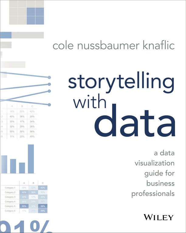
Nova: It is much deeper, Atlas. It's how we process information, how we learn, how we form memories. So, if we agree on the "why," the next logical step for a designer like yourself, someone who seeks logic and connection, is the "how." This is where "Tactical Insights" come in, inspired by brilliant minds like Cole Nussbaumer Knaflic and her work on "Storytelling with Data."
Atlas: Okay, so how does Knaflic's idea, this "Storytelling with Data," actually translate to a UI? What's the "narrative" in a dashboard or a report, beyond just making it look good?
Nova: Knaflic shows how to identify the narrative the data itself and present it in a way that guides the audience to insights. She emphasizes clarity, empathy, and visual impact. Our "Nova's Take" framework builds on this: you're not just showing data; you're telling a story that makes the user feel informed and empowered. It's about turning complex UI elements, like those dashboards or reports we just talked about, into journeys.
Atlas: That's fascinating. So, when you say "journey," what does that mean in practical terms? What do "hero," "challenge," and "resolution" look like within a data screen? Give me a concrete example I can visualize.
Nova: Let’s take a project management tool. Your user, the project manager, is the "hero." Their goal is to complete a project successfully. The "challenge" isn't just the tasks, but the obstacles: overdue items, budget overruns, team member bottlenecks. The resolution is the project's successful completion. Now, how does the UI tell this story? The project dashboard isn't just a list of tasks. It shows their progress, highlights critical issues, and celebrates milestones. A progress bar isn't just a percentage; it’s a visual representation of the hero moving towards their goal. A notification about an overdue task isn't just an alert; it's a call to action to overcome a challenge.
Atlas: Wow, that’s actually really elegant. It connects the dry logic of data points with the inherent human drive to achieve and overcome. That resonates with my own drive for logical beauty and sensory pleasure. It’s about constructing order, but an order that feels alive. So, for a designer who's listening and thinking, "Okay, I get it, but where do I even start?" What's the "Tiny Step" you mentioned?
Nova: The tiny step is simple, Atlas, but powerful. Take a data-heavy screen you've designed right now. Any screen. Now, try to identify the 'hero' of the story – who is the user, and what are they trying to achieve? What's the 'challenge' they're facing on this screen? And what's the desired 'resolution'? How can you rearrange elements, even subtly, to highlight this narrative flow?
Synthesis & Takeaways
SECTION
Nova: So, what we're really talking about, Atlas, is that narrative UI isn't about fabricating stories; it's about revealing the inherent story that already exists within the user's interaction with your data and guiding them through it. It’s about transforming a cold, functional interaction into an empowering journey.
Atlas: That makes perfect sense. It’s about moving beyond just building interfaces to actually exploring and connecting with the human experience. It's about building order, yes, but an order that speaks to the user's deeper motivations and experiences. It's the difference between merely presenting facts and actually building understanding and connection.
Nova: Exactly. Imagine the impact of every interface you design becoming a mini-saga, where the user isn't just a consumer of data, but the active protagonist. That's a truly meaningful design.
Atlas: I'm going to look at every dashboard differently now. For our listeners, I encourage you to take that tiny step Nova mentioned. Pick one screen, find its hero, its challenge, its resolution. And observe how that narrative lens changes your perspective. What story is your UI telling? And more importantly, what story it be telling?
Nova: It’s a powerful shift in perspective that can unlock incredible engagement.
Atlas: This is Aibrary. Congratulations on your growth!