The Art of the Data Narrative: Visualizing Insights
Golden Hook & Introduction
SECTION
Nova: Atlas, if I told you that the secret to truly influencing decisions, to shaping entire narratives, wasn't just about having brilliant insights, but about painting pictures with numbers, what would you say?
Atlas: Oh, I know that feeling! It sounds like the holy grail for anyone who lives in the world of data, trying to make it sing. So, we’re talking about turning those endless spreadsheets into something… compelling?
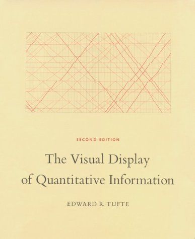
Nova: Exactly! Today, we're diving into the art of the data narrative, pulling wisdom from two absolute giants in the field: Edward R. Tufte’s seminal work, and Cole Nussbaumer Knaflic’s incredibly practical guide,
Atlas: Wow. Tufte, the godfather of data visualization, whose work feels like a philosophy as much as a how-to guide, and Knaflic, who really demystified how to make data with a business audience. That’s a powerhouse combo.
Nova: It absolutely is. What's fascinating about Tufte is his background as a political science and statistics professor. He brings this incredible rigor, almost an ethical dimension, to how we present information. He's not just about pretty charts; he's about truth and precision in graphical representation.
Atlas: That’s a great way to put it. For anyone who's ever felt overwhelmed by a dashboard full of flashing lights and confusing graphs, Tufte is like a beacon of clarity. He’s all about getting to the essence.
Nova: And Knaflic, on the other hand, comes from a business intelligence background, having worked at Google. Her focus is less on the theoretical underpinnings and more on the practical application: how do you actually get your audience to after seeing your data? How do you craft a narrative arc around it?
Atlas: So, we’ve got the foundational principles from Tufte and the actionable storytelling from Knaflic. That sounds like a perfect blend for anyone who needs to not just understand data, but to use it to drive change.
Nova: Precisely. And for our listeners, the strategic futurists, the cultural architects, the analytical innovators, this isn't just about making better charts. It's about wielding data as a tool for foresight, for ethical exploration, and for understanding the very evolution of public discourse.
Crafting Clarity from Complexity
SECTION
Atlas: Okay, so let's start with Tufte. His work, is legendary for a reason. What’s the core principle that makes it so enduring?
Nova: The core, Atlas, is "clarity, precision, and efficiency in conveying information without distortion." Tufte essentially argues that much of what passes for data visualization is actually "chartjunk"—elements that don't convey information but merely decorate. He wants us to maximize the "data-ink ratio."
Atlas: Data-ink ratio… that’s a phrase that always sticks with me. So, if it’s not data, it’s junk. It’s like saying every brushstroke on a canvas should mean something, otherwise, it’s just noise.
Nova: Exactly! Imagine a bar chart with a heavily textured background, elaborate 3D effects, or unnecessary borders and shading. Tufte would say these elements are "non-data-ink." They distract from the actual numbers. The ideal is to have every bit of ink on the page represent data, or at least serve a clear, non-redundant purpose.
Atlas: That makes me wonder… I’ve seen so many corporate presentations where people try to make their data "pop" with all sorts of visual flair, but what they’re actually doing is obscuring the message.
Nova: Precisely. Tufte’s work is almost a philosophical stance against visual clutter. He believes that true elegance in data display comes from simplicity and intellectual integrity. He talks about how poorly designed graphics can actually by distorting proportions, exaggerating trends, or hiding crucial context.
Atlas: So, it’s not just about aesthetics, it’s about ethics. It’s about being honest with the data. That’s a profound insight, especially when we consider how data can be manipulated, intentionally or unintentionally, to support a particular narrative.
Nova: It’s absolutely ethical. He famously critiqued the Challenger disaster diagrams, arguing that faulty data visualization contributed to the tragic decision to launch. The engineers had the data to show the O-rings would fail, but the way it was presented obscured the critical information.
Atlas: Wow, that’s a powerful example. It shows that data visualization isn't just a communication tool, it can be a matter of life and death, or at least, critical strategic decisions.
Nova: It highlights the responsibility we have when we present data. Tufte's principles push us to pare down, to remove anything that doesn't directly serve the purpose of informing the viewer. It's about respect for the data and respect for the audience's intelligence.
Atlas: So, the tiny step he suggests – taking a piece of data and visualizing it three different ways while applying these principles – that’s a fantastic exercise. It forces you to strip away the "chartjunk" and really focus on the core message.
Nova: It’s a powerful way to train your eye. You start to see how much extraneous detail we often include out of habit or a misguided attempt to make things "pretty." And then, once you’ve achieved that clarity, that’s where Knaflic steps in.
Mastering the Data Lens
SECTION
Atlas: Okay, so we’ve made our data honest and clear, thanks to Tufte. But clarity alone doesn’t always move people. That’s where Cole Nussbaumer Knaflic’s becomes indispensable, right?
Nova: Absolutely. Knaflic takes Tufte’s foundation of clarity and builds the narrative on top of it. She emphasizes that even the clearest graph can fall flat if it doesn't tell a compelling story. Her focus is on understanding your audience, the context, and then crafting that narrative arc.
Atlas: So, it’s about answering the "so what?" question. You’ve got this brilliant, clean visualization, but what does it mean for? What should I with this information?
Nova: Precisely. She talks about the six lessons of storytelling with data. It starts with understanding the context, choosing an appropriate visual display, eliminating clutter, focusing attention where you want it, thinking like a designer, and then, finally, telling a story.
Atlas: I like that it brings in the human element. It’s not just about the numbers anymore; it’s about the people those numbers represent or affect. It’s about empathy in data.
Nova: Yes, and her advice is incredibly practical. For instance, she'll tell you to use pre-attentive attributes—things like color, size, or position—to guide your audience's eye to the most important parts of your visual. You want them to instantly see the "aha!" moment, not hunt for it.
Atlas: So, it’s about making it effortless for the audience to grasp the insight. It’s almost like she’s a director, staging the data to get the maximum emotional and intellectual impact.
Nova: She literally uses the words "narrative arc." You introduce the problem, present the data as the rising action, reveal the insight as the climax, and then propose a call to action as the resolution. It’s classical storytelling applied to spreadsheets.
Atlas: That makes so much sense. We’re wired for stories. Our brains process information better when it’s presented as a narrative. So, the "one-sentence story for each visualization" she suggests – that’s essentially forcing you to distill your entire insight into a punchy, memorable takeaway.
Nova: It's the elevator pitch for your data. If you can't summarize your visualization's key takeaway in one sentence, you probably haven't focused enough, or your visualization isn't clear enough. It's a fantastic test.
Atlas: That's a great example of accessible explanation. And it brings us to a deep question that ties both Tufte's precision and Knaflic's storytelling together: how can contemporary art or pop art inspire new, more engaging forms of data visualization that transcend traditional business graphs?
Nova: Oh, that's where it gets truly exciting! Think about it: pop art, for instance, often takes everyday objects and elevates them, sometimes with bold colors, repetition, or a sense of irony. Could we apply that to, say, a sales report?
Atlas: That’s a bit out there! Are we talking about a Warhol-esque graph of quarterly earnings?
Nova: Why not? Imagine a series of identical bar charts, each slightly altered with a different color palette or texture to highlight a specific market segment, much like Warhol's soup cans. It wouldn't be about increasing data points, but about emphasizing a particular or to the data. It's about making the data "felt" as much as "seen."
Atlas: I like that. It challenges the very notion of what a "serious" business graph should look like. It pushes us beyond the conventional, often dull, templates. It’s about finding new ways to engage the subconscious, not just the logical mind.
Nova: Precisely. Or contemporary art, which often questions perception, scale, or the very medium itself. Could a data visualization be an immersive experience, a sculptural representation, or even an interactive exhibit that changes based on user input, rather than just a static chart on a slide?
Atlas: So, taking data out of the 2D PowerPoint slide and turning it into something experiential. That would certainly resonate with someone looking to connect disruptive tech with board leadership, or exploring the ethical dimensions of AI. It’s about building a bridge between the abstract and the tangible.
Nova: It’s about pushing the boundaries of what data communication can be. Tufte gives us the intellectual rigor, Knaflic gives us the narrative structure, and then art can give us the audacious spirit to make data not just understood, but truly and.
Synthesis & Takeaways
SECTION
Atlas: So, Nova, what's the ultimate takeaway for our listeners who are constantly synthesizing complex information and trying to shape the future? How do they harness this art of the data narrative?
Nova: It’s about embracing the unexpected, Atlas. It’s about understanding that data visualization isn't just a technical skill; it’s a form of profound influence. You start by rigorously applying Tufte’s principles to ensure your data displays are honest, clear, and efficient. No chartjunk, maximum data-ink ratio.
Atlas: Right, strip away the noise. Get to the pure signal.
Nova: Then, you layer on Knaflic’s storytelling prowess. You identify your audience, understand the context, and build a narrative arc around your data. You guide the eye, you focus attention, and you craft that one-sentence story that makes the insight unforgettable.
Atlas: So, it’s clarity first, then story. It’s about making sure your insights don't just exist, but that they resonate and inspire action.
Nova: Exactly. And the profound insight here is that by mastering this, you move beyond merely presenting information. You start to shape understanding, influence decisions, and ultimately, you contribute to shaping the future. The ability to articulate complex insights compellingly is paramount for any strategic futurist. It's how you make the invisible visible, and the abstract actionable.
Atlas: That’s actually really inspiring. It transforms what could be a dry topic into an act of creative power. It’s not just about showing numbers; it’s about showing possibilities.
Nova: Indeed. The data narrative isn't just a communication tool; it's a leadership tool. It's how you inspire confidence, clarify vision, and mobilize for impact. It's fundamental to shaping a better future.
Atlas: This is Aibrary. Congratulations on your growth!