The Candle's Code: A Software Engineer's Guide to Market Patterns
Golden Hook & Introduction
SECTION
Nova: Sim, as a software engineer, you spend your day building order out of chaos, writing precise logic to control complex systems. But what if I told you there's a 300-year-old visual language, invented by Japanese rice traders, that tries to do the exact same thing for the most chaotic system of all: the financial market? It’s not about magic; it's about pattern recognition. It's about reading the code hidden in plain sight.
sim: That's a fascinating premise. In software, we're always trying to find the signal in the noise, to build predictable models for complex user behavior or system loads. The idea that there's an "ancient algorithm" for the market… that’s immediately appealing. I'm less interested in the trading itself and more in the system. How does it work? What are its rules?
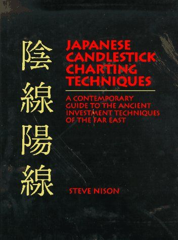
Nova: I knew you'd love this! And that's exactly the lens we need today. We're not giving financial advice. We are geeking out on a brilliant system. And that’s what we're exploring today, using Steve Nison's classic book, 'Japanese Candlestick Charting Techniques,' which brought this knowledge to the Western world. We’re going to tackle this from two perspectives.
sim: Okay, lay it out for me.
Nova: First, we'll decode the basic building block, the single candlestick, treating it like a packet of data. Then, we'll see how these blocks combine to form powerful patterns that tell a story, almost like a simple algorithm predicting a system's next state.
sim: Data packets and algorithms. You're speaking my language. I'm ready.
Deep Dive into Core Topic 1: The Candlestick as a Data Packet
SECTION
Nova: Perfect. So let's start with the absolute basics, the single atom of this entire language. Forget the charts for a second, and let's just look at one, single candle. Most people have seen a line chart for a stock, right? It just shows the closing price over time. It's... fine. But it leaves so much information out.
sim: It's a one-dimensional view. You see the result, but not the process. You don't see the volatility or the range of activity within that time period.
Nova: Exactly! The Japanese rice traders knew this centuries ago. They needed to know the story of the day, not just the final score. So, let's build a candle. Imagine a stock opens for trading at $100. That's our first data point: the Open.
sim: Got it.
Nova: Now, during the day, there's a flurry of activity. Excited buyers push the price all the way up to $105. That's our second data point: the High. But then, some negative news hits, and sellers panic, driving the price all the way down to $95. That's our third data point: the Low. Finally, as the trading day ends, things settle down and the price closes at $102. That's our final data point: the Close.
sim: Okay, so we have four numbers: Open 100, High 105, Low 95, Close 102. A simple list.
Nova: Right. Now here’s the genius. The candlestick visualizes all of that in one elegant shape. The thick part of the candle, called the 'real body,' connects the opening price to the closing price. In our case, from $100 to $102. And because the close was higher than the open, we'd color that body white or green. It was a winning day for the buyers, the 'bulls'.
sim: So the body represents the net change, the result of the main battle.
Nova: Precisely! And the thin lines that stick out from the top and bottom of the body are called 'shadows' or 'wicks'. The top shadow goes from the top of the body, $102, up to the high of the day, $105. The bottom shadow goes from the bottom of the body, $100, down to the low of the day, $95.
sim: I see it now. It's a brilliant form of data compression. In one simple shape, you've encoded four critical variables—open, high, low, close—and you've also instantly visualized the net change through the body's size and the total volatility through the length of the shadows. The color-coding is like a boolean flag for 'positive_day'. It's far more information-dense than a single point on a line graph.
Nova: Isn't it? And if the price had closed at $98, below the open, the body would be black or red. You'd know instantly, just by the color, that the sellers, or 'bears', won the day. You don't even have to read the numbers. It's a visual heuristic.
sim: That makes sense. My only question is about scope. Is a candle always one day? Or is the time period arbitrary?
Nova: Great question, and it speaks to the scalability of the system. It can be anything. A candle can represent one minute, one hour, one day, or one week. The logic is the same. You're just changing the resolution of your analysis.
sim: So you can zoom in and out on the data, but the visualization principle remains consistent. That's a hallmark of a well-designed system. It's elegant. It's not just a chart; it's a data object.
Nova: I love that framing. A 'data object'. Each candle is an instance of the 'trading period' class, with properties for open, high, low, and close.
sim: Exactly. And now I'm curious what happens when you start stringing these objects together.
Deep Dive into Core Topic 2: Patterns as Narrative
SECTION
Nova: Ah, and that's where the magic really begins. If one candle is a data packet, then a sequence of them starts to form a narrative. This is where it gets really interesting for an analytical mind. Let's talk about one of the most philosophically interesting patterns: the Doji.
sim: Doji. What does that mean?
Nova: It comes from a Japanese phrase meaning 'error' or 'blunder', because it signals a situation that shouldn't last. A Doji is a candle where the opening price and the closing price are virtually identical. So the 'real body' is just a flat line, or extremely small. It might have long shadows stretching up and down, showing a lot of volatility during the period, but by the end, the net result is... nothing. It's a perfect stalemate.
sim: So, in system terms, it's a signal of pure equilibrium. The forces pushing the price up and the forces pushing it down are in perfect balance within that time frame. The net force is zero.
Nova: Exactly! Imagine a long trend of green candles, marching upwards day after day. The buyers are clearly in control. Then, suddenly, a Doji appears. A tiny cross-shape. What does that tell you?
sim: It tells me the previous state has been interrupted. The upward momentum has stalled. It doesn't necessarily mean the price will reverse and go down, but it's a critical flag. It says the conviction of the buyers is now being perfectly matched by the conviction of the sellers. The system is in a fragile, indeterminate state.
Nova: You've nailed it. Nison says the Doji is a moment of indecision. The market is pausing to catch its breath. It's a warning sign that the current trend might be ending. It's not a command to act, but a signal to pay very close attention.
sim: I like that. It's not a predictor; it's an indicator of instability. In computing, you might see a similar pattern in system load before a crash. A period of wild fluctuation that averages out to normal, right before a major state change. The Doji is a flag that says, 'The context has changed.'
Nova: What a great analogy. Now, let's look at a pattern that's far more dramatic. A pattern with a clear story of violence and rejection. Let's talk about the Hammer.
sim: The Hammer. Sounds aggressive.
Nova: It is! Picture this. The market has been in a downtrend. Lots of red or black candles. Today, it opens, and the sellers take immediate control, just like they have been. They push the price way, way down. It looks like another catastrophic day.
sim: So the trend is continuing as expected.
Nova: It seems that way. But then, something shifts. The buyers, who have been hiding, suddenly see the price as a bargain. They rush in with incredible force. They not only stop the decline, but they completely reverse it, pushing the price all the way back up. By the end of the day, the price closes at or very near where it opened.
sim: So what does the candle look like?
Nova: It has a very small real body at the very top of the trading range, and a very long lower shadow. It looks... like a hammer. Or a gavel. The market has hammered out a bottom.
sim: I see. The narrative is what makes it powerful. The long lower shadow is the visual evidence of the failed sell-off. The system attempted to continue in its 'bear state,' but it encountered a massive 'rejection.' The buyers drew a line in the sand and defended it.
Nova: That's the story exactly! It’s a story of a failed attack and a powerful counter-attack. And for this pattern to be valid, as you'd probably guess, there are rules.
sim: I was just about to ask. It can't just be any candle that looks vaguely like a hammer, right? There must be a formal definition.
Nova: There is. Nison specifies that the lower shadow should be at least twice the length of the real body. The body itself should be at the upper end of the trading range. And there should be little to no upper shadow. It's a specific, testable definition.
sim: That's the key. That's what separates it from just being a 'vibe' and turns it into a system. It's a defined rule set. You can write a program to detect a Hammer pattern based on those parameters. You can backtest its effectiveness. You're quantifying a psychological event. That is incredibly cool.
Synthesis & Takeaways
SECTION
Nova: So when we step back, we've seen that these candlesticks are so much more than just squiggles on a screen. They're a high-density data visualization language that tells a story of the psychological battle between buyers and sellers.
sim: Right. It's a heuristic-based pattern recognition system. It's not about achieving 100% certainty, because that's impossible in a chaotic system like the market. It's about increasing probabilities by identifying these key moments of change: the tense equilibrium of the Doji, or the forceful rejection of the Hammer. You're looking for inflection points.
Nova: Beautifully put. So for everyone listening, especially those of us who are, like you, software engineers, analysts, or just curious thinkers, and not necessarily financial traders—what's the big takeaway from this ancient system?
sim: I think for me, it's a powerful lesson in how we communicate data. We all have spreadsheets, dashboards, and reports. But are they telling a story? Or are they just a wall of numbers? The lesson from these 17th-century rice traders is that how you data can be as powerful as the data itself.
Nova: So we should all be looking for the narrative in our numbers.
sim: Exactly. Whether you're tracking server performance, user engagement, or project timelines, ask yourself: what's the story here? Is there a Doji—a moment of indecision? Is there a Hammer—a moment where a bad trend was forcefully reversed? Visualizing your data in a way that reveals its underlying narrative can lead to insights you'd never get from a simple list of figures. That's the real code hidden in the candles.
Nova: Find the narrative in your numbers. I love that. Sim, this has been an absolutely fantastic deep dive. Thank you for bringing your analytical mind to this today.
sim: The pleasure was all mine. This was a lot of fun.