Your Eyes Are Lying to You
Golden Hook & Introduction
SECTION
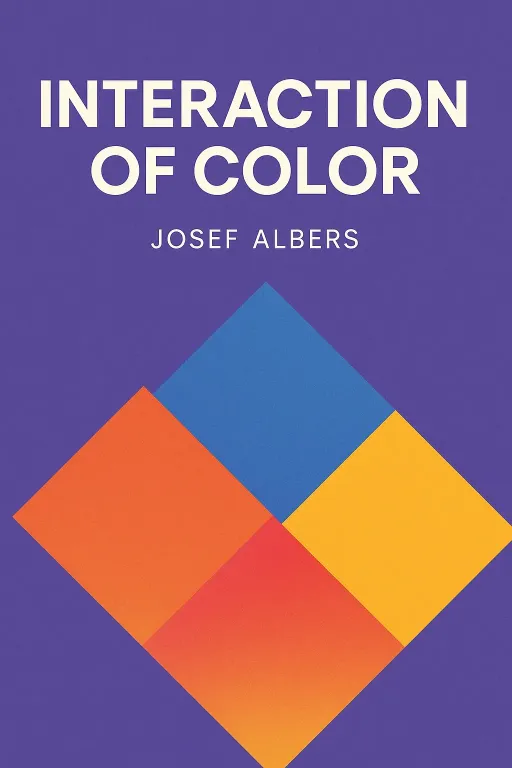
Rachel: Alright, Justine. Quick—what do you know about the color gray? Justine: Umm... it's what happens when my white laundry gets mixed with a black sock? It's the official color of Mondays? Boring. Rachel: That's what I thought. But what if I told you that learning to see gray is the secret to seeing the most brilliant colors in the universe? Justine: Okay, now you sound like you're about to sell me a crystal. I'm intrigued, but skeptical. What are we talking about today? Rachel: We are diving into a book that is less of a book and more of an experience. It’s Interaction of Color by Josef Albers. Justine: Josef Albers. The name sounds important. Should I know it? Rachel: You definitely know his influence. Albers was a giant. He was a core instructor at the legendary German art school, the Bauhaus, before he came to America. He went on to lead the design department at Yale and was the first living artist ever to have a solo exhibition at the Metropolitan Museum of Art. Justine: Whoa. Okay, so not a crystal salesman. A certified genius. So what’s his big idea in this book? Is it just a bunch of color wheels and talk about primary and secondary colors? Rachel: Absolutely not. In fact, he kind of hated that approach. He believed that starting with rigid rules is the fastest way to kill creativity. His book isn't about memorizing theories; it's a series of mind-bending experiments designed to change how you see. Justine: Experiments? It sounds more like a science lab than an art class. Rachel: Exactly. And the first experiment is a psychological one, designed to prove one simple, earth-shattering point: you have never, not once in your life, seen a color as it really is.
The Great Deception: Why You Never See Color as It 'Really' Is
SECTION
Justine: Hold on. What? That sounds completely bonkers. Of course I have. The sky is blue, a stop sign is red. I'm looking at a yellow pencil on my desk right now. It's yellow. Rachel: Is it? Albers starts with a brilliant thought experiment. Imagine I say the word "Red" to a room of 50 people. How many different reds do you think pop into their heads? Justine: Oh, dozens. Fire engine red, cherry red, wine red... okay, I see your point. Rachel: Right. So Albers tightens the focus. He says, "Okay, what about Coca-Cola red?" That's a color we've all seen thousands of times. It's standardized, globally recognized. Surely we all remember that specific red, right? Justine: Yeah, I can picture it perfectly. That vibrant, almost-but-not-quite-orange red. Rachel: But Albers argues that even then, if you asked those 50 people to pick out the exact Coca-Cola red from a chart of a hundred similar reds, you'd get a huge variety of answers. And here's the kicker: he says even if you show them the actual sign, the "factual" color hitting their retina, the "actual" color they perceive is still different for everyone. It's shaped by memory, by the lighting in the room, by the color of the wall behind it, even by what they ate for lunch. Justine: So you're saying there's no such thing as 'true' red? My whole life is a lie! That feels... unsettling. How can a color be real if no one agrees on what it is? Rachel: It’s because color isn't a static fact. It's a relationship. It's an experience. Albers says color is the most relative medium in art. It's constantly in flux, always being influenced by what's around it. Justine: That’s so abstract. I’m having a hard time wrapping my head around my eyes lying to me on such a fundamental level. Rachel: Okay, let me give you an analogy Albers uses that makes it perfectly clear. It has nothing to do with sight. It’s about touch. Have you heard of the three pots of water experiment? Justine: No, but it sounds like a fairytale riddle. Rachel: It's a classic perception trick. You take three bowls. You fill one with hot water, one with ice-cold water, and the middle one with lukewarm, room-temperature water. Now, you put one hand in the hot water and the other in the cold water, and you leave them there for a minute. Justine: Okay, I'm with you. One hand is burning, the other is freezing. Rachel: Precisely. Now, you take both hands out at the same time and plunge them into the middle bowl of lukewarm water. What do you think each hand feels? Justine: Oh, wow. The hand that was in the hot water will feel like the lukewarm water is cold. And the hand that was in the cold water will feel like the lukewarm water is hot. Rachel: Exactly! Your brain is receiving two completely contradictory signals—hot and cold—from the exact same physical stimulus. The water's temperature is a fact, but your perception of it is purely relative to its context, to the experience that came right before. Justine: That is a perfect analogy. So the color of a stop sign is like the lukewarm water. It's a physical fact—a specific wavelength of light—but how we perceive it depends entirely on whether we were just looking at a bright white building or a dark green forest. Rachel: You've got it. That's the "physical fact" versus the "psychic effect." Albers's entire philosophy is built on that distinction. He believed that to truly understand color, you have to stop trusting what you think you see and start learning to observe what's actually happening in the interaction. Justine: Okay, so if our eyes are constantly lying to us, and color is this shifty, untrustworthy thing, how did Albers teach people to see the truth? Or at least, to understand the illusion?
Training the Eye: How to See What's Actually Happening
SECTION
Rachel: He did it with the simplest, most humble material imaginable: colored paper. No paint, no pigments. He preferred paper because it was a flat, uniform color. There was no texture, no brushstrokes, no shiny or matte finishes to distract the eye. It was pure, unadulterated color. Justine: So he's isolating the variable. He wants to study only the color interaction. That's the scientist in him coming out again. Rachel: Exactly. And his exercises are legendary. The very first one he gives his students is a challenge that sounds impossible: make one color appear as two different colors. Justine: Without Photoshop? How is that even possible? Rachel: It’s all about context. He’d have his students take a small square of a single color—let's say a kind of neutral, grayish-brown. Then, they’d have to find two larger background colors that would force this one brown square to look completely different. Justine: I’m trying to picture this. Give me an example. Rachel: Okay, imagine you place that grayish-brown square on a background of a very vibrant, acidic yellow-green. And then you place an identical grayish-brown square on a background of a deep, rich maroon. Justine: Okay… Rachel: When you look at them side-by-side, something incredible happens. On the maroon background, the brown will be influenced by the red and will start to look almost greenish-gray by contrast. But on the yellow-green background, the same brown will suddenly look warmer, almost pinkish-brown. The single, factual color of the small square is perceived as two completely different actual colors. Justine: That's a literal magic trick! It’s an optical illusion, but he’s using it to reveal a fundamental truth. It’s not a trick to deceive, it’s a trick to enlighten. Rachel: That is the perfect way to put it. And he has dozens of these. Making two different colors look the same. Creating the illusion of transparency with opaque paper. Making boundaries between colors vibrate or completely vanish. Each exercise is designed to break down our lazy visual habits. Justine: But hold on. I was looking into this, and Albers wasn't universally praised for this method, was he? I read that some critics found this approach a bit... cold? One even called it a "pathology of color perception," suggesting that building an entire artistic practice on the idea that your eyes are broken might be a problem. Does focusing so much on the mechanics of illusion strip the art of its soul? Rachel: That’s a fantastic question, and it gets to the heart of the controversy around Albers. He could seem very rigid, very scientific. His students, who included famous artists like Robert Rauschenberg, often described him as a tough, exacting teacher. But Albers would argue that he wasn't teaching a 'style' or a set of mechanical rules. He was teaching a way of seeing. Justine: What’s the difference? Rachel: He believed that most art education was teaching students to copy results. "Paint like Rembrandt," "Compose like Mozart." Albers said that was useless. He famously said we should "compete with their attitude, not with their results." Justine: Compete with their attitude? What does that even mean? Rachel: It means understanding the how and the why behind their work. How did Rembrandt use light to create such deep emotion? How did Mozart arrange notes to create that feeling of joy? Albers believed that by understanding the fundamental principles of perception—the way colors push and pull each other, the way they create illusions of space and light—you unlock infinite creative freedom. You're not just copying a solution; you're learning the language itself. Justine: So it’s like learning the rules of grammar not so you can write like Shakespeare, but so you can write your own poetry. The rules don't confine you; they empower you. Rachel: Precisely. He saw it as a way of developing a "sensitive eye." And for him, that sensitivity was the foundation of all art. He wasn’t interested in self-expression in the sense of just spilling your feelings onto a canvas. He believed that was easy. The hard part, the artful part, was to make the colors themselves act—to make them perform the emotional work you wanted them to do.
Synthesis & Takeaways
SECTION
Justine: It’s fascinating. We started with this idea of color being a deception, a lie. But it seems like Albers’s point is that the "lie" is actually the most truthful and powerful part of it. Rachel: Exactly. The deception isn't a flaw in our vision; it's the very source of art's power. The fact that a patch of yellow next to a patch of blue can create a feeling of sunlight on water is the magic. It’s not about finding the "true" yellow or the "true" blue. It's about mastering the interaction between them to create a new reality, a new feeling. Justine: And that interaction is everything. It’s not just about the colors themselves, but the space between them, the quantity of them, the light hitting them. It’s a whole system. Rachel: A dynamic system. He compared good coloring to good cooking. A recipe gives you the ingredients, but a great chef is constantly tasting, adjusting, adding a pinch of this, a little less of that. They're responding to the situation. Albers wanted to teach artists to be chefs, not just recipe-followers. He wanted them to develop "thinking in situations." Justine: So the real lesson isn't about color charts at all. It's about context. What looks one way in isolation looks completely different when it's next to something else. That feels like a lesson for more than just art. Rachel: It absolutely is. His work has been interpreted as a metaphor for social dynamics, for how our perception of people and ideas is shaped by the context we find them in. It’s a profound lesson in open-mindedness. Justine: It makes me want to go out and just… look at things differently. It makes me think about a color I thought I hated. Maybe I don't hate it. Maybe I've just been seeing it in the wrong company. Rachel: I love that. And that’s a perfect challenge for everyone listening. What's a color you think you dislike? Maybe it's a certain shade of orange or a murky green. Try putting it next to something new—a color you love, or a neutral gray—and just see if it changes. See if it tells you a different story. Justine: We’d love to hear what you discover. Find us on our socials and share your own color experiments or just your thoughts on this episode. It’s a conversation we’d love to continue. Rachel: A beautiful, and very colorful, conversation. Justine: This is Aibrary, signing off.