

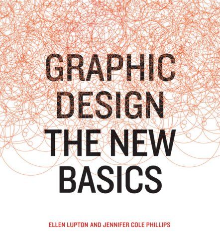
Graphic Design
The New Basics
Introduction
Nova: What if I told you that one of the most influential graphic design textbooks of the past two decades opens not with software tutorials or rules about kerning, but with a single chapter called "Back to the Bauhaus"? That's how Ellen Lupton and Jennifer Cole Phillips kick off "Graphic Design: The New Basics" — and it tells you everything about their philosophy.
Nova: Exactly! And that's the first surprising thing about this book. Lupton and Phillips argue that despite all our new digital tools — Photoshop, Figma, processing code — the fundamentals of visual language haven't changed. Point, line, plane, scale, hierarchy, color, texture — these formal elements are as relevant today as they were when the Bauhaus was redefining design education a century ago.
Nova: Precisely. And they've built what many call the definitive contemporary textbook around that idea. Published first in 2008 by Princeton Architectural Press, and revised in 2015 with sixteen new pages, this book has become a staple in design classrooms worldwide. But here's what makes it different — it's not just a textbook. Reviewers call it "more than a mere textbook" — an authoritative yet inspiring companion that even seasoned professionals return to.
Nova: Ellen Lupton is a powerhouse. She's a writer, curator, educator, and designer. She's the Senior Curator of Contemporary Design at the Cooper Hewitt Smithsonian Design Museum and the director of the MFA Graphic Design program at MICA, the Maryland Institute College of Art. Jennifer Cole Phillips is her longtime colleague at MICA. Together they've essentially shaped how a generation of designers thinks about visual form. And today, we're going to unpack what makes their book so enduring.
Point, Line, Plane and the Language of Form
The Building Blocks of Everything
Nova: Let's start at the absolute foundation. The very first concept Lupton and Phillips tackle is point, line, and plane — and they treat it almost philosophically. They quote Wassily Kandinsky, the famous Bauhaus painter, who wrote: "A line is the track made by the moving point. It is created by movement — specifically through the destruction of the intense, self-contained repose of the point."
Nova: Isn't it? But it's also deeply practical. A point marks a position. A line is a series of points in motion. A plane is a flat surface created by a moving line. These three elements are the atoms of visual design. Whether you're designing a logo, building a website layout, or creating a poster, everything begins with these building blocks.
Nova: Perfect analogy. And Lupton and Phillips show how universal this is. Software literally describes images using these terms — points and lines mapped onto planes. But traditional techniques like woodcuts or lithography also rely on manipulating marks to build form. The book is full of student work from MICA that demonstrates how points can create texture, how lines define edges or express emotion, how planes build shapes and fields of color.
Nova: And that brings us to one of the book's most original concepts.
How to Generate Ideas When the Obvious Ones Aren't Enough
Formstorming: Creativity as a Discipline
Nova: Lupton and Phillips coined a term that's become legendary in design education: formstorming. Think of it as brainstorming, but applied directly to visual form.
Nova: The core idea is that designers need to push past their first, easiest ideas. Lupton writes: "Getting to more interesting territory requires the perseverance to sift, sort, and assimilate subjects and solutions until a fresh spark emerges and takes hold." Formstorming is a set of structured techniques to force that deeper exploration.
Nova: One of the most famous exercises is "One Hundred Iterations" — visually interpreting a single subject one hundred different ways. Imagine designing a single letter "A" a hundred times, each version distinct. By iteration twenty you've exhausted the obvious. By iteration fifty you're panicking. But by iteration eighty or ninety, something genuinely original starts to emerge.
Nova: Exactly. Other techniques include Dailies — daily creative acts within a conceptual framework — and something called Alterego, where you design through a fictitious persona to break your own habits. There are also formstorming templates, structured layouts that organize research and visual thinking. And Process Verbs — applying actions like fold, cut, warp, or tear to a design to see what happens.
Nova: That's it. And the book emphasizes this is vital in a world saturated with easily accessible but often unoriginal visual content. Anyone can grab a template. Formstorming is what separates a designer from someone who just knows how to use Canva.
Rhythm, Balance, Hierarchy, Grids, and Modularity
The Invisible Architecture of Design
Nova: Once you have your building blocks, you need to organize them. And this is where Lupton and Phillips get into what I'd call the invisible architecture of design: rhythm, balance, hierarchy, grids, and modularity.
Nova: Precisely. Lupton writes: "Design is the conscious effort to impose a meaningful order." Balance provides stability, whether symmetrical or asymmetrical. Rhythm creates flow through repetition and variation. And hierarchy — that's about signaling importance through visual distinction. Scale, color, spacing, placement — all of these cue the viewer about what to look at first, second, third.
Nova: Yes. And without it, a design feels like chaos. Now, the other half of this chapter is about grids and modularity. A grid is a network of lines that helps align elements and structure space — including white space. Lupton has this wonderful line: "Typography is mostly an act of dividing a limited surface."
Nova: And grids give you the framework to do that. But here's the key insight from the book: constraints aren't limiting, they're liberating. When you work within a grid or a modular system, you stop agonizing over every placement decision and start using the structure as a creative playground. Modules — fixed elements like pixels, shapes, or objects — let you build complex forms from simple, repeatable units.
Nova: Exactly. And the second edition of the book, published in 2015, added sixteen new pages specifically about working with grids and designing with color, because the authors recognized that these systems-thinking skills are more relevant than ever in responsive web design and UI work.
Gestalt, Framing, Layers, and Transparency
How the Eye Deceives the Brain
Nova: Let's talk about one of the most fascinating sections of the book: how designers harness the way our brains perceive visual information. Lupton and Phillips dedicate significant space to Gestalt principles and the dynamics of framing.
Nova: Right. The brain simplifies complex stimuli into understandable units. We group elements based on proximity — things close together seem related. Similarity — things that look alike feel connected. Continuity, closure, symmetry — all of these principles explain why we see a circle even when there's a gap in the outline.
Nova: And designers can exploit that. Lupton writes: "The form of an object is not more important than the form of the space surrounding it." This figure-ground relationship is central. You can create tension, surprise, and energy by manipulating what reads as foreground and what reads as background.
Nova: Exactly. And framing is the other half of this. Borders, margins, cropping — these define edges and context. A photograph cropped tight feels completely different from one with generous margins. Interfaces — the frames through which we interact with digital products — shape our entire experience.
Nova: This is where the book bridges physical and digital beautifully. Layers are overlapping elements that exist simultaneously — think of collage, or Photoshop layers. Transparency allows one layer to be seen through another. Lupton captures the magic of this: "Transparency means a simultaneous perception of different spatial locations. The position of the transparent figures has equivocal meaning as one sees each figure now as the closer, now as the farther one."
Nova: And that ambiguity is visually rich. It creates depth, complexity, intrigue. Software gives us infinite control over opacity and blending modes, but the concept originates in physical materials — glass, water, perforated surfaces. Again, the book shows that the principles are timeless even as the tools evolve.
Time, Motion, Diagrams, and the Expanded Designer's Toolkit
Design That Moves and Informs
Nova: Two more concepts round out the book, and they're especially relevant in today's world: time and motion, and diagrams.
Nova: That's the old view. Lupton and Phillips argue that time and motion are inherent in dynamic media but can also be implied in static design. Every drawing, as they put it, is a motion study — a path of motion recorded by graphic means. Diagonal lines, cropping, sinuous shapes — these all imply movement on a static page.
Nova: Yes. The Motionographer review of the book highlighted this chapter as containing possibly "the best synopsis of the challenges facing motion graphics designers" they'd ever read. Lupton writes that motion designers must think like painters and typographers AND like animators and filmmakers. They're designing frames that change over time — shifts in position, scale, color, transparency. Timing is crucial: elements must change slowly enough to be understood but dynamically enough to engage.
Nova: Beautifully put. And then there are diagrams — which may sound dry, but Lupton and Phillips treat them as a core design skill. Diagrams translate data and concepts into visual form, revealing connections you can't see in a list or paragraph. They cover network diagrams, flowcharts, maps, timelines — and they reference Edward Tufte's call for analytical design that's rooted in evidence rather than propaganda.
Nova: And that's really the thesis of the entire book. Graphic design isn't about making things look pretty. It's about constructing visual arguments, telling visual stories, organizing complex information so it can be understood. Every chapter builds toward that bigger idea.
Nova: Absolutely. The book uses a clean grid layout inspired by classic design education books like Armin Hofmann's Graphic Design Manual. The spreads are spacious. The image quality, paper weight, and binding are all high-grade. The authors wanted you to hold onto this book — physically and intellectually.
Conclusion
Nova: So let's bring this together. "Graphic Design: The New Basics" by Ellen Lupton and Jennifer Cole Phillips has become a cornerstone of design education for compelling reasons. First, it's built on timeless principles — the Bauhaus-inspired focus on form means the book doesn't age as tools change. Second, it's practical and rigorous — concepts like formstorming give designers actual methods, not just inspiration.
Nova: That's the key. Lupton herself has said that in an era of quick solutions and a cut-and-paste mentality, the book provides something deeper. It asks designers to understand WHY certain visual decisions work, not just to copy what looks trendy.
Nova: And the 2015 revised edition kept it fresh with new content on grids and color. The companion website with design exercises extends the learning beyond the page. Lupton has gone on to write other influential books like "Thinking with Type" and "Design Is Storytelling," but "The New Basics" remains the entry point for so many designers.
Nova: Without question. Whether you're a student sketching your first logo or a seasoned professional orchestrating a complex digital product, the principles in this book are the grammar of visual language. You speak it every day without realizing it. This book teaches you to become fluent.
Nova: Beautifully summarized. And I'll leave listeners with one of my favorite lines from Lupton: "All colors are the friends of their neighbors and the lovers of their opposites." That's the kind of insight that makes this book so enduring — it finds truth in poetry and applies it to the page.
Nova: Keep designing. Keep thinking. And never stop formstorming.