The Data Whisperer: Translating Metrics into Strategic Narratives
Golden Hook & Introduction to Data Storytelling
SECTION
Nova: Atlas, quick question for you. When someone says "data presentation," what’s the first image that pops into your head? No filter.
Atlas: Oh, man. Immediately, I picture a spreadsheet so dense it could double as a brick. Or maybe a PowerPoint deck with so many charts that by slide three, my eyes have glazed over, and I’m already mentally planning my grocery list.
Nova: Exactly! That's the blind spot we're talking about. We, as strategic analysts, gather mountains of incredibly valuable data. We crunch numbers, we find insights, we build these elaborate reports. But then, too often, the true power of that data just... evaporates. It's not effectively communicated, it's not understood, and crucially, it doesn't drive action.
Atlas: So, it's not that the data is bad, but that we're speaking a different language to the decision-makers? I mean, we spend all this time digging for gold, and then we just dump a pile of raw ore on the CEO's desk and expect them to build a palace.
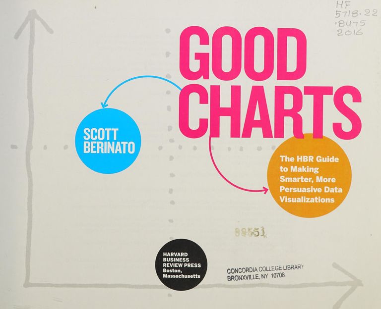
Nova: Precisely! And that's where the art of data storytelling comes in. It’s about translating those raw numbers into a compelling narrative that resonates and motivates. Today, we're diving into the transformative power of this skill, drawing insights from two seminal works: Scott Berinato’s "Good Charts" and Nancy Duarte’s "Data Story." Berinato, a visual journalist by trade, brings this incredibly fresh perspective to making data visuals not just accurate, but truly compelling. And Duarte, a legend in presentation design, provides the structured approach to building a persuasive narrative around those insights.
Atlas: Oh, I like that. So, it’s not just about making prettier graphs, it’s about making them? I imagine a lot of our listeners, especially those in high-stakes analytical roles, feel that frustration when their brilliant analysis just… sits there.
The Blind Spot: Why Raw Data Falls Flat
SECTION
Nova: Absolutely. Think about it: our brains are hardwired for stories, not spreadsheets. When you just present numbers, you're giving someone a puzzle to solve. When you present a story, you're guiding them through an experience, showing them the problem, the characters, the stakes, and the potential resolution. The blind spot is assuming the numbers will speak for themselves. They won't. They can't. They need a voice.
Atlas: So, what does that look like in practice? Can you give an example of a data report that utterly failed because of this blind spot? A hypothetical, but something our listeners could instantly recognize.
Nova: Imagine a sales team battling declining numbers. The analyst compiles a report: "Quarterly Sales Down 15% YoY," followed by pages of regional breakdowns, product line performance, average transaction values – all accurate, all meticulously gathered. But it's just a data dump. The leadership team glances at it, maybe frowns, and then moves on to the next agenda item. There's no urgency, no clear path forward. The analyst is left thinking, "Didn't they the problem?"
Atlas: Wow. I know that feeling. It's like presenting a detailed weather map to someone, and then being surprised they didn't bring an umbrella. So, it's not just about showing the data, but showing what the data for them, and what they about it.
Nova: Exactly. In that sales report example, the blind spot wasn't the data itself, but the failure to connect it to the business's human element, its strategic goals, and a clear call to action. It lacked a protagonist – the sales team or the customer – a conflict – the declining revenue and its impact – and a potential resolution.
Atlas: But wait, looking at this from a strategic analyst's perspective, isn't that just… manipulating the data? I mean, isn't the point to be objective? Doesn't adding 'story' just inject bias?
Nova: That's a great question, and it’s a crucial distinction. Data storytelling is not about fabricating information or distorting facts. It’s about translating complex information into an understandable and persuasive format. Think of a doctor explaining a diagnosis. They don't just hand you your lab results and say, "Here are the numbers." They explain what those numbers mean for health, what the potential consequences are, and what steps you need to take. That's not manipulation; that's responsible communication aimed at inspiring action for a positive outcome. It’s about persuasion for good.
The Shift: Crafting Compelling Data Narratives with 'Good Charts' and 'Data Story'
SECTION
Nova: That brings us perfectly to the shift we need to make. This is where Scott Berinato's "Good Charts" becomes indispensable. Berinato argues that good charts tell a story. He provides a framework for creating visuals that aren't just accurate, but also clear, compelling, and actionable. He emphasizes starting with your audience and your message, then choosing the right visual, and finally, refining it for clarity and impact. It's about moving from simply showing data to it through visualization.
Atlas: So, for our listeners who are buried in dashboards and need to communicate their findings upwards, how does Berinato suggest we start? Is it just making prettier graphs, or is there a deeper principle at play?
Nova: It’s definitely not just about aesthetics. Berinato's core idea is to first define your. Are you making an exploratory chart for yourself, or an explanatory chart for others? Most business presentations need explanatory charts. Then, he pushes you to think about the your chart is telling. He encourages annotations, clear titles, and highlighting the key insight directly on the chart, so the viewer doesn't have to hunt for it. It turns a visual into a statement, not just a data dump.
Atlas: That makes sense. It’s like, instead of just showing me a map, you highlight the best route and point out the landmarks.
Nova: Exactly. And then, we layer on Nancy Duarte's "Data Story." Berinato helps you make individual charts powerful, while Duarte helps you weave those powerful charts into a cohesive, persuasive narrative arc for your entire presentation. She outlines a structured approach to move audiences from understanding to belief, and ultimately, to action. She uses this elegant structure: "What Is," "What Could Be," and "The New Bliss."
Atlas: Oh, I like that. "What Is," "What Could Be," "The New Bliss." So, Duarte isn't just about making a presentation, it's about crafting a path to influence? It's about leading with data, not just reporting it? That sounds like a powerful tool for someone trying to make a significant mark.
Nova: It absolutely is. Let's take that sales decline example. "What Is" would be presenting the 15% decline and its direct consequences – perhaps lost market share, increased competitive pressure. "What Could Be" would be painting a picture of where the company could be if they addressed the issue – recapturing market share, regaining customer trust. And "The New Bliss" is the clear, actionable path: "By implementing X strategy, we can reverse this trend and achieve Y growth, securing our position as industry leaders." It transforms a problem into an opportunity, with a clear call to action.
Atlas: That’s a perfect example. It's not just stating the facts, it's about creating a compelling vision for the future, and showing how the data backs up that vision. So, it's about shifting from being a data reporter to a data.
Synthesis & Takeaways
SECTION
Nova: Precisely. By mastering these approaches, you elevate your role from a mere analyst to a strategic advisor. Your insights aren't just seen; they're truly understood, believed, and acted upon. It's how you ensure your meticulous work translates into tangible impact for your teams and leadership.
Atlas: That's actually really inspiring. So, for our listeners, the strategic analysts, the impact drivers, the future-proof innovators – the deep question from the book content really resonates here: Consider a recent data report you presented. How could you have reframed it as a story to make its conclusions more impactful and memorable?
Nova: It's a powerful exercise, isn't it? It forces you to think beyond the numbers and really consider the human element, the narrative arc, and the call to action. What's the "what is," the "what could be," and the "new bliss" in your own data?
Atlas: And honestly, that sounds like a journey worth embracing. Not every step needs to be perfect, but every step towards this kind of communication is progress.
Nova: Absolutely. Start small, try reframing one chart, then one slide, then an entire presentation. The impact will be profound.
Atlas: This is Aibrary. Congratulations on your growth!