

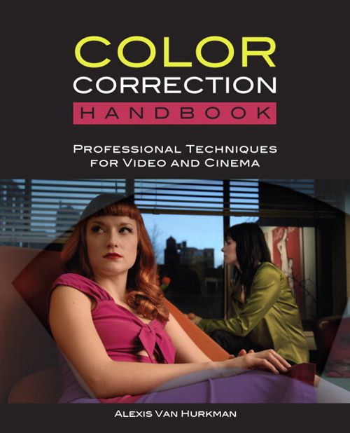
Color correction handbook
Professional Techniques for Video and Cinema
Introduction
Nova: You're watching a film. The hero walks through a rain-soaked street at night. The blues are deep and cold, the shadows are crushed, and the streetlights glow with an almost sickly green. You feel lonely, tense, unsettled. Now imagine that exact same shot, but the colorist never touched it. Flat, washed out, no mood at all. That's the difference color correction makes. And there's one book that has become the bible for learning how to do it: Alexis Van Hurkman's Color Correction Handbook.
Nova: : That's a bold claim, Nova. The bible? For color correction? What makes this book so special?
Nova: Fair question. This is a five-hundred-plus-page tome that has been called the definitive guide to color grading by working professionals across the industry. It's not just a software manual. It's a deep exploration of both the art and the science of making images look incredible. And the author, Alexis Van Hurkman, didn't just write about color correction from an ivory tower. He's a working colorist, a filmmaker, a writer, and the person who literally wrote the official manuals for DaVinci Resolve, Apple Color, and Final Cut Pro.
Nova: : So he's not just an academic. He's in the trenches.
Nova: Exactly. He's graded everything from History Channel documentaries to BBC Four programs to independent narrative films. His own award-winning film, Carry My Heart to the Yellow River, played at over fifty festivals worldwide. And now he's at Adobe, helping modernize color tools in Premiere Pro. This is someone who knows color at every level.
Nova: : Alright, I'm intrigued. Let's dig into this handbook. What's actually in it?
From Audio to Color Grading
The Author and His Unconventional Path
Nova: Before we crack open the book, let's talk about the author's journey, because it's genuinely unusual. Alexis Van Hurkman didn't start as a colorist. He bounced around between audio engineering, editorial work, motion graphics, and visual effects. Each of those stops built a piece of the puzzle.
Nova: : Wait, how does audio engineering connect to color grading?
Nova: It's actually a brilliant parallel. In both disciplines, you're shaping perception through subtle adjustments. Think about it: an audio mixer balances frequencies to create clarity and emotional impact. A colorist balances color channels and contrast to do the same thing visually. Van Hurkman himself has talked about how the parallel between sound mixing and color grading runs deep. You're listening for muddiness in audio; you're watching for muddiness in the shadows of an image.
Nova: : That's a connection I've never made before. So all those different disciplines fed into each other.
Nova: They really did. And here's the thing: his path to becoming a colorist was gradual and self-made. He eventually started his own one-man boutique grading facility. He built a clientele the hard way. And at some point, he started writing. Writing the DaVinci Resolve manual, the Apple Color documentation, training videos for Ripple Training. And through all that writing and teaching, his own skills deepened. There's a podcast interview where he says that writing actually increased his color knowledge, because explaining something forces you to understand it completely.
Nova: : So the book is the culmination of years of doing and then years of teaching.
Nova: Exactly. And the first edition came out in 2010, then a thoroughly updated second edition in 2014. That second edition is what most people refer to as the standard text. Five hundred thirty-three pages, ten chapters, plus downloadable ProRes media so you can practice along with the examples. It's a learning tool, not just a reference.
Why the Book Teaches Principles, Not Software
A Platform-Agnostic Philosophy
Nova: Here's what really sets this book apart from almost every other color resource out there. It doesn't teach you a specific piece of software. Instead, Van Hurkman covers virtually every major grading platform: DaVinci Resolve, FilmLight Baselight, Assimilate Scratch, Quantel Pablo, Autodesk Lustre, even Magic Bullet Colorista. Screenshots and examples draw from all of them.
Nova: : That seems almost counterintuitive for a how-to book. Don't people want to know which buttons to push?
Nova: That's exactly the trap Van Hurkman wants you to avoid. His core argument is that the specific knobs and curves you manipulate are less important than understanding why you're making an adjustment. The theories and techniques that build the foundation of the art form don't rely on any one machine or piece of software. They rely on your eyes, your brain, and even your heart as a storyteller.
Nova: : But does the book give you any practical guidance at all, or is it all theory?
Nova: Oh, it's packed with practical technique. But the approach is clever. A chapter on primary contrast adjustments, for example, will teach you what lift, gamma, and gain actually do to an image, then show you how those controls work across different platforms, then walk you through specific scenarios like dealing with underexposed footage or adjusting log-encoded contrast. The concept comes first, then the application.
Nova: : Lift, gamma, gain. I've heard those terms but I'm not sure I really understand them.
Nova: Most people don't, and that's why Van Hurkman spends a lot of time on them. Think of it this way: lift controls the darkest parts of your image, the shadows. Gain controls the brightest parts, the highlights. And gamma controls everything in between, the midtones. Together, they're the three-legged stool of contrast adjustment. The book explains not just what they do but how they interact. For example, if you raise the lift too much, you'll wash out your blacks and your image will look milky. If you crush the gain, your highlights lose detail. And gamma is where most of the creative look lives.
Nova: The book also dedicates significant space to the difference between YCbCr luma adjustments and RGB luma adjustments, which sounds technical but actually has huge creative implications. RGB adjustments preserve color saturation when you change contrast. YCbCr adjustments can desaturate. Understanding that difference can save you hours of frustration.
Video Scopes and Why Your Eyes Lie to You
The Colorist's Most Important Tool
Nova: One of the recurring themes throughout the entire handbook is this: your eyes cannot be trusted. Not fully. And this comes from someone who has spent thousands of hours grading professionally.
Nova: : That sounds like a strange thing for a colorist to say.
Nova: It does, but here's why. Your eyes adapt. If you stare at a warm image for five minutes, your brain normalizes it. Suddenly a neutral image looks cold. If you're grading in a room with a slight color cast on the walls, your perception shifts. The only thing that never lies is the video scope. So Van Hurkman makes scopes central to the book's methodology.
Nova: : What kinds of scopes are we talking about?
Nova: The big three: the waveform monitor, the vectorscope, and the RGB parade. The waveform shows you luminance, basically the brightness of every part of your image from left to right. The vectorscope shows you hue and saturation, with different directions on the scope representing different colors. And the RGB parade splits your image into red, green, and blue channels so you can see color imbalances instantly.
Nova: : And these show up throughout the book, not just in one chapter?
Nova: They permeate every chapter. Contrast adjustments, color balance, skin tone evaluation, broadcast legality. Van Hurkman uses scope readings as evidence for every point he makes. He's been quoted saying that if he could only have one scope, he'd choose the waveform. If he could have a second, the vectorscope. That's how essential they are to his process.
Nova: : So the book is training you to trust data over instinct?
Nova: Not data over instinct. Data to inform instinct. A great colorist develops an intuitive feel for what looks right, but they use scopes to verify and to stay consistent across an entire project. The book shows you how to read a waveform and know immediately if your shadows are crushed, how to look at a vectorscope and see if skin tones are veering too magenta or too yellow. It's like learning to read a second language.
The Standout Chapter
Memory Colors and the Art of Skin Tone
Nova: If you talk to anyone who's read this book, there's one chapter they always mention: Chapter 8, Memory Colors. Specifically, the section on skin tone. Reviewers consistently call it the most detailed treatment of the subject ever put in print.
Nova: : Memory colors. What does that term mean exactly?
Nova: Van Hurkman defines memory colors as the colors that viewers recall in association with familiar objects. Blue sky. Green grass. And most importantly, human skin. These are colors that audiences have an almost instinctive relationship with. If the skin tones in your film look wrong, even slightly wrong, the audience will feel it before they can articulate it. They'll say the image looks weird or sickly or unnatural, and they won't know why.
Nova: : So getting skin tone right isn't just technical, it's psychological.
Nova: Deeply psychological. And Van Hurkman goes into extraordinary detail. He talks about the ideal hue range for different skin types, the relationship between saturation and perceived health, how skin tone interacts with the surrounding environment, and what happens when you adjust skin using primaries versus secondaries. He even breaks down how different display technologies and color spaces affect the perception of skin.
Nova: : Does he give actual numbers? Like, here's where skin should fall on a vectorscope?
Nova: He does. There's a famous guideline in the color world called the skin tone line on a vectorscope. Van Hurkman discusses it extensively but also warns against treating it as an absolute rule. Different ethnicities, different lighting conditions, different creative intentions. All of these shift where skin should land. The book gives you the tools to evaluate each situation rather than a one-size-fits-all formula.
Nova: : What about skies and foliage? You mentioned those too.
Nova: Yes, the chapter also covers skies and foliage in depth. Skies have their own memory color expectations. Too cyan and a sky looks unnatural. Too purple and it feels stormy in unintended ways. Foliage is another one. Viewers expect greens to look a certain way. If your grade pushes foliage toward yellow-green, it can read as sickly or autumn-like, which might or might not be your intention.
Nova: The chapter also includes extensive techniques for using secondary color corrections to isolate and adjust these memory colors without affecting the rest of the image. HSL qualification, power windows, tracked shapes. All of it in service of making skin, sky, and leaves look natural and beautiful.
Precision Tools for the Modern Colorist
Secondary Corrections, Shapes, and Animated Grades
Nova: Once you've mastered primary corrections, the book takes you into the precision toolkit. Chapters 5, 6, and 7 cover HSL qualification, shapes, and animating grades. These are the techniques that separate good colorists from great ones.
Nova: : HSL qualification. Break that down for me.
Nova: HSL stands for hue, saturation, and luminance. Qualification is the process of isolating a specific range of values in the image so you can adjust just that part. Want to change the color of a red dress without affecting the actor's skin? You qualify the red. Want to darken a blue sky while keeping everything else intact? You qualify the blue. Van Hurkman walks through the individual qualifier controls, shows you how to optimize selections to avoid noise and artifacts, and demonstrates different creative workflows.
Nova: : And shapes? That sounds like what other software calls power windows or masks.
Nova: Exactly. Chapter 6 is all about shapes. You use geometric or custom-drawn shapes to isolate areas of the frame. Highlight a face, create a vignette, simulate a light source. Van Hurkman covers everything from basic shape controls to advanced techniques like using shapes plus HSL qualifiers together, and even aggressive digital relighting, where you essentially paint light into a scene that wasn't there before.
Nova: : Digital relighting. That sounds almost like visual effects.
Nova: It borders on it, which is why Van Hurkman's background in VFX is so relevant. He understands that the line between color grading and visual effects has become increasingly blurry. And then Chapter 7, on animating grades, covers how grades can change over time within a shot. Maybe the camera pans from interior to exterior and the exposure shifts. Maybe there's a practical light that changes during the take. Van Hurkman shows you how to keyframe corrections so they track the action seamlessly.
Nova: : So the book is comprehensive. Primary corrections, secondary corrections, shapes, animation. What's left?
Nova: Two more critical chapters. Shot matching and quality control.
Scene Balancing and Broadcast Safety
Shot Matching and the Invisible Art
Nova: Chapter 9 might be the most practical chapter in the entire book. It's about shot matching and scene balancing, which is what colorists spend the majority of their time actually doing day to day.
Nova: : Because films aren't one shot. They're hundreds or thousands of shots, all cut together.
Nova: Exactly. And those shots are often filmed over multiple days, in changing light, with different camera angles, maybe even different cameras. The colorist's job is to make all of that look like it belongs in the same world. Van Hurkman calls this color timing, and he breaks it down into a systematic process. First you balance each shot individually. Then you match shots within a scene. Then you match scenes across the entire project.
Nova: : It sounds painstaking.
Nova: It can be, but he gives you strategies to make it efficient. He covers techniques like recycling grades, where you copy a grade from one shot and tweak it for another. He talks about how to work with clients in the room, which is a whole skill set in itself. How do you handle a director who wants a look that you know will cause problems? How do you communicate about color with someone who doesn't speak the technical language?
Nova: : That's the human side of the job.
Nova: It really is. And then the final chapter, Chapter 10, is all about quality control and broadcast safety. This is the unglamorous but essential part of the work. Your beautiful grade means nothing if the broadcaster rejects it because the saturation levels are illegal or the luminance exceeds the broadcast limit.
Nova: : What does illegal mean in this context?
Nova: Broadcast standards define specific limits for how bright, how dark, and how saturated a signal can be. If you exceed those limits, the signal can cause technical problems in transmission, or simply get clipped by the broadcaster's equipment, ruining your carefully crafted look. Van Hurkman provides a six-step structured process to legalize your picture while preserving as much creative intent as possible. He covers soft clipping for luma and RGB, gamut monitoring, and how different grading applications handle broadcast-safe output.
Nova: : So the book takes you from the first creative impulse all the way to the final technical delivery.
Nova: That's exactly its strength. It's a complete journey.
The Look Book and Beyond
The Companion Volume and Lasting Legacy
Nova: After the success of the Color Correction Handbook, Van Hurkman published a companion volume called the Color Correction Look Book. Where the Handbook is about the craft and the technique, the Look Book is about creative inspiration. It walks through twenty-one categories of creative grading techniques: tints and color washes, undertones, vibrance and targeted saturation, film stock emulation, bleach bypass looks, cross-processing, day-for-night, and many more.
Nova: : So the Handbook teaches you how to drive the car, and the Look Book shows you where to go.
Nova: That's a perfect analogy. The two books are designed to work together. In fact, the second edition of the Handbook ends with a preview of the Look Book, almost as an invitation to continue the journey from technical mastery to artistic expression.
Nova: : Where does this book sit in the industry today? Is it still relevant?
Nova: Absolutely. It's still the first recommendation you'll see on forums like Lift Gamma Gain, the professional colorist community. Reddit's r/colorists consistently recommends it as the starting point for beginners. Professional colorists like Taylre Jones have praised it in AMAs. The principles don't age because they're not tied to any software version. Contrast is contrast. Color balance is color balance. Those fundamentals are eternal.
Nova: : Though I imagine some things have evolved since 2014. HDR, for example.
Nova: True, and that's probably the one area where the book shows its age. The second edition does include a section on working with HDR media, but HDR has advanced significantly since 2014. However, the fundamentals Van Hurkman teaches are the exact foundation you need to understand HDR grading. You can't understand HDR without first understanding dynamic range, contrast ratios, and how the human eye perceives luminance, all of which the book covers in depth.
Conclusion
Nova: So let's bring it all together. Alexis Van Hurkman's Color Correction Handbook is more than just a technical manual. It's a philosophy of seeing. It teaches you to stop looking at images passively and start analyzing them actively. What is the contrast doing? Where are the shadows falling? Is that skin tone healthy? Is that sky believable? These become second nature after working through this book.
Nova: : And it sounds like the book serves different readers differently. The beginner gets a comprehensive foundation. The intermediate gets systematic approaches to problems they've been solving by instinct. And the expert picks up alternate workflows and perspectives from someone who has graded across practically every major platform.
Nova: That's exactly what the reviews say. Scott Simmons at ProVideo Coalition wrote that the novice will find it a treasure trove, while the expert will pick up tips from a colleague's point of view. And the foreword to the second edition, written by a colorist who graded over three thousand music videos and the feature film Constantine, calls it the definitive book on grading, the book he'd been waiting for his entire career.
Nova: : What's the single most important takeaway for someone who picks up this book?
Nova: I think it's this: color correction is not about making images look pretty. It's about making images communicate. Every adjustment you make is a storytelling decision. Darkening the shadows creates mystery. Cooling the color temperature creates distance. Warming the skin tones creates intimacy. The book gives you the vocabulary and the technique to make those decisions intentionally rather than randomly.
Nova: : And Van Hurkman's own career path reminds us that there's no single route into this field. He came through audio, editorial, graphics, VFX, and eventually found his way to the color suite. Each step contributed something essential.
Nova: He's a living example that diverse creative experience makes you a better specialist. So whether you're an editor who wants to improve your color skills, a filmmaker who wants to communicate more effectively with your colorist, or an aspiring colorist looking for the definitive starting point, this book belongs on your shelf.
Nova: : And if you finish it and want more, there's the Look Book waiting to take you further into creative territory.
Nova: Exactly. This is Aibrary. Congratulations on your growth!