The Four Horsemen of Design
11 minGolden Hook & Introduction
SECTION
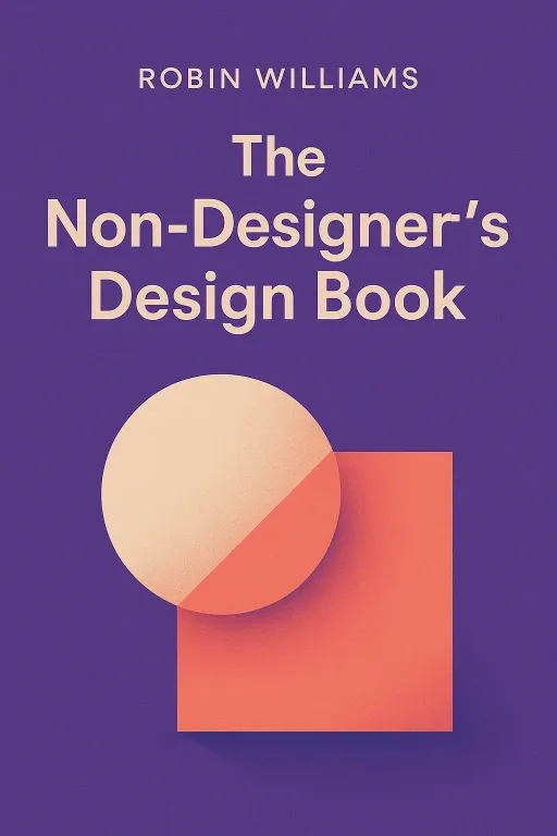
Rachel: Alright Justine, pop quiz. On a scale of one to "I use Comic Sans unironically," how would you rate your graphic design skills? Justine: Oh, that's easy. I'm a solid "When in doubt, center it and make the font bold." My design philosophy is basically shouting, but with typography. I once made a bake sale flyer with five different fonts because I thought it showed personality. It showed chaos. Rachel: The flyer probably looked like a ransom note made by a committee. And you know what? You are the exact person Robin Williams wrote her legendary book for. Today, we are diving into The Non-Designer's Design Book. Justine: I feel seen. And a little attacked. Is this going to be a design intervention? Rachel: It's an empowerment session! What's fascinating is that Williams wrote this back when desktop publishing first became a thing. Suddenly, everyone—secretaries, small business owners, teachers—had the tools to create documents, but they had no instruction manual for making them look good. She saw a world of chaotic flyers and decided to write the missing manual. Justine: She was fighting the good fight against centered, bolded text everywhere. A true hero. So what’s the secret? Is there a magic button I don't know about? Rachel: There are four, actually. But they aren't buttons. They're principles. And once you see them, you can't unsee them. They're the foundation for everything that looks clean, professional, and intentional.
The Four Horsemen of Good Design: Proximity, Alignment, Repetition, and Contrast
SECTION
Justine: Okay, I'm ready. My PowerPoint presentations are depending on this. What's the first principle? Rachel: The first is Proximity. It’s the simplest and maybe the most powerful. It just means you group related items together. Think about a typical, messy business card. The name is in one corner, the phone number is in another, the address is centered at the bottom. Your eye has to jump all over the place to make sense of it. Justine: You're describing every business card I've ever received at a networking event. They're like little visual scavenger hunts. Rachel: Exactly. Proximity says: if the name, title, and company belong together, physically move them close together. Create logical visual units. By grouping them, you immediately tell the reader, "This block of text is one piece of information." It's about creating order out of chaos. Justine: That makes sense. It’s like organizing your kitchen. You put all the spices together; you don't have cinnamon next to the dish soap. Rachel: Perfect analogy. The second principle is Alignment. This is the one that separates the amateurs from the pros. Nothing on the page should be placed arbitrarily. Every element should have a visual connection to another element. Justine: Wait, so my beloved "center everything" strategy is a no-go? It feels so safe and balanced! Rachel: It feels safe, but it often creates a very weak, boring look. A strong edge alignment—flushing everything to the left or right—creates a much cleaner, more dramatic, and more professional impression. Think of an invisible line on your page and connect multiple elements to it. It unifies the entire design. Justine: Okay, I'm starting to see it. A strong line gives the eye something to follow. It feels intentional. What's next? Rachel: Repetition. You repeat visual elements throughout the piece: a bold font, a specific line thickness, a color, a bullet style. Repetition is what creates consistency and brand identity. It’s the visual theme that ties everything together. If you use a bold, sans-serif font for your headlines, use that same style for all the headlines. Justine: So it’s about creating a recognizable pattern. That makes the whole document feel like a single, cohesive piece instead of a bunch of random parts thrown together. I like that. What’s the last one? Rachel: The last one is the fun one: Contrast. This is what makes a design pop. Contrast is about creating visual interest and drawing the eye. If two elements are not the same, then make them very different. Justine: What do you mean by "very different"? Is my slightly-bolder font not enough? Rachel: This is where the author's grandfather comes in with his "Horseshoe Analogy." He used to say, "'Almost' only counts in horseshoes and hand grenades." In design, two fonts that are "almost" the same size or "almost" the same color don't create contrast; they create conflict. It looks like a mistake. Justine: Wow, that’s a fantastic rule for life, not just design. So for contrast to work, it has to be bold and obvious. Rachel: Exactly. Think big type with small type. A thick, heavy line with a thin, delicate one. A warm color with a cool color. The book has this fantastic mantra that applies here: "Don't be a wimp." If you're going to make something different, make it really different. The author shows this incredible "Report Cover Redesign" where a dull, centered page is transformed. They apply proximity, then alignment, then repetition. But the final, jaw-dropping step is adding big, bold black boxes behind some of the text. The contrast is so strong it completely energizes the page. Justine: "Don't be a wimp." I'm going to get that printed on a t-shirt. It’s permission to be bold. So these four principles—Proximity, Alignment, Repetition, and Contrast—are the whole secret? Rachel: They are the foundation. The book is widely acclaimed and has been a bestseller for decades for a reason. It’s because these four simple, learnable principles can take any messy document and instantly make it look more thoughtful, organized, and professional.
Casting Call for Fonts: The Drama of Type Concord, Conflict, and Contrast
SECTION
Justine: Okay, I'm sold on the layout principles. But I have another confession. My documents often look terrible because I get excited and use a dozen different fonts. How do you choose fonts that actually work together? Rachel: That is the perfect question, and it leads us right into the second major idea of the book: the drama of typography. Williams suggests you think of it like a casting director for a movie. You're choosing actors—your fonts—to play roles on the page. Justine: I love that. So some fonts are leading men and others are quirky character actors? Rachel: Precisely. And when you combine them, you can get one of three relationships. The first is Concord. This is when you use only one typeface family. Maybe you use the regular, italic, and bold versions, but they're all clearly related. It creates a calm, harmonious, and formal look. It’s a safe and often beautiful choice. Justine: That’s the "everyone in the cast is from the same famously talented family" approach. It works, but it might not be the most exciting movie. Rachel: Right. Then you have the opposite, which is Conflict. This is what happens when you combine two typefaces that are too similar. The book uses a great example of a wedding invitation that uses two different, fancy script fonts. They're both scripts, but they're not the same. They fight each other. Justine: Oh, I know that feeling! It’s like two singers trying to sing the same note but one is slightly flat. It’s just uncomfortable to listen to—or in this case, to look at. It feels like a mistake. Rachel: That's the perfect way to put it. The similarities are what create the conflict. Which brings us to the third, and most interesting, relationship: Contrast. This is when you combine typefaces that are distinctly different. You're intentionally highlighting their differences to create a dynamic, engaging design. Justine: So this is casting a tall, stoic actor opposite a short, energetic one. Their differences make the scene more interesting. Rachel: Exactly. The wedding invitation example for contrast uses a very bold, modern, sans-serif font for the names, and a light, classic, oldstyle font for the details. The contrast in weight, structure, and style is dramatic and it works beautifully. It creates a clear visual hierarchy and draws your eye in. Justine: Okay, so the big rule is: either go for Concord (total harmony) or go for Contrast (dramatic difference). The danger zone is the middle, which is Conflict. But how do you know which fonts will contrast well? Is there a cheat sheet? Rachel: There is! The book breaks down most typefaces into six basic categories: Oldstyle, Modern, Slab Serif, Sans Serif, Script, and Decorative. The simplest rule for creating good contrast and avoiding conflict is this: don't combine two fonts from the same category. Don't use two Oldstyles, or two Scripts, or two Moderns together. Justine: Whoa, that’s it? That’s the cheat code? So I could pair a Modern font with a Sans Serif, or a Slab Serif with a Script, and it would likely create good contrast? Rachel: It's a fantastic starting point. You're ensuring a contrast of structure right from the beginning. From there, you can amplify the contrast with size, weight, and color. But just by picking from different categories, you've already avoided the primary cause of typographic conflict. Justine: That one tip alone is worth the price of admission. It takes the guesswork out of it. You’re not just randomly picking fonts that "feel right," you’re making an informed choice based on their fundamental structure. Rachel: And that's the whole point of the book. It's not about memorizing a thousand rules. It's about understanding a few core concepts that give you the power and confidence to make conscious, effective design choices. It’s about turning that feeling of chaos into a feeling of control.
Synthesis & Takeaways
SECTION
Rachel: When you really boil it down, all these principles—Proximity, Alignment, Repetition, Contrast, and even the rules of typography—are not just about making things look pretty. Justine: Right. It feels like they're actually principles of clear communication. It’s about respecting the person who is going to be reading your work. Rachel: That’s the deeper insight. Good design is an act of empathy. You're organizing information in a way that's easy for someone's brain to process. You're saving them time and effort. A messy, chaotic design is disrespectful. It makes the reader do all the work. A clean, organized design does the work for them. Justine: And it makes you, the creator, look more credible. When something is well-aligned and has clear contrast, you automatically trust the information more. It feels more authoritative. Rachel: Absolutely. The medium really is the message. A professional-looking design communicates that you are a professional who cares about details. So for anyone listening who feels that "non-designer" anxiety, what's one thing they can do today to start applying these ideas? Justine: I think the most powerful and immediate one is Alignment. Go open a document you've made—a resume, a report, anything. Turn on the rulers or guides in your program, and just force every single element to snap to one or two strong vertical lines. I bet it will instantly look 50% better. Rachel: That's a perfect action step. The book also suggests a fun exercise: find a poorly designed ad in a local paper or online, and just try to redesign it using these principles. You don't even have to be a great artist. Just rearrange the existing elements to create better proximity and a strong alignment. It’s a great way to train your "designer eye." Justine: I love that. And for everyone listening, if you try this, we'd love to see it. Share your design crimes or your "before and after" redesigns with us on social media. Let's see those wimpy designs get a dose of contrast! Rachel: Let's start a movement of bold, intentional design. It all starts with these simple, powerful ideas. Justine: This is Aibrary, signing off.
