The Inequality Illusion
13 minHow Government Biases Policy Debate
Golden Hook & Introduction
SECTION
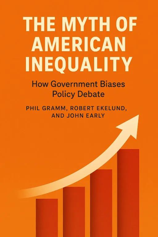
Joe: Here’s a riddle for you, Lewis. Government data says the poorest 20% of American households earn about $13,000 a year. But separate government data shows they spend over $26,000. How can you spend double what you make, every single year? Lewis: Hold on, that can't be right. That sounds like a statistical typo. Are you telling me that an entire quintile of the country is running a 100% deficit year after year? That would break the laws of financial physics. There has to be a catch. Joe: There is a catch, and the answer to that riddle changes almost everything we think we know about inequality in America. That paradox is the central mystery at the heart of the book The Myth of American Inequality: How Government Biases Policy Debate by Phil Gramm, Robert Ekelund, and John Early. Lewis: And these aren't just random commentators throwing bombs from the sideline. One of the authors, John Early, was an assistant commissioner at the Bureau of Labor Statistics. He's an insider who knows exactly how the statistical sausage is made. Joe: Exactly. And that insider knowledge is what makes this book so explosive. It was even named one of the best books of the year by the Wall Street Journal for how it meticulously dismantles the official narrative we hear every day. The book basically argues that the story of runaway inequality is built on a foundation of bad math. Lewis: A foundation laid by the very government agencies that are supposed to be giving us the straight facts. Okay, I'm hooked. Let's solve this riddle. Where does the missing money come from?
The Statistical Illusion: Why Official Numbers Don't Tell the Whole Story
SECTION
Joe: The answer is the key to the book's first, and biggest, argument. The money isn't missing at all. The problem is that the government, in its official poverty and inequality statistics, simply pretends it doesn't exist. Lewis: What do you mean, 'pretends it doesn't exist'? It's either income or it's not. Joe: Well, that's the thing. The official measure of income used by the Census Bureau is called "money income." It's a definition that was created way back in 1947, before the vast majority of our social safety net was even built. And that old definition excludes over two-thirds of all government transfer payments. Lewis: Wait, give me some examples. What kind of payments are we talking about? Joe: We're talking about the biggest anti-poverty programs we have. The Census doesn't count food stamps, or SNAP, as income. It doesn't count housing subsidies. It doesn't count the massive value of Medicare and Medicaid. It doesn't even count the cash payments from refundable tax credits like the Earned Income Tax Credit. Lewis: That is genuinely shocking. You're telling me that if the government gives a family thousands of dollars in housing aid, food assistance, and medical care, the official poverty report that gets cited on the news effectively records that family's income as if they received none of it? Joe: Precisely. The authors dug into the numbers for 2017, and it's staggering. They found that the average household in the bottom 20% received about $45,389 in government transfer payments. But the official Census data only counted about $9,000 of that. It literally ignored over $36,000 of resources per household. That's how a family "earning" $13,000 can spend $26,000. They have other resources that the official scorekeepers are choosing not to see. Lewis: Choosing not to see. That's the part that gets me. It feels less like an oversight and more like a deliberate decision to paint a certain picture. Why would they stick with such an outdated and obviously flawed measurement? Joe: The book suggests it's a mix of bureaucratic inertia—it's just 'how it's always been done'—and the fact that this flawed number has become politically useful. A higher poverty rate justifies bigger budgets and more government programs. The narrative of crisis fuels political careers. But the authors' main point is that it's just bad science. Lewis: Okay, so they're undercounting income at the bottom. What about the other end of the spectrum? How do they measure income for the wealthy? Joe: That's the other side of the coin. The Census measures income for the top quintile before they pay taxes. So, we have a situation where we're not counting massive government benefits for the poor, and we're not subtracting massive tax payments from the rich. The result is a statistical funhouse mirror that dramatically exaggerates the gap between the top and bottom. Lewis: So what does the real picture look like, according to the book? Joe: When the authors correct for these two things—counting all transfers as income and subtracting all taxes paid—the numbers completely flip. The official Census data for 2017 shows the top 20% of households having 16.7 times more income than the bottom 20%. A massive gap. But after you make the corrections, that ratio plummets to just 4-to-1. Lewis: From almost 17-to-1 down to 4-to-1. That's a fundamentally different country. But let me push back a bit, because this is where the book gets controversial. Critics would say this feels like a conservative argument designed to minimize the problem of inequality. Are they just cherry-picking data to say everything's fine? Joe: The authors are clear they aren't saying inequality doesn't exist. What they're arguing is that the scale of the problem and, crucially, the trend over the last 50 years, have been completely distorted. They believe we're having a furious political debate and designing massive policies based on a number that is, to quote the book's opening line from Mark Twain, something "you know for sure that just ain't so." Lewis: And when you're making policy for a country that you think has a 17-to-1 inequality ratio, you're going to make very different decisions than if you knew the reality was closer to 4-to-1. Joe: Exactly. And that leads directly to the book's most provocative and, I think, most challenging argument. The transfer payments have been incredibly successful in closing that gap and reducing material hardship. But they came with a huge, unintended consequence.
The Great Decoupling: How Welfare Changed Work
SECTION
Lewis: Okay, so what's this unintended consequence? If we've successfully transferred resources to lift people out of material poverty, isn't that a win? Joe: It is a win, in one sense. The authors don't dispute that. But they argue it created what they call "the great decoupling." A decoupling of low-income households from the workforce. Lewis: Ah, the classic argument that welfare creates a disincentive to work. This is a very old debate. What new evidence do they bring to the table? Joe: They bring some pretty stark numbers. They point out that in 1967, before the massive expansion of the welfare state, 68 percent of prime work-age adults in the bottom quintile had jobs. By 2017, that number had fallen off a cliff to just 36 percent. Lewis: Wow, a drop of nearly half. That's a dramatic shift in the labor participation of an entire segment of the population. Joe: It is. And they connect this back to the original promise of the War on Poverty. They quote President Lyndon B. Johnson, who said the goal was not just to support people, but "to give people a chance... to allow them to develop and use their capacities." The authors ask a tough question: has the system we built achieved the first goal—material support—by sacrificing the second goal of empowerment and self-sufficiency? Lewis: This gets into the 'welfare cliff' idea, right? Where if you're receiving benefits and you start to earn more money, your benefits get cut so sharply that you can actually end up with less disposable income. You're effectively punished for working more. Joe: That's a huge part of it. They argue that the system, while well-intentioned, has inadvertently made work less financially attractive for many. When you can receive a package of benefits that gets you to a certain standard of living, the incentive to take a low-wage job that might cause you to lose those benefits is significantly reduced. Lewis: It's like the government is offering a safety net, but it's so comprehensive that it accidentally becomes a hammock. It catches you, but it also might make it too comfortable to get back up and start climbing again. Joe: That's a perfect analogy for their argument. And they're not just being philosophical. They're pointing to the data showing a massive decline in work among the very people these programs are designed to help. They argue this has profound social consequences beyond just economics. It affects dignity, community, and the passing of a work ethic to the next generation. Lewis: This is definitely the most controversial part of the book. It challenges the core of the modern social safety net. But it's a powerful point. If the goal is human flourishing, not just material sustenance, then you have to ask if the current system is truly succeeding. It forces you to look beyond just the income numbers. Joe: And that's their whole point. The numbers we use are flawed in more ways than one. It's not just about income. It's also about how we measure our overall progress and well-being.
Redefining Progress: Beyond Income to Well-Being
SECTION
Lewis: Okay, so we've established the income and poverty stats are skewed. But what about the general feeling that many people have that life is just getting more expensive, that real wages have been stagnant for decades? That's a powerful narrative. Joe: It is, and the authors argue that narrative is also fueled by a statistical illusion. This is the final piece of their puzzle: our primary tool for measuring inflation, the Consumer Price Index or CPI, is also deeply flawed. Lewis: How so? I thought the CPI was the gold standard for tracking the cost of living. Joe: It's what we use, but the book argues it systematically overstates inflation because of two key biases. The first is "substitution bias." When the price of beef goes up, people buy more chicken. The CPI is slow to capture that, so it overestimates how much the price hike actually hurt people's wallets. But the bigger one is "new product bias." Lewis: New product bias? What's that? Joe: The CPI is terrible at measuring the value of innovation. It can track the price of a phone or a car, but it can't really capture the massive improvement in quality and capability. And the book uses a brilliant, powerful example to illustrate this: the treatment of peptic ulcers. Lewis: I'm listening. How does a stomach ulcer explain inflation? Joe: In the 1960s, if you had a bad ulcer, the treatment was often invasive surgery. It meant a week in the hospital, a long, painful recovery, and it cost thousands of dollars in today's money. The outcome was uncertain. Today, we know most ulcers are caused by a bacteria. The treatment? A course of antibiotics that costs maybe fifty bucks. Lewis: Right. A complete revolution in treatment. Better outcome, dramatically lower cost. Joe: Exactly. But how does the CPI measure that? It struggles. It's still tracking the price of a surgeon's time and a hospital bed, items that are no longer relevant for most ulcer patients. It fails to capture the immense value created by the medical breakthrough—the fact that a life-altering problem was solved for a tiny fraction of the cost and suffering. Lewis: Wow. So our official inflation number is systematically under-valuing progress. It's measuring the cost of the tools but not the value of the cure. When you multiply that effect across thousands of innovations—from smartphones replacing a dozen different devices to streaming services replacing expensive cable—the distortion must be huge. Joe: It's massive. The authors argue that this overstated inflation makes real wage growth look stagnant when it's actually been quite strong. It makes us feel poorer on paper than we are in reality. When they apply a more accurate inflation measure, they find that the vast majority of American households today have a standard of living that would have placed them in the top 20% back in the 1960s. Lewis: That's an incredibly optimistic take, and it runs completely counter to the prevailing mood of economic anxiety. It suggests the American dream of generational progress is alive and well, but we've just been using a broken thermometer to measure it. Joe: That's the core of their conclusion. The story of the last 50 years isn't one of stagnation and decay, but one of broadly shared prosperity that has been rendered invisible by a fog of bad statistics.
Synthesis & Takeaways
SECTION
Joe: So when you put all three pieces together—the miscounting of income from transfers, the ignoring of taxes paid, and the use of flawed inflation metrics—the book's case becomes clear. The dominant political and media narrative of a broken, deeply and increasingly unequal America is largely a myth, built on a foundation of statistical quicksand. Lewis: It really makes you question so much. If the data we're all using for these critical debates is this wrong, how many of our fiercest political arguments are just shouting matches about a fictional reality? We're arguing about the wallpaper in a house that might not even be built the way we think it is. Joe: And that's the ultimate plea of the book. The authors aren't saying America has no problems. They are saying that before we perform radical surgery on our economic system based on a diagnosis of rampant inequality, we should at least make sure our X-rays aren't faulty. The first step is demanding better, more honest statistics from our own government. Lewis: It's a powerful and, for many, a deeply controversial argument. It challenges the work of people like Thomas Piketty and the entire progressive worldview on economics. But it does so with data, not just rhetoric. It leaves me wondering, does this statistical picture resonate with people's lived experiences, or does it feel like it's missing a piece of the human story? Joe: That's the million-dollar question, isn't it? The gap between data and feeling. We'd love to know what our listeners think. Does this corrected picture of American prosperity feel true to you, or does the narrative of struggle and inequality still feel more real? Let us know your thoughts. Lewis: It’s a conversation we need to have with the right numbers on the table. Joe: This is Aibrary, signing off.
