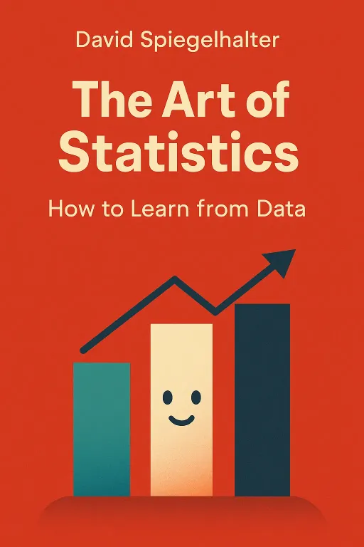
The Art of Statistics
How to Learn from Data
Introduction
Narrator: For over two decades, a mild-mannered family doctor in a suburb of Manchester, England, went about his work. Dr. Harold Shipman was, by all accounts, a pillar of the community. Yet, beneath this veneer of respectability, he was committing murder on an unimaginable scale, ending the lives of at least 215 of his mostly elderly patients with lethal injections of diamorphine. His crimes went undetected for years, shielded by the age of his victims and his position of trust. How could such a pattern of evil remain invisible for so long? The answer, and the key to its eventual discovery, lies not in a detective's hunch, but in the cold, hard logic of numbers. The case of Harold Shipman is a chilling reminder that data, when properly interrogated, can tell stories that would otherwise remain hidden. In his book, The Art of Statistics: How to Learn from Data, Professor David Spiegelhalter provides the essential toolkit for this interrogation, revealing that statistics is not a dry, abstract science, but a powerful art form for understanding the world.
The Art of Persuasion: How Framing Shapes Our Reality
Key Insight 1
Narrator: Statistics are never truly neutral; their presentation is a powerful act of communication that can either clarify or mislead. The way a number is framed can dramatically alter its emotional impact. This was tragically illustrated in the Bristol Royal Infirmary scandal of the 1990s, where an unusually high number of children died after heart surgery. When the data was finally analyzed, it was revealed that between 1991 and 1995, there had been 30 more deaths than would be expected compared to national averages.
Communicating this risk is a delicate task. Presenting a "98% survival rate" sounds reassuring and focuses on a positive outcome. However, framing it as a "2% mortality rate" shifts the focus to the tragic loss of life, creating a much more alarming impression. Spiegelhalter shows how this extends to everyday risks. When the World Health Organization announced that eating 50g of processed meat daily was associated with an 18% increased risk of bowel cancer, headlines screamed about the dangers of bacon. Yet, this relative risk is misleading. A more honest communication uses absolute risk: out of 100 people who don't eat bacon daily, about 6 will get bowel cancer. If 100 people ate a bacon sandwich every day, that number would rise to 7. The risk is real, but the framing determines whether it sounds terrifying or manageable. This demonstrates that the first step in statistical literacy is understanding that numbers don't speak for themselves—we give them meaning through the stories we choose to tell.
Beyond the Average: Uncovering the True Shape of Data
Key Insight 2
Narrator: When faced with a mountain of data, the human instinct is to simplify it into a single, representative number, often the "average." But as Spiegelhalter demonstrates, the choice of average matters immensely. In 1907, the scientist Francis Galton observed a contest where 787 people guessed the weight of an ox. Galton, a pioneer of statistics, collected the guesses. The average guess (the mean) was 1,208 pounds. The actual weight was 1,198 pounds—remarkably close. However, Galton wisely chose the median, the middle value in the ordered list of guesses, which was 1,207 pounds.
Why the distinction? The mean is highly sensitive to extreme outliers. In a similar, more recent experiment where people guessed the number of jelly beans in a jar, the mean guess was 2,408, skewed by a few wildly high guesses. The median, however, was 1,775, much closer to the true number of 1,616. The median represented the "wisdom of the crowd" far more accurately because it wasn't distorted by the extremes. This principle is vital when analyzing skewed data, such as income levels or, as the book explores, the number of sexual partners people report. Looking only at the mean can create a distorted picture of reality, while understanding the full distribution of data, through tools like medians and histograms, reveals a much richer and more accurate story.
The Seductive Lie: Why Correlation Doesn't Equal Causation
Key Insight 3
Narrator: It is a deep human need to find reasons for things, to connect events in a chain of cause and effect. Statistics can reveal powerful associations, but it can also lay traps for the unwary. The most common trap is mistaking correlation for causation. A Swedish study, for example, found that men with higher levels of education had a slightly increased rate of brain tumor diagnosis. A university press office, eager for a headline, announced that "High levels of education are linked to heightened brain tumour risk," which a newspaper then sensationalized into "Why Going to University Increases Risk of Getting a Brain Tumour."
The reality was far more mundane. The study's authors noted that wealthier, more educated people are simply more likely to seek medical care and have their tumors diagnosed and registered—a phenomenon known as ascertainment bias. The education wasn't causing the tumors; it was causing the diagnosis. Similarly, the media once reported that a nearby Waitrose supermarket "adds £36,000 to house price." This is a classic case of reverse causation: Waitrose doesn't increase house prices; it strategically opens stores in already wealthy areas. Spiegelhalter cautions that before we can claim one thing causes another, we must rule out confounding factors, reverse causation, and other "lurking variables."
Building a Crystal Ball: From Regression to Predictive Algorithms
Key Insight 4
Narrator: If correlation isn't causation, what can we do with it? One of the most powerful applications is prediction. Using techniques like regression analysis, statisticians can build models that predict an outcome based on a set of explanatory variables. The book uses the tragic sinking of the Titanic as a case study. We have data on over 1,300 passengers: their age, gender, ticket class, and whether they survived.
Using this data, it's possible to build a classification tree—a type of algorithm—to predict survival. The algorithm learns from the data, finding that the most important predictor was being male, which drastically lowered survival chances. For the remaining passengers, ticket class was the next crucial factor, followed by age. This model can then be tested on a new set of data to see how accurately it predicts outcomes. However, this process is fraught with peril. It's easy to create a model that is perfectly "over-fitted" to the training data, capturing every random quirk, but which fails completely when applied to new situations. The art lies in building a model that captures the true underlying signal without being fooled by the noise.
The Certainty of Uncertainty: Embracing the Margin of Error
Key Insight 5
Narrator: In January 2018, the news reported that UK unemployment had fallen by 3,000. This was presented as a hard fact. However, this number was an estimate derived from a survey, and it came with a crucial, but often ignored, piece of information: a margin of error of ±77,000. This means the true change could have been anything from a fall of 80,000 to a rise of 74,000. The reported change of 3,000 was statistically meaningless.
Spiegelhalter argues that one of the most vital skills in statistics is acknowledging and quantifying uncertainty. Every estimate from a sample comes with a range of plausible values for the true population parameter. This range is the confidence interval, often expressed as a margin of error. Techniques like bootstrapping—where a computer simulates taking thousands of new samples from the original one—allow statisticians to calculate these intervals without making complex mathematical assumptions. Acknowledging this uncertainty is not a sign of weakness; it is the hallmark of honest and reliable statistical science.
When Science Goes Wrong: The Dead Salmon and the Reproducibility Crisis
Key Insight 6
Narrator: In 2009, researchers placed a 4lb Atlantic salmon—which was "not alive at the time of scanning"—into an fMRI machine. They showed it a series of photographs of human faces and looked for brain activity. Astonishingly, they found it. A small cluster of voxels in the fish's brain lit up, showing a statistically significant response. Was this evidence of paranormal perception in deceased fish? No. It was a brilliant demonstration of the dangers of multiple testing.
The researchers had scanned over 8,000 sites in the salmon's brain. By pure chance, some of those sites were bound to show a random fluctuation that met the threshold for "significance." This problem, writ large, is a major contributor to the "reproducibility crisis" in science, where many published findings cannot be replicated by other researchers. The pressure to publish, combined with questionable research practices like "P-hacking" (tweaking an analysis until it yields a significant result), has led to a flood of false-positive claims. This story serves as a hilarious but powerful warning against the misuse of significance testing and the importance of robust, pre-planned analysis.
Conclusion
Narrator: The ultimate lesson of The Art of Statistics is that learning from data is a structured, humble, and deeply human endeavor. It is not about applying complex formulas blindly, but about following a rigorous problem-solving cycle: defining the Problem, creating a Plan, collecting Data, performing the Analysis, and communicating the Conclusion. This PPDAC cycle is the backbone of trustworthy statistical work. Spiegelhalter's greatest contribution is to demystify the process, showing that the core of statistics is not mathematics, but a disciplined form of critical thinking.
The book challenges us to move beyond being passive consumers of numbers and to become active, critical participants in the stories that data tells. The next time you see a headline proclaiming a new risk or a miraculous discovery, ask the right questions: What is the absolute risk? Is this correlation or causation? What is the uncertainty around this estimate? By arming us with these questions, Spiegelhalter empowers us to navigate a world saturated with data, not with fear or cynicism, but with a healthy, informed skepticism.
