The Art of the Obvious
15 minGolden Hook & Introduction
SECTION
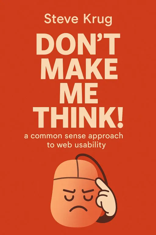
Joe: Alright Lewis, I've got a book title for you: Don’t Make Me Think! What's your first guess? A manual for surviving family holidays? Lewis: No, no. That's clearly the autobiography of my cat. Or maybe a political manifesto for the modern era. Just... exist. Don't engage the brain. Joe: I love that. And honestly, you're not that far off. We're talking about the digital world's equivalent of that manifesto. The book is Don't Make Me Think! A Common Sense Approach to Web Usability by Steve Krug. Lewis: Web usability. Okay, that sounds a little less exciting than a feline memoir. Why are we talking about a book that sounds like a technical manual? Joe: Because it’s the exact opposite. Krug is a user experience consultant, and he wrote the first edition of this book way back in 2000, right in the middle of the dot-com crash. All these websites were being built by engineers, for engineers, and they were a nightmare to use. They were complicated, confusing, and frustrating. Lewis: I remember some of those. You needed a PhD just to buy a book online. Joe: Exactly. So Krug wrote this incredibly short, funny, and practical book to make the core ideas of usability accessible to everyone—designers, developers, managers, anyone. And what's amazing is that even though the technology has changed dramatically, the book's principles are more relevant than ever. They're not about code; they're about human psychology. Lewis: Okay, so it's not about my cat. But 'Don't Make Me Think' sounds so simple. Is that really the big secret to making a good website?
The First Law of Usability: Don't Make Me Think!
SECTION
Joe: That is the big secret. It’s Krug's First Law of Usability. When you land on a webpage, it should be self-evident. Obvious. You shouldn't have to pause, even for a millisecond, and ask yourself, "What is this? Where do I click? Is that a button or just a weirdly shaped picture?" Lewis: I know that feeling. It's the tiny little papercut of frustration that builds up. You're looking for job openings on a company's site, and instead of a button that says "Jobs" or "Careers," it says something clever like "Your Future Awaits" or "Join the Odyssey." Joe: You've just hit on one of Krug's classic examples. That cleverness, that marketing-speak, it makes you think. It introduces a question mark into your mental process. And every one of those question marks erodes a tiny bit of your confidence and goodwill towards that site. Krug argues that your job as a designer is to get rid of the question marks. Lewis: But do people really care that much? We're all used to a bit of confusion online, aren't we? Joe: We are, but we shouldn't have to be. And Krug says this is because we fundamentally misunderstand how people actually use the web. He lays out three facts of life. The first is: we don't read pages, we scan them. Lewis: Oh, one hundred percent. I look for big headlines, bullet points, and words in bold. I'm like a hawk searching for keywords in a field of text. Joe: We all are. We're in a hurry. We're on a mission. We don't have time to read the charming introductory paragraph. This is why Krug has a second law that's almost as important as the first: "Get rid of half the words on each page, then get rid of half of what’s left." Lewis: I love that. It's brutal. So all that "happy talk," the "Welcome to our amazing, innovative platform," just needs to go. Joe: It's just noise. It's like a person at a party who won't stop talking about themselves. You just want to get away. The second fact of life is even more important: we don't make optimal choices. We satisfice. Lewis: Satisfice? What does that mean? Is that a mix of satisfy and suffice? Joe: It is. It's a term from economics. It means we don't look for the best option; we look for the first reasonable option. Think about it. You're on a huge e-commerce site looking for a new coffee maker. Do you meticulously compare the specs of all 200 models? Lewis: Absolutely not. I scroll, I see one that has good reviews and isn't ridiculously expensive, and I click 'Buy Now.' My brain is already on to the next thing. Joe: You just satisficed. And we all do it because optimizing is hard work. The penalty for making a less-than-perfect choice on the web is usually tiny. If you click the wrong link, you just hit the back button. Krug tells this great story about a researcher named Gary Klein who studied how fireground commanders make life-or-death decisions. He found they don't sit there comparing two or three different plans. They use their experience to come up with the first workable plan, and if it feels right, they go with it. Lewis: Wow. So if a firefighter under immense pressure is satisficing, my decision about which coffee maker to buy probably doesn't need a spreadsheet. Joe: Exactly. And this brings us to the third and most humbling fact of life: we don't figure out how things work. We muddle through. Most people have wildly inaccurate mental models of how the internet, or even a simple website, actually functions. But it doesn't stop them. Lewis: Can you give an example? Because that sounds a bit harsh. Joe: Krug shares this incredible story from his early usability testing days. He would watch people who, every single time they wanted to go to a website, would first go to the Yahoo homepage and type the full URL, like 'www.amazon.com', into the Yahoo search box. Lewis: No way. Instead of the address bar at the top of the browser? Joe: Yes. And when asked, some of them explained that, to them, Yahoo was the internet. That was their mental model. It was completely wrong, but it worked for them. They muddled through. They were like the pauper in Mark Twain's novel who used the Great Seal of England as a nutcracker. It worked, but he had no idea what it was actually for. Lewis: That is both hilarious and a little terrifying. So as a designer, you have to assume the user has no idea what they're doing, is in a massive hurry, and will click the first thing that looks vaguely correct. Joe: That's the reality. And once you accept that people are basically impatient, satisficing, muddling scanners, it completely changes how you should design a page.
Designing for Scanners: Building Billboards, Not Novels
SECTION
Lewis: Okay, so if we're not writing a detailed instruction manual for a rational user, what are we doing instead? Joe: Krug's analogy for this is brilliant: you're not writing a novel, you're designing a billboard. Lewis: A billboard? Like on the side of the highway? Joe: Precisely. You have about three seconds to get your message across to someone speeding past at 70 miles per hour. There's no room for cleverness or ambiguity. It has to be instantly understood. He tells this wonderful story about the old Burma-Shave ads from the 1930s. Lewis: I think I've seen pictures of those. Weren't they a series of small signs? Joe: They were. A series of six small red signs, spaced out along the highway. Each one had one line of a rhyming jingle, and the last sign just said "Burma-Shave." It was genius. It was scannable, sequential, and you couldn't help but read them all to get the punchline. That's what a good webpage should do. It should guide your eye through a clear visual hierarchy. Lewis: So you're talking about things like having the most important headline be the biggest thing on the page? Joe: That's the most basic level of it, yes. But it's also about grouping related things together visually, and nesting things to show what's part of what. It's what newspapers have been doing for centuries. You glance at the front page and you instantly know what the biggest stories are, which articles are related, and where the sports section begins. It preprocesses the page for you. Lewis: That makes sense. But a big part of that newspaper design is that it follows a pattern. You know where to expect things. What's the web equivalent of that? Joe: That's the second principle of billboard design: take advantage of conventions. Conventions are your best friends. Things like having the site logo in the top-left corner and making it a link to the homepage. Or the universal icon for a shopping cart. Lewis: But isn't it boring if every website looks the same? Don't designers want to be creative and innovate? Joe: They do, and that's a huge point of tension. But Krug has a great rule for this. He says you should only break a convention if your new idea is either so blindingly clear that it needs zero learning curve, or it adds so much value that it's worth a small learning curve. If you can't say "Wow!" to your own idea, just use the convention. Don't reinvent the wheel, especially when it's a wheel everyone already knows how to use. Lewis: That feels like a good reality check for a lot of designers. So, clear hierarchy, use conventions... what else makes a good billboard? Joe: Making it obvious what's clickable. And designing clear navigation. Krug calls this "Street Signs and Breadcrumbs." He compares navigating a website to his experience shopping for a chainsaw at a big department store like Sears. You walk in, you scan the big signs on the wall for "Tools" or "Garden," then you look at the signs at the end of the aisles, then you scan the shelves. Lewis: You're following a scent. You're narrowing it down. Joe: Exactly. A website needs those same signs. Every page needs a clear name, like a street sign, that's prominently displayed. And you need "You are here" indicators, so the user knows where they are in the site's structure. And breadcrumbs—that little trail of links at the top of the page that shows you the path you took to get there. Lewis: Right, like Home > Tools > Power Saws > Chainsaws. So you can easily go back up a level. Joe: It gives you a sense of place, which is something we desperately lack on the web. There's no sense of scale or direction. Breadcrumbs anchor you. Lewis: This brings up another one of Krug's laws, doesn't it? The idea that the number of clicks doesn't matter as much as we think. Joe: Yes! His Second Law of Usability: "It doesn’t matter how many times I have to click, as long as each click is a mindless, unambiguous choice." The old "three-click rule" is a myth. People will happily click ten times if each click is easy, obvious, and reassures them they're on the right path. It's the clicks that require thought and create anxiety that kill the experience. Lewis: That's a huge insight. It's not about the quantity of clicks, but the quality of the choice. But this all sounds so logical. It sounds like common sense. Why is it so hard to get right? Joe: Because it all falls apart when you put five smart people in a room together.
The Ultimate Tie-Breaker: Why Testing Beats 'Religious Debates'
SECTION
Lewis: What do you mean? It seems like a team of smart people should be able to agree on these principles. Joe: You would think so. But Krug says that most web design teams spend a shocking amount of time in what he calls "religious debates." Lewis: Religious debates? About what color a button should be? Joe: About everything. Should we use a pulldown menu here? Is this language too formal? Is that picture too big? He calls them religious debates because they consist of people expressing strongly held personal beliefs about things that can't be proven. Everyone has an opinion. Lewis: Oh, I know that meeting. The marketing person says, "My dad would never understand this." The developer says, "But it's more efficient this way." The designer says, "But it ruins the aesthetic." And nothing gets decided. Joe: That is the exact scenario Krug describes. He tells a story about a team arguing over a pulldown menu. The designer wants it to save space. The marketing guy, Rick, hates pulldowns. The developer, Bob, asks if there's any research. Rick just says, "I don't need research. I just hate them." Two weeks later, they're having the exact same argument. It's a total waste of time and energy. Lewis: It's a stalemate of opinions. So what's the antidote? How do you break the tie? Joe: You stop arguing and you start testing. This is Krug's ultimate solution. Don't ask, "Do people like pulldown menus?" Instead, build two quick versions of the page—one with the pulldown, one without—and watch three people try to use them. The answer will become obvious, very quickly. Lewis: So you don't need a fancy usability lab with two-way mirrors and scientists in white coats? Joe: Not at all. He's a huge advocate for "discount" usability testing. Do it yourself, do it cheap, and do it often. Once a month, grab three people, give them a hundred bucks, and watch them try to perform a few basic tasks on your site for an hour. Buy them pizza. The whole team should watch. Lewis: And what do you learn from that? Joe: You learn humility. You see all the things you thought were obvious that are actually completely confusing. You see people get stuck on things you never even considered. Krug says the most common thing people say after their first usability test is, "Why didn't we do this sooner?" He tells a story about a workshop attendee who did a ten-minute live test on their site. They made one change based on that test, and it saved their company a hundred thousand dollars. Lewis: A hundred thousand dollars from a ten-minute test. That's an insane return on investment. Joe: It's because testing moves the conversation away from the realm of opinion and into the realm of what works and what doesn't. It's not about proving who was right. It's about finding and fixing problems. Krug has this fantastic analogy for it. He says the Marx Brothers used to test their movie scenes on the vaudeville circuit. They'd perform a scene, and if a joke didn't get a laugh, they'd change it. If it got a small laugh, they'd tweak it to get a bigger laugh. By the time they filmed the movie, every single line was a tested, proven winner. Lewis: They were doing iterative usability testing on their comedy. That's brilliant. So in the end, all these laws and principles—don't make me think, design billboards, test your work—it all comes down to something simpler, doesn't it? Joe: It does. Krug calls it "Usability as Common Courtesy." It's about being a good host. It's about anticipating your user's needs, answering their questions before they have to ask, and making things easy for them. It's about respecting their time and their attention.
Synthesis & Takeaways
SECTION
Lewis: That's a really powerful way to frame it. It's not a technical discipline, it's a form of hospitality. Joe: Exactly. And that's the genius of this book. It took a field that was becoming very specialized and expensive and brought it back to its human core. Krug argues that every time a user visits your site, they arrive with a small reservoir of goodwill. Every time you make them think unnecessarily, hide information they need, or make them feel stupid, you drain a little bit of that goodwill. Lewis: And if the reservoir runs dry, they just leave. And they probably don't come back. Joe: They're gone. The competition is always just one click away. But if you do the opposite—if you make things clear, save them steps, and provide the information they need—you fill that reservoir up. You build trust. Lewis: So the one thing our listeners can do today, whether they're designing a website or just writing a team-wide email, is to step back and ask: "Am I making someone think unnecessarily?" Just asking that one question seems like a huge first step. Joe: It's everything. It's the start of a more considerate, more human-centered way of building things. The core of Don't Make Me Think! is that the digital world isn't fundamentally a technical space; it's a human space. And the best designs aren't the most technologically advanced or the most visually stunning. They're the most considerate. Krug's great contribution was to show that this isn't rocket surgery. It's common sense. Lewis: I love that. And we'd love to hear from you. What's the most frustrating website you've used recently? What was the thing that made you think way too hard? Share your stories with the Aibrary community. We could all use a little group therapy. Joe: Absolutely. Let's hear those usability horror stories. Lewis: This is Aibrary, signing off.
