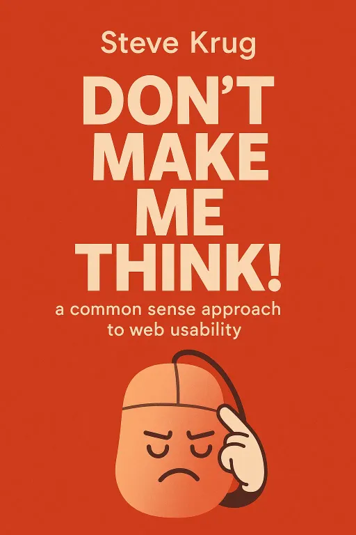
Don’t Make Me Think! a common sense approach to web usability
Introduction
Narrator: Imagine a firefighter arriving at a burning building. The commander doesn't pull out a spreadsheet to analyze every possible entry point and hose configuration. They don't weigh the pros and cons of ten different strategies. Instead, they rely on experience and a quick assessment to choose the first reasonable plan that comes to mind, and they execute it. This isn't carelessness; it's a survival strategy for high-pressure situations. Now, what if the way we use the internet is more like fighting a fire than we think? In his seminal book, Don’t Make Me Think!, usability expert Steve Krug argues that this is precisely the case. He reveals that the most fundamental principle of web design isn't about dazzling visuals or complex features, but about eliminating the one thing that drives users away: unnecessary thought.
The First Law of Usability is Don't Make Me Think
Key Insight 1
Narrator: At the heart of Krug's philosophy is a single, powerful rule: when a person looks at a webpage, it should be self-evident, obvious, and self-explanatory. Users shouldn't have to spend even a millisecond pondering what to do next. Every element that causes a user to pause and ask, "What is this?" or "Can I click that?" is a "question mark" that adds to their cognitive load. This mental friction erodes their confidence and patience.
Krug illustrates this with a simple scenario. Imagine a friend tells you that XYZ Corp is hiring. You go to their website to find the job listings. You scan the page, looking for a link that says "Jobs," "Careers," or "Employment." But what if the company, in an attempt to be clever, has named the section "Job-o-Rama" or "Opportunities"? Suddenly, you have to stop and think. You have to decipher the company's internal jargon. This tiny moment of confusion is a paper cut to the user experience. A few too many, and the user will bleed out their patience and leave. The goal, Krug insists, is to get rid of the question marks. When you’re creating a site, your job is to make every page so clear that a user can instantly understand what it is and how to use it, because on the internet, the competition is always just one click away.
Users Don't Read, They Scan and Satisfice
Key Insight 2
Narrator: Designers often operate under the illusion that users will carefully read through a webpage, absorbing every word and appreciating the thoughtful layout. Krug shatters this myth with three realities of user behavior. First, users don't read; they scan. They are on a mission, and they glance over pages looking for keywords, phrases, and visual cues that are relevant to their goal.
Second, users don't optimize; they satisfice. This is where the firefighter story comes in. Researcher Gary Klein studied fireground commanders and found they didn't compare multiple options to find the best one. They chose the first workable option they could find. Web users do the same. They don't look for the best choice; they look for the first reasonable one. Optimizing is hard and time-consuming; satisficing is efficient.
Third, users don't figure out how things work; they muddle through. Most people have incomplete and often incorrect mental models of how the internet works. Krug tells a story of watching users in usability tests who, instead of typing a URL into the browser's address bar, would go to Yahoo's homepage and type the full URL into the search box every single time. It worked, so they never learned the "correct" way. For designers, this means a site must be built to be forgiving and intuitive, allowing users to succeed even if they don't understand the underlying mechanics.
Design for Scanning, Not Reading
Key Insight 3
Narrator: If users are scanning, then websites must be designed like billboards, not novels. Krug outlines several principles for creating scannable pages. The most important is establishing a clear visual hierarchy. Just like a newspaper uses large headlines for major stories and smaller ones for less important articles, a webpage should use size, color, and placement to guide the user's eye to the most important elements first. This pre-processes the page for the user, saving them the effort of figuring out what matters.
Another key principle is to take advantage of conventions. Conventions are the established patterns of web design—the logo in the top-left corner, navigation across the top, a shopping cart icon in the top-right. Reinventing these conventions forces users to learn a new system, adding to their cognitive load. Krug's advice is blunt: innovate only when you are certain you have a better idea. Otherwise, stick to the conventions that users already understand. Finally, designers must minimize visual noise. This includes not just busy backgrounds and excessive graphics, but also the clutter of unnecessary words, which leads to his next major insight.
Omit Needless Words
Key Insight 4
Narrator: Drawing from the classic writer's guide The Elements of Style, Krug presents his third law of usability: "Get rid of half the words on each page, then get rid of half of what’s left." He argues that web writing should be ruthless in its conciseness. There are two main culprits to eliminate. The first is "happy talk"—the introductory, self-congratulatory text that welcomes users and explains how great the site is. Users ignore this. It's just noise that gets in the way of the information they're actually looking for.
The second is unnecessary instructions. If a feature is well-designed, it shouldn't need a paragraph of explanation. Long instructions can make a simple task seem more complicated than it is, intimidating users before they even start. By cutting out this verbal clutter, the useful content becomes more prominent, pages become shorter, and users can scan and find what they need with far less effort.
Navigation Must Be Mindless and Consistent
Key Insight 5
Narrator: Krug challenges another common myth: that the goal of web design is to minimize the number of clicks. He proposes a second law of usability: "It doesn’t matter how many times I have to click, as long as each click is a mindless, unambiguous choice." He offers a simple rule of thumb: three mindless, unambiguous clicks are equal to one click that requires thought. The frustration isn't in the clicking; it's in the uncertainty.
To achieve this, navigation must be designed with absolute clarity and consistency. Krug compares it to navigating a department store like Sears. You use large signs to find the right department, then aisle signs to narrow your search. On a website, this is achieved through persistent navigation—the set of elements like the site ID, sections, and search bar that appear on every single page. This consistency reassures users and helps them build a mental map of the site. Page names should act like street signs, clearly telling users where they are. And breadcrumbs—the "You are here: Home > Section > Subsection" links—provide a clear path back, preventing users from feeling lost.
Testing is the Antidote to Religious Debates
Key Insight 6
Narrator: Web design teams are famous for having endless, circular arguments about what users want. A designer might love pulldown menus, while a marketing manager insists they are confusing. Krug calls these "religious debates" because they are based on strongly held personal beliefs rather than provable facts. The problem is that the "Average User" is a myth. All users are unique and their behavior is idiosyncratic.
The only way to settle these debates is to stop arguing and start testing. Krug is a passionate advocate for simple, cheap, do-it-yourself usability testing. You don't need a fancy lab or a large budget. The formula is simple: find three or four users, ask them to perform common tasks on your site, and watch what happens. He argues that testing one user is 100 percent better than testing none, and testing with a small group early in the project is far more valuable than testing with 50 users right before launch. Testing moves the conversation away from subjective opinions and into the realm of what actually works, defusing arguments and revealing the real problems that need to be fixed.
Good Usability is Common Courtesy
Key Insight 7
Narrator: Ultimately, Krug frames usability not just as a technical discipline, but as a form of respect for the user. He suggests that every user arrives at a site with a "reservoir of goodwill." Every time the site is confusing, frustrating, or disrespectful, that reservoir drains. Hiding important information, like shipping costs, until the last minute drains goodwill. Asking for unnecessary personal information on a signup form drains goodwill. Using manipulative language or flashy ads that get in the way drains goodwill.
Conversely, every time a site makes something easy, anticipates a user's question, or saves them a step, it adds to that reservoir. Making it obvious what's clickable, providing printer-friendly pages, and writing clear error messages are all acts of courtesy that build trust. A usable site, Krug concludes, is one that behaves like a "mensch"—a Yiddish word for a person of integrity and honor. It's a site that is considerate, helpful, and respectful of the user's time and intelligence.
Conclusion
Narrator: The single most important takeaway from Don’t Make Me Think! is that usability is not about technology; it's about empathy. It's the practice of putting yourself in the user's shoes and designing an experience that is as effortless and intuitive as possible. The core principles are not complex algorithms but simple truths about human behavior: people are in a hurry, they scan for information, and they appreciate clarity over cleverness.
The book's most challenging idea is its relentless focus on simplicity and the removal of anything that doesn't serve the user's primary goal. This requires designers and stakeholders to set aside their own egos and internal jargon. So, the next time you visit a website, try what Krug calls the "Trunk Test": imagine you've been blindfolded and dropped onto a random page. Can you tell in five seconds what site you're on, what page you're on, and where to go next? If not, someone wasn't thinking about you.


