The Trapdoor Button
The Essentials of Interaction Design
Golden Hook & Introduction
SECTION
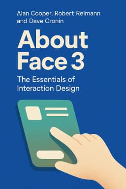
Joe: Alright Lewis, I'm going to say a phrase, and you tell me the first thing that comes to mind. Ready? "Interaction Design." Lewis: Ugh. That sounds like the title of the most boring mandatory course in college. The one where the professor's slides are from 1998 and still have WordArt on them. Joe: That is a painfully accurate description of what many people think it is. And it’s the exact mindset that the book we’re diving into today was written to destroy. We are talking about the legendary tome, About Face 3: The Essentials of Interaction Design by Alan Cooper, Robert Reimann, and David Cronin. Lewis: A legendary tome to fight against bad PowerPoint slides? I’m listening. What makes it so special? Joe: Well, for starters, the lead author, Alan Cooper, is a true giant in the software world. He's known as the “Father of Visual Basic.” He literally invented the core of it and sold it to Bill Gates in the late 80s. Lewis: Hold on. The guy who created one of the most influential programming tools ever then wrote a book about… making buttons look nice? That seems like a weird career pivot. Joe: That’s the perfect way to frame it. He wasn't some academic in an ivory tower; he was a builder who got profoundly fed up with building and using frustrating software. He saw that the problem wasn't the technology itself, but the way we were forced to interact with it. He realized we were building powerful machines that treated humans like idiots. Lewis: I know that feeling. I have a daily argument with the self-checkout machine at my grocery store, and I’m pretty sure it thinks I’m an idiot. So what was this legendary programmer’s big solution?
Designing for Goals, Not Just Features
SECTION
Joe: His solution is the heart of the book. It’s a philosophy called Goal-Directed Design. The core idea is incredibly simple but revolutionary. It says you should design products to help users achieve their goals, not just to show off what the technology can do. Lewis: Okay, that sounds good in theory, but isn't that what every company claims to do? "We're user-focused!" "We love our customers!" It feels like marketing speak. Joe: It often is. But Cooper gives a framework to make it real. He contrasts it with what most companies actually do, which is feature-driven design. The engineering team builds a cool new function, so marketing says, "Great, add it to the box!" The product gets more and more bloated with features, becoming more powerful but also more confusing. Lewis: Oh, I know this. It’s my phone's camera app. It has 50 different modes. Pro mode, food mode, night portrait, super-slow-mo-plus… I just want to take a nice picture of my dog without needing a PhD in photography. Joe: Exactly! You are a perfect example. Your goal isn't to "engage with the panorama feature." Your goal is to "capture a memory of my cute dog." Goal-Directed Design says we need to start there. And the best story to illustrate this is the one about the Nest thermostat. Lewis: The smart thermostat? I thought that was just about saving energy. Joe: It is, but how it does it is pure Goal-Directed Design. Before Nest, thermostats were a nightmare. They had dozens of tiny buttons, complex programming schedules… The result was that almost nobody programmed them. People’s goals were simple: "I want to be comfortable," and "I want to save money without thinking about it." They didn't want the "goal" of becoming a thermostat programmer. Lewis: That’s so true. My parents had one of those. The plastic flip-down cover was permanently yellowed and I think the clock on it was blinking "12:00" for fifteen years. Joe: Precisely. So the Nest team did deep research. They created what the book calls "personas." These are detailed, research-based archetypes of their users. They didn't just invent them; they synthesized them from interviews with real people. They might have had 'Tech-Savvy Tom,' who wants to see data and control everything from his phone, but also 'Simple Susan,' who is maybe a bit older and just wants the house to be warm when she wakes up and cool when she gets home. Lewis: Wait, personas? I have to be honest, that sounds a little… fluffy. Aren't those just made-up people? Like a marketing team in a boardroom saying, "Our target demographic is 'Active Amanda!'" Joe: That’s the cynical, and often correct, view of how it’s misused. But when done right, as Cooper outlines, it’s a powerful tool for empathy. It’s not about demographics. It's about goals and behaviors. The persona of 'Simple Susan' forces the designer to ask: "Would Susan understand this? Would this feature help her or just confuse her?" It stops designers from only designing for themselves or for 'Tech-Savvy Tom.' Lewis: Okay, I can see the value in that. It’s a check against your own biases. So how did this play out with the Nest? Joe: Instead of a hundred buttons, they gave it one simple dial. You turn it, the temperature changes. Easy. But the genius part was the machine learning. It watched your behavior. It learned that you turn it down when you leave for work and up when you get home. After a week, it started doing it for you. It achieved the user's goals—comfort and savings—without forcing them to become an expert. It was a massive success and Google bought them for over 3 billion dollars. It won by doing less, but doing it smarter. Lewis: Wow. So the lesson is that a simple, intuitive product that meets a real human goal will beat a complex, feature-packed product every time. Joe: That's the dream. But you know, this approach has its critics. The book is widely acclaimed, a true classic, but some people find this deep research and persona-building process to be… well, a bit slow for the modern world. Lewis: I was just thinking that. It sounds amazing, but also expensive. In a world of agile development and weekly sprints, who has the time to do months of ethnographic research to create 'Simple Susan'? It feels a bit… un-agile. Joe: That is the number one critique leveled against it. Many companies feel they can't afford that much upfront design. They'd rather ship something fast and iterate. But the book’s counter-argument is that skipping this step is what leads to products that fail, that need to be redesigned, and that ultimately cost more in the long run because they never understood the user’s mind in the first place. Lewis: The user’s mind. That feels like a good pivot point. It’s not just about their goals, but about how they think. Joe: Exactly. And that brings us to the second, and maybe even more profound, idea in the book. It’s about the hidden psychology of interfaces, and it explains why so much bad software doesn't just frustrate you—it makes you feel stupid.
The Hidden Psychology of Interfaces
SECTION
Lewis: Okay, I am definitely ready for this therapy session. Why do I feel personally attacked by my printer every time it says "PC LOAD LETTER"? What does that even mean?! Joe: (Laughs) That is a perfect example of the gap the book talks about. It’s the chasm between the user's "mental model" and the system's "implementation model." Lewis: You’re going to have to break that down for me. More design jargon. Joe: It’s simpler than it sounds. Your mental model is how you think the thing works. It’s your intuitive understanding. "I put paper in, I click print, a document comes out." The implementation model is how the code and machinery actually work. "The printer's sensor P-C-L-5 has detected an empty tray designated for letter-sized paper." The job of a good designer is to make the product’s presentation—how it communicates with you—match your mental model as closely as possible. Lewis: And when it doesn't, you get "PC LOAD LETTER." The machine is speaking its own language, the implementation model, and expecting me to understand it. It’s not even trying to meet me halfway. Joe: It’s not meeting you at all! It’s making you conform to its internal logic. The book is filled with these insights, but the most brilliant and darkly funny illustration of this is a concept called "affordance." Lewis: Affordance? Joe: An affordance is a perceived signal of what an object can do. A handle on a mug affords gripping. A chair affords sitting. In interface design, a button that looks like a 3D object popping off the screen affords pushing. The book uses a fantastic, if slightly terrifying, story to explain what happens when affordance goes wrong. Lewis: I’m ready. Hit me with it. Joe: Imagine you walk up to a house. Next to the front door is a small, round, white button. What is it? Lewis: A doorbell. Obviously. My mental model, built from a lifetime of experience, says that button, in that location, is a doorbell. Its affordance is ringing a bell. Joe: Right. So you press it. You expect a chime. Instead, a trapdoor opens up beneath your feet and you fall into a pit. Lewis: Whoa! That is… a very aggressive security system. And a lawsuit waiting to happen. Joe: It's a perfect, albeit extreme, metaphor. The button’s affordance—what you thought it did—was completely disconnected from its actual function. The design lied to you. This is happening on a smaller, less life-threatening scale all the time in software. You see a link that looks like it will take you to a new page, but instead it downloads a PDF. You click a big green "Save" button, but it opens a complicated "Save As" dialog box with ten different options. Lewis: That happens constantly! The design gives you a clue, you follow it, and you end up somewhere you didn't expect. It breaks your trust. And it makes you feel like you made a mistake, even though you just did what the design told you to do. Joe: And that’s the emotional core of it. The book argues that things like confusing error messages and misleading affordances are a form of "excise." That's another great term from the book. It’s like a tax. It’s the extra, unnecessary work you have to do just to use the product—like navigating through five menus to find one setting. It’s work that doesn’t help you achieve your goal. Lewis: It’s cognitive friction. It’s the mental energy you burn just trying to figure the system out. And after a while, you just give up. Or you feel exhausted. Joe: You do. And the book makes a powerful, almost ethical argument about this. It says that when a user gets an error, the system shouldn't pop up a box that says "You made an error." It should be more like a helpful human. The book uses the analogy of an uptight accounting clerk. If you hand them a form with one box empty, they throw it back and refuse to do any work. A helpful assistant would say, "Looks like we just need the zip code here, I can look that up for you." Software should be the helpful assistant. Lewis: It should be tolerant. It should assume the human is smart and has a goal, and its job is to help them get there, even if the input isn't perfect. Joe: That’s the entire philosophy in a nutshell. Make the user feel smart. Make them feel powerful. Don't stop the proceedings with idiocy.
Synthesis & Takeaways
SECTION
Lewis: So when you boil it all down, after all the models and personas and affordances, what's the one thing we should really take away from this "bible" of design? Joe: I think it’s that design is never neutral. It's an act of communication, and at its best, it's an act of empathy. The book’s most enduring legacy is its shift in blame. For decades, when people struggled with technology, the assumption was that the user was the problem. They needed more training, they were "computer illiterate." Lewis: Right, the problem was the person, not the product. Joe: Exactly. And Cooper and his co-authors flipped that entirely. They argue with incredible force that when software is confusing or frustrating, the user is never the one who is stupid. The design has failed. It’s a profound call for designers and developers to take responsibility for the emotional and cognitive impact of their work. Lewis: That’s a powerful shift in perspective. It’s not just about making things efficient; it’s about making them considerate. It makes you look at every app on your phone, every website, every self-checkout machine completely differently. Joe: It really does. So for everyone listening, think about the last time a piece of technology made you feel frustrated or foolish. Was it really your fault? Or was the design speaking its own language, ignoring your goals, and maybe even hiding a trapdoor under that button you just pressed? Lewis: I love that. And we'd love to hear your stories. What's the most frustrating piece of design you have to deal with in your daily life? Share your experiences with the Aibrary community. Let's see what patterns emerge. I bet we'll find a lot of blinking "12:00"s out there. Joe: I have no doubt. This is Aibrary, signing off.


